CSS Grid System Display: Grid
table of Contents
Grid system can also be implemented in floating
Can see another blog
It is better to use floating to achieve a grid
Similar to the elastic box, the grid layout also acts on the two-stage DOM structure.
display:grid
This element becomes a grid container, its child element becomes a mesh element.
Grid syntax has a limit
All mesh elements must be a direct child node of a grid container
Define grid tracks
New attribute definition grid track:
FR's score unit, weight
Three columns
grid-template-rows: 1fr 1fr;
//Equivalent to
grid-template-rows:repeat(2,1fr );
grid-template-columns: 2fr 1fr 1fr 3fr;
 //Equivalent to
grid-template-columns: 2fr repeat(2,1fr ) 3fr;
Add a function when it is definedrepeat
Implement code
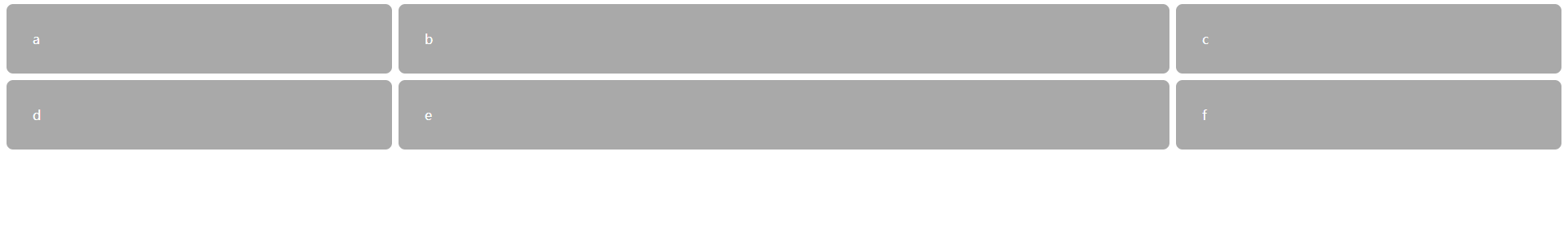
<!doctype html>
<head>
  <style>
  :root {
    box-sizing: border-box;
  }

  *,
  ::before,
  ::after {
    box-sizing: inherit;
  }

  .grid {
    display: grid;
    grid-template-columns: 1fr 2fr 1fr;
    grid-template-rows: 1fr 1fr;
    grid-gap: 0.5em;
  }

  .grid > * {
    background-color: darkgray;
    color: white;
    padding: 2em;
    border-radius: 0.5em;
  }
  </style>
</head>
<body>
  <div class="grid">
    <div class="a">a</div>
    <div class="b">b</div>
    <div class="c">c</div>
    <div class="d">d</div>
    <div class="e">e</div>
    <div class="f">f</div>
  </div>
</body>
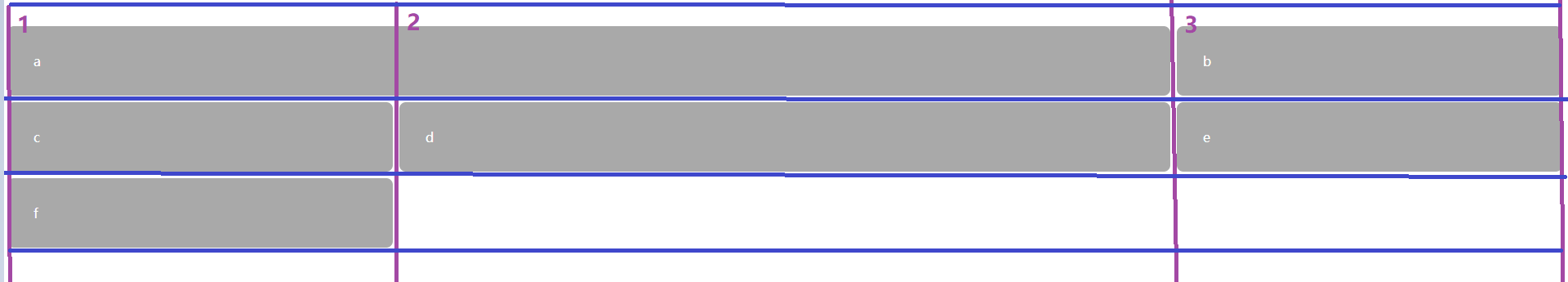
Implicit grid
The above explicitly defines a grid, if the element is more than the grid number in the actual DOMAutomatic expansion mesh
These are implicit grids
forImplicit networkSet a default size value
Set Grid-Auto-Rows: 1FR;
grid-auto-colums: 1fr;
Specify the location of the element
grid-column: 1 / 3;
Add to the previous code
 .a{
        grid-column: 1 / 3;
  }
Page changes
Supplementary grammar
Named grid line
Named grid line
.container {
    display: grid;
    grid-template-columns: [left-start] 2fr
                           [left-end right-start] 1fr
                           [right-end];
    grid-template-rows: repeat(4, [row] auto);
    grid-gap: 1.5em;
    max-width: 1080px;
    margin: 0 auto;
  }

  header,
  nav {
    grid-column: left-start / right-end;
    grid-row: span 1;
  }

  .main {
    grid-column: left;
    grid-row: row 3 / span 2;
  }

  .sidebar-top {
    grid-column: right;
    grid-row: 3 / 4;
  }
Named grid area
The grid area must form a rectangle
As a name representative empty one grid
.container {
    display: grid;
    grid-template-areas: "title title"
                         "nav   ."
                         "main  aside1"
                         "main  aside2";
    grid-template-columns: 2fr 1fr;
    grid-template-rows: repeat(4, auto);
    grid-gap: 1.5em;
    max-width: 1080px;
    margin: 0 auto;
  }
Feature inquiry
CSS View Browser Support Characteristics
Retreat style outside of property query
 @supports (display: grid) {
      .portfolio {
        display: grid;
        grid-template-columns: repeat(auto-fill, minmax(200px, 1fr));
        grid-auto-rows: 1fr;
        grid-gap: 1em;
        grid-auto-flow: dense;
      }
    }
         // or
     @supports not(display: grid){}
     @supports (display: grid) or (display: table){}
     @supports (display: grid) and (display: table){}
Set different sizes
Give some elements account for multiple grid areas
.portfolio .featured {
      grid-row: span 3;
      grid-column: span 3;
    }
before
Rear
This change is the default grid-auto-flow: ROW;
Intelligent Recommendation
CSS Grid (CSS Grid)
The CSS grid is a newer standard for building complex response layout. It converts the HTML element to a grid container with rows and columns to place the child elements in the required position. cont...
Grid layout Display: grid;
What is a grid layout? It is a powerful CSS layout program that divides the web page into one mesh, which can be combined with the grid (similar Excel) Grid layout is the layout system of CSS3 Similar...

display: grid; grid layout
The grid layout is a two -dimensional surface, like the X -axis and Y axis of the coordinate system. Grid-after takes a be alias for each grid area; GRID-Template-Columns sets how many columns are set...

Display: Grid grid layout
1. The first example understands the grid layout Second, the second example operation result: Three, attributes Display Set the Grid layout display: grid // default is block -level element display: in...
More Recommendation

Grid layout Display: grid
Grid layout The CSS grid layout module (CSS Grid Layout Module) provides a grid -based layout system with lines and columns, which makes the web design easier without using floating and positioning. G...
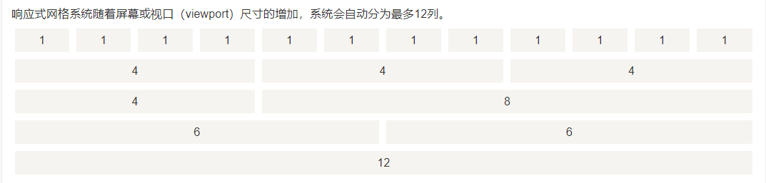
Bootstrap CSS -1: Grid System
1. Definition Bootstrap includes a responsive, mobile device-first, and non-fixed grid system, which can be appropriately expanded as the device or viewport size increases 12 Column. It contains prede...

Bootstrap-CSS style grid system
Article Directory Raster parameters Column offset Nested column Column sort Less mixin and variables Bootstrap provides a responsive, mobile device-first streaming grid system. As the size of the scre...

Write bootstrap grid system with css
Grid grid layout The Grid module provides a new value for the display property: grid. When you set the display property of any element to grid, then this element is a grid container, and all its direc...
Stories about the CSS grid system
Speaking ofGrid system(grid system), you may have seen this concept: In this way, the layout design is carried out through a fixed grid structure. This is a design style, and it has been widely used i...