display: grid of css layout
tags: css
A new adaptive layout display: grid
Share a new layout,display: grid, Used to solve some layout problems such as card statistics, such as

To achieve the effect of this card layout, it takes only three lines of code to use the grid layout
Code
<!DOCTYPE html>
<html lang="en">
<head>
    <meta charset="UTF-8">
    <meta name="viewport" content="width=device-width, initial-scale=1.0">
    <meta http-equiv="X-UA-Compatible" content="ie=edge">
    <title>display: Use of grid</title>
    <style>
        .box {
            width: 1600px;
            margin: 50px auto;
            height: 100px;
            display: grid;
            grid-template-columns: repeat(4,1fr);
            grid-column-gap: 80px;
        }
        .box div {
            border-radius: 4px;
            box-shadow: 2px 2px 5px #ccc;
            background: orange;
        }
    </style>
</head>
<body>
    <div class="box">
        <div></div>
        <div></div>
        <div></div>
        <div></div>
    </div>
</body>
</html>
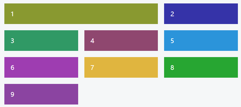
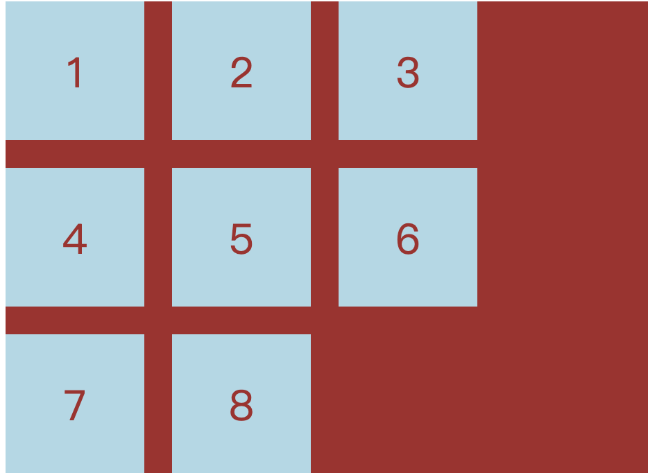
Effect picture (copy code to view)

And only three lines of main code are needed to achieve this effect
display: grid;
grid-template-columns: repeat(4,1fr);
grid-column-gap: 80px;
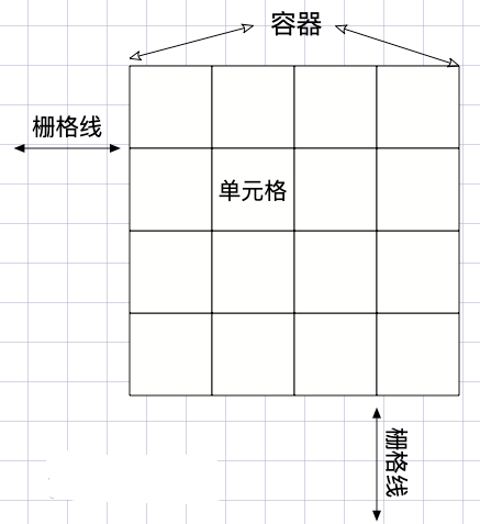
The main properties of grid:
| Attributes | effect | parameter |
|---|---|---|
| grid-template-columns | Set the limit and style of each row for the child elements in the grid element | Pixels / fr / repeat |
| grid-template-rows | Set the limit and style of each column for the child elements in the grid element | Pixels / fr / repeat |
| grid-row-gap | Set the line spacing for the child elements in the grid element | Pixels / percent |
| grid-column-gap | Set the column spacing for the child elements in the grid element | Pixels / percent |
| grid-gap | The combined short form of grid-column-gap and grid-row-gap | grid-gap: grid-row-gap grid-column-gap |
| justify-items | The horizontal position of the content of the child element cell | start (left) / end (right) / center (middle) / stretch (stretch) |
| align-items | The vertical position of the child element cell content | start (up) / end (down) / center (middle) / stretch (stretch) |
| place-items | The short form of the merge of the align-items attribute and the justify-items attribute | place-items: align-items justify-items |
1.fr: The child elements are evenly divided into the same length or width, for example, the width of the two columns is 1fr and 2fr, which means that the latter is twice the former
2.repeat: It is a function that accepts two parameters. The first parameter is the number of repetitions (in this case, 4), the second parameter is the value to be repeated. It is also possible to repeat a certain pattern
For example: repeat (2, 1fr 2fr 1fr)
In this example, only grid-template-columns and grid-column-gap are used, which defines a row to display 4 child elements, each child element has an average length of 80px
There are also some special attributes that are not listed in the table, as long as you master the attributes in the table, you can easily build some styles, so be it
Intelligent Recommendation
CSS-grid layout -grid
CSS-grid layout -grid 1. Concept of CSS grid layout 2. How to use 2.1. Direct appearance 2.2. Key 3. Reference documentation 1. Concept of CSS grid layout The CSS grid layout is good at dividing a pag...
CSS -GRID grid layout
The three -row code to achieve your headache Jiugongge layout:Source code, Turn to Method Six, there will be This is the charm of GRID. Oops, I have not planned to study in -depth recently, first post...
【CSS】 GRID grid layout
Grid layout Specify a container to use a grid layout to control sub -class projects. Set up the post -level project will be converted toblock You can also set it up like thisinline-block characteristi...
CSS layout - Grid grid layout
CSS is getting more and more colorful, the Flex layout is so powerful, and the grid grid layout is now available. so colorful~ Be a small practice, familiar with Grid Beautify Div is a block-level ele...
CSS Grid Layout grid layout
Set the element to a grid container Definition line and column (2x4) fr: Unit I with a width, which means the available space, is similar to the extension coefficient in Flexbox, that is, the remainin...
More Recommendation


[CSS] css grid layout
css grid layout out for a long time, can be translated into the fence layout, or grid layout, we saw a good application, so write down Cipian based tutorial. For example, we want to achieve such an ef...
CSS grid layout grid entry
CSS grid layout grid entry CSS grid layout is a two-dimensional grid layout, use it for a two-dimensional page layout, convenient and easy to introduce the following its specific use: 1. Definitions g...
css series-grid grid layout
Introduction to grid #Glossary CSS Grid Layout (Grid Layout) is the most powerful layout system in CSS. This is a two-dimensional system, which means it can process columns and rows at the same time. ...
CSS grid realizes grid layout
Article Directory 1 Overview 2 grid 3 details 1 Overview I have been writing a web page recently and encountered a grid layout problem, so I would like to share it with you. 2 grid Mainly used in cssd...