CSS - GRID grid layout
tags: Web front end development css grid
CSS - GRID grid layout
Container package multiple projects;
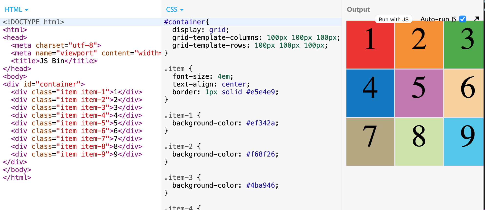
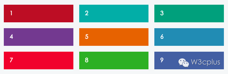
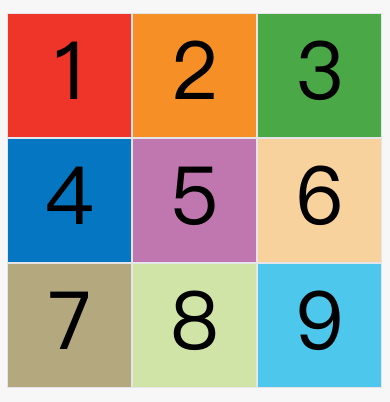
<div id="container">
  <div class="item item-1">1</div>
  <div class="item item-2">2</div>
  <div class="item item-3">3</div>
  <div class="item item-4">4</div>
  <div class="item item-5">5</div>
  <div class="item item-6">6</div>
  <div class="item item-7">7</div>
  <div class="item item-8">8</div>
  <div class="item item-9">9</div>
</div>
Container: Container
- Specify
grid
Project: Item
- First level child element
Under the grid layout, the Display value of other child elements of the project will fail; such as float, inline-block, table-cell, vertical-align and column- *;
Grid layout foundation
.container {
  display: grid;
}
/* or */
.container {
  display: inline-grid;
}
grid-template-columnsProperty: Define the column width of each column;grid-template-rowsAttribute: Define the row of each line;
/ * Three rows of three columns of grid * /
.container {
  display: grid;
  grid-template-columns: 100px 100px 100px;
  grid-template-rows: 100px 100px 100px;
}
/* or */
.container {
  display: grid;
  grid-template-columns: 33.33% 33.33% 33.33%;
  grid-template-rows: 33.33% 33.33% 33.33%;
}
/ * OR: Using the REPEAT () function * /
.container {
  display: grid;
  grid-template-columns: repeat(3, 33.33%);
  grid-template-rows: repeat(3, 33.33%);
}
repeat()The function can also be used with this;
/ * Definition 6 columns: Repeat three columns * /
grid-template-columns: repeat(2, 100px 20px 80px);
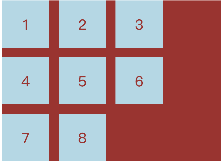
auto-fillKeywords: (filled)
The size of the cell is fixed, but the size of the container is uncertain. At this time, the AUTO-FILL is used instead of the first parameter of the REAT () function, and can automatically fill as many cells as possible on the row or column;
.container {
  display: grid;
  grid-template-columns: repeat(auto-fill, 100px);
}
frKeywords: (alien)
It is more convenient to represent the proportional relationship. If the width of the two columns is 1Fr and 2FR, the latter is twice that of the former;
.container {
  display: grid;
  grid-template-columns: 1fr 1fr;  // Two columns
}
/* or */
.container {
  display: grid;
  grid-template-columns: 150px 1fr 2fr;  // Three columns (one column fixed other two columns to proportionally allocate)
}
minmax()function:
/ * The third column minimum 100px maximum is 1/3 wide * /
grid-template-columns: 1fr 1fr minmax(100px, 1fr);
autoKeywords:
Indicates that the length is determined by the browser;
grid-template-columns: 100px auto 100px;
- Name of the grid line:
Note that the name is specified here is the name of each line;
The grid layout allows multiple names in the same line, such as[fifth-line row-5];
.container {
  display: grid;
  grid-template-columns: [c1] 100px [c2] 100px [c3] auto [c4];
  grid-template-rows: [r1] 100px [r2] 100px [r3] auto [r4];
}
Layout instance
- Bart-column layout:
.wrapper {
  display: grid;
  grid-template-columns: 70% 30%;
}
- Twelve grid layout:
grid-template-columns: repeat(12, 1fr);
- Nine-pace:
Grid layout - container properties
grid-row-gapProperty: Setting the interval of rows and rows (line spacing)grid-column-gapAttribute: Set the interval of column and column (column spacing)grid-gapThe attribute is the merger of Grid-Column-Gap and Grid-Row-GAPgrid-gap: <grid-row-gap> <grid-column-gap>;
According to the latest criteria, the above three attribute names
grid-The prefix has been deleted,grid-column-gapwithgrid-row-gapWritecolumn-gapwithrow-gap,grid-gapWritegap;
.container {
  grid-row-gap: 20px;
  grid-column-gap: 20px;
  grid-gap: 20px 20px;  // The second value can be omitted
}
grid-template-areasProperty:- A area consists of single or more cells;
grid-template-areasThe property is used to define the area;- Multiple cells are merged into one area;
/ * 9 cells are divided, then nine a nine areas of A to I * /
.container {
  display: grid;
  grid-template-columns: 100px 100px 100px;
  grid-template-rows: 100px 100px 100px;
  grid-template-areas: 'a b c'
                       'd e f'
                       'g h i';
}

/ * Multiple cells merge into one area: 9 cells are divided into three areas of A, B, C * /
grid-template-areas: 'a a a'
                     'b b b'
                     'c c c';
/ * A layout instance * /
grid-template-areas: "header header header"
                     "main main sidebar"
                     "footer footer footer";

/ * If some areas do not need to be utilized, use "Point" (.) "* /
/ * One list is a point, indicating that the cell is not used, or the cell does not belong to any area * /
grid-template-areas: 'a . c'
                     'd . f'
                     'g . i';
Note that the naming of the area affects the grid line. The starting grid line of each area will automatically name the area name.
-startTermination grid line automatically named the area name-end;
For example, the area name isheader, The horizontal grid line and vertical grid line of the start position are calledheader-start, Horizontal grid line and vertical grid line of the termination position are calledheader-end;
-
grid-auto-flowAttributes:- The default is
row"That is" first line " - Set
column, Become "first list" - Set to
row dense, Means "first-line", and filled with as close as possible, try not to have spaces - Set to
column dense, Means "first-line", and filled with as close as possible, try not to have spaces
- The default is
-
justify-itemsProperty: Set the horizontal position of the cell content (left is right) -
align-itemsProperty: The property sets the vertical position of the cell content (up)- START: Alignment of the starting edge of the cell
- End: Alignment End Edge Edge
- Center: Internal Centro
- Stretch: Stretch, accounting for the entire width of the unit (default)
-
place-itemsAttribute: is the align-items attribute and the merge form of the Justify-Items property.place-items: <align-items> <justify-items>;- If the second value is omitted, the browser considers equal to the first value;
.container {
  justify-items: start | end | center | stretch;
  align-items: start | end | center | stretch;
  place-items: start end;
}
justify-contentAttributes:Entire contentThe horizontal position in the area in the container (left in the upper right)align-contentProperty: Vertical position of the entire content area (bottom)- Stretch - The project size is not specified, stretching the entire grid container
- Space-around - Interval between each project is equal. Therefore, the interval between the projects is doubled than the interval between the project and the container border.
- Space-between - the interval between the project and the project, etc., there is no interval between the project and the container border.
- Space-Evenly - Project is equal to the interval of the project, and the project and the container border are also the same length interval.
place-contentProperty: Shorthand
.container {
  justify-content: start | end | center | stretch | space-around | space-between | space-evenly;
  align-content: start | end | center | stretch | space-around | space-between | space-evenly;
}
grid-auto-columnsAttribute andgrid-auto-rowsAttribute: Used to set, the browser automatically creates the column width and row; their write is exactly the same as Grid-Template-Column and Grid-Template-Rows;
/ * More than 3 * 3 part of the line will be set to 50 * /
.container {
  display: grid;
  grid-template-columns: 100px 100px 100px;
  grid-template-rows: 100px 100px 100px;
  grid-auto-rows: 50px;
}
grid-templateAttribute: It is a merger of the three properties of Grid-Template-Column, Grid-Template-Rows, and Grid-Template-Areas;gridProperty: Yes, Grid-Template-Rows, Grid-Template-Column, Grid-Template-all, Grid-auto-Rows, Grid-Auto-Column, Grid-Auto-Flow, is a merged form;
Grid layout - project properties
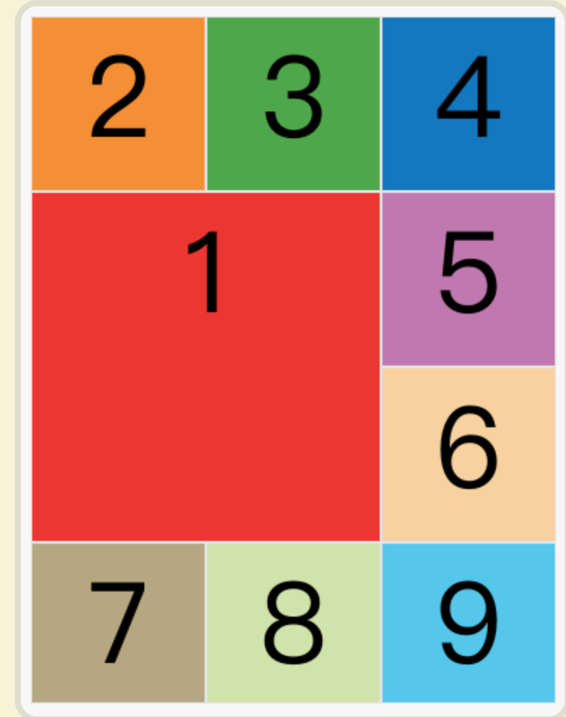
Specify the four borders of the project to specify the location of the project:
- Grid-column-start attribute: The vertical grid line where the left box is located
- Grid-column-end attribute: Vertical grid line where the right box is located
- Grid-row-start attribute: horizontal grid line on the border
- Grid-row-end attribute: horizontal grid line where the bottom box is located
No items in the specified location, automatically layout by the browser, decided in accordance with the grid-auto-flow property of the container;
.item-1 {
  grid-column-start: 2;  // The left box is the second vertical grid line
  grid-column-end: 4;  // Right Box is the fourth vertical grid line
}
/ * OR: Specifies the name of the grid line * /
.item-1 {
  grid-column-start: header-start;
  grid-column-end: header-end;
}
An example of a meaning:
.item-1 {
  grid-column-start: 1;
  grid-column-end: 3;
  grid-row-start: 2;
  grid-row-end: 4;
}
The value of these four attributes can also use the span keyword, indicating "leap", ie, how many grids across the left and right bords (upper and lower borders);
.item-1 {
  grid-column-start: span 2;
}
/ * OR: The effect is the same * /
.item-1 {
  grid-column-end: span 2;
}
With these four properties, if the project overlap is generated, use the Z-Index property to specify the overlap sequence of the project;
grid-columnProperty: It is the merged form of Grid-Column-Start and Grid-Column-Endgrid-rowProperty: It is the merged form of Grid-Row-Start attribute and Grid-Row-End
.item-1 {
  grid-column: 1 / 3;
  grid-row: 1 / 2;
}
grid-areaProperty: Which area is specified?
.item-1 {
  grid-area: e;
}
grid-areaProperty: Can be used as a merged form of Grid-Row-Start, Grid-Column-Start, Grid-Row-End, Grid-Column-End
.item {
  grid-area: <row-start> / <column-start> / <row-end> / <column-end>;
}

.item-1 {
  grid-area: 1 / 1 / 3 / 3;
}
justify-selfAttribute: Set the horizontal position of the cell content (left in the left right), completely consistent with the usage of the Justify-Items property, but only acts on a single itemalign-selfAttribute: Set the vertical position of the cell content (up), which is completely consistent with the usage of the align-items attribute, and only acts on a single itemplace-selfProperty: Is the Align-Self Properties and Justify-Self Properties Merging Simplial Form- If the second value is omitted, the Place-Self attribute will consider these two values.
.item {
  justify-self: start | end | center | stretch;
  align-self: start | end | center | stretch;
  place-self: <align-self> <justify-self>;
}
Intelligent Recommendation
CSS grid realizes grid layout
Article Directory 1 Overview 2 grid 3 details 1 Overview I have been writing a web page recently and encountered a grid layout problem, so I would like to share it with you. 2 grid Mainly used in cssd...
CSS Grid implements grid layout
Learning website:http://www.ruanyifeng.com/blog/2019/03/grid-layout-tutorial.html Detailed examples:https://www.sohu.com/a/115465158_488157 grid attribute The grid attribute is an abbreviation of the ...
A taste of CSS Grid grid layout
Technology comes from life and serves life address:api.imibi.cn:8080 Simple Grid CSS style effects index.html...
CSS Grid layout: grid area
In the previous section, I learned about the columns and spacing in the CSS Grid layout, but did not mention the grid area. So far, grid items have been placed in separate cells, but we should break t...
CSS Grid grid layout (detailed)
display: gridSpecify a container to use a grid layout. By default, container elements are all block-level elements, but they can also be set as inline elements. The picture above isdisplay: inline-gri...
More Recommendation
CSS display: grid grid layout
Main attributes: grid-template-columns: //Arrange vertically grid-template-rows: //Horizontal arrangement The Grid layout is similar to the Flex layout, and both can specify the position of multiple i...
CSS Grid Grid Layout Tutorial
Two core elements of the CSS grid are wrapper (parent) and projects (child). The packaging is the actual grid, and the project is the content in the grid. This is the tag of the wrapper containing six...
Wonderful Grid, CSS grid layout
The Grid layout is really powerful, because the most use of the Flex layout in your project, resulting in less use of Grid. I will summarize the Grid when I am idle. Because fewer use of themselves ar...
CSS GRID grid layout Note
CSS GRID grid layout I. Overview Basic concept 2.1 container and project 2.2 Line and column 2.3 cells 2.4 grid line Third, container attributes 3.1 Display attribute 3.2 Grid-Template-Columns and Gri...
CSS GRID grid layout experience
Definition: GIRD can be customized with high degree of grid layout (customize!!!) Main parameters and grammar: grid-template-columnsAttribute definition of the column width of each column, grid-templa...