CSS display: grid grid layout
tags: css3
Main attributes:
grid-template-columns: //Arrange vertically
grid-template-rows: //Horizontal arrangement
The Grid layout is similar to the Flex layout, and both can specify the position of multiple items inside the container.
the difference:
- Flex layout is an axis layout, you can only specify the position of the "project" for the axis, which can be regarded as a one-dimensional layout.
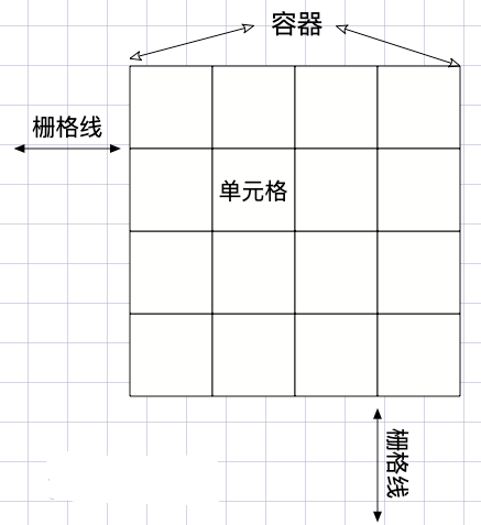
- The Grid layout divides the container into "rows" and "columns", generates cells, and then specifies the cell where the "item is located", which can be regarded as a two-dimensional layout. Grid layout is far more powerful than Flex layout
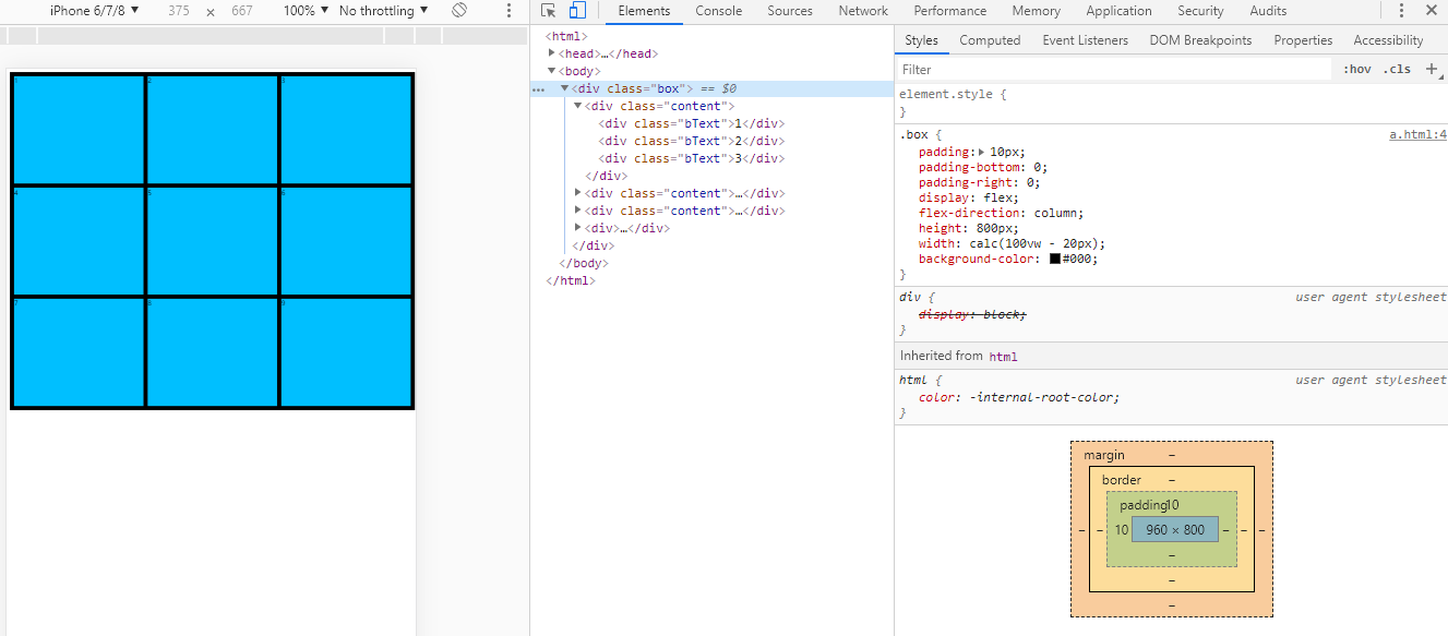
First, compare flex and grid to achieve adaptive nine-square grid, height 800px, width adaptation:
flex: After more than one layer, the style becomes complicated, especially the processing of the border is a bit complicated
<html>
<head>
  <style type="text/css">
   .box {
      padding: 10px;
      padding-bottom: 0;
      padding-right: 0;
      display: flex;
      flex-direction: column;
      height: 800px;
      width: calc(100vw - 20px);
      background-color: #000;
    }
    .content {
      display: flex;
      margin-bottom: 10px;
      flex: 1
    }
    .bText {
      flex: 1;
      margin-right: 10px;
      background-color: deepskyblue;
    }
  </style>
</head>
<body>
  <div class="box">
    <div class="content">
      <div class="bText">1</div>
      <div class="bText">2</div>
      <div class="bText">3</div>
    </div>
    <div class="content">
      <div class="bText">4</div>
      <div class="bText">5</div>
      <div class="bText">6</div>
    </div>
    <div class="content">
      <div class="bText">7</div>
      <div class="bText">8</div>
      <div class="bText">9</div>
    </div>
  <div>
</body>
</html>
The effect diagram of flex layout of Jiugongge:
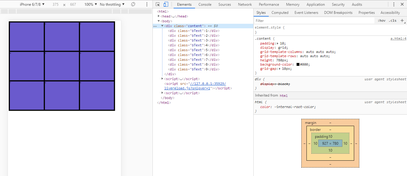
**grid:** There can also be many methods, and the code is simpler than flex
<html>
<head>
  <style type="text/css">
    .content {
      padding: 10;
      display: grid;
      grid-template-columns: auto auto auto;
      grid-template-rows: auto auto auto;
	  /* padding has a width of 20 */
      height: 780px;
      background-color: #000;
      grid-gap: 10px;
    }
    .bText {
      background-color: slateblue;
    }
  </style>
</head>
<body>
  <div class="content">
    <div class="bText">1</div>
    <div class="bText">2</div>
    <div class="bText">3</div>
    <div class="bText">4</div>
    <div class="bText">5</div>
    <div class="bText">6</div>
    <div class="bText">7</div>
    <div class="bText">8</div>
    <div class="bText">9</div>
  </div>
</body>
</html>
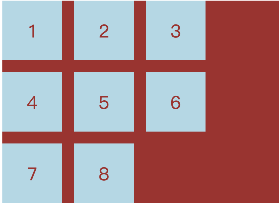
Effect drawing of grid layout of Jiugongge:
The common attributes of grid are as follows:
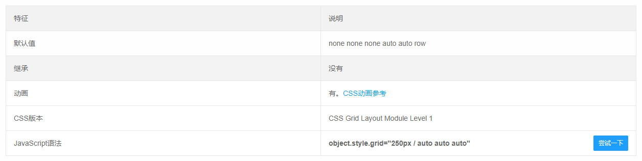
1):Height height height/(one) row (two) row (three) row
grid: 1fr 1fr 1fr/1fr 1fr 1fr ;
Examples are as follows:
grid: 100px 200px 100px /1fr 1fr 1fr;
// equal to
grid-template-rows: 100px 200px 100px;
grid-template-columns: 1fr 1fr 1fr;
grid-template-areas: none;
grid-auto-flow: initial;
grid-auto-rows: initial;
grid-auto-columns: initial;
2):Define the columns, according to the order you want them to appear in the grid, set the grid -template-columns attribute to the column size
grid-template-columns: 100px 100px; //There are several columns, how big is each column
.grid {
    display: grid;
    grid-template-columns: 100px 100px 100px; // Define three cells with a width of 100px
}
3):Used to define the number and size of rows in the grid
grid-template-rows :100px 100px; //There are several lines, how big is each line
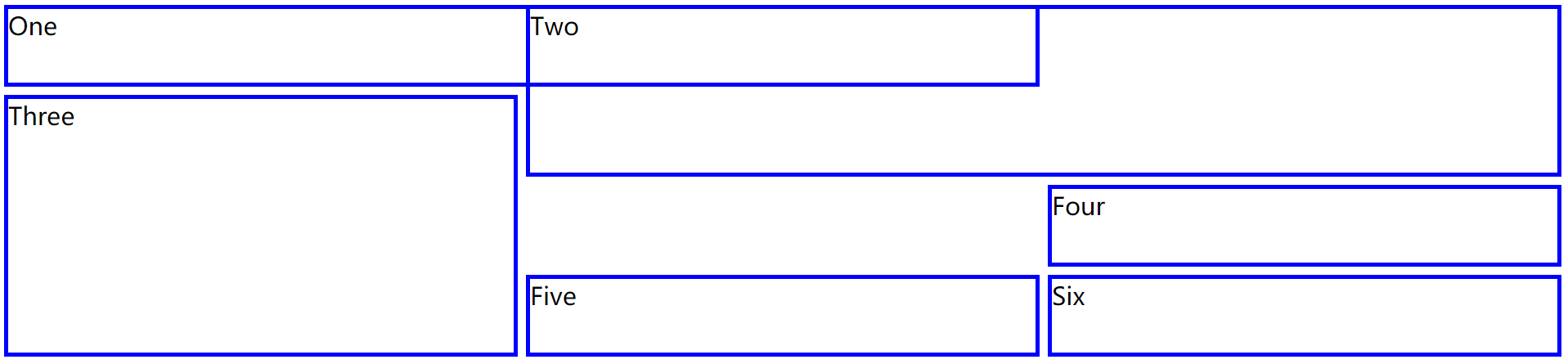
4):grid is the abbreviation of grid-template-rows, grid-template-columns and grid-template-areas
//[Name] The height of the row of'columns' [Name] /Three widths corresponding to the three columns
//(The name can be empty '1 1 1'means it is divided into three columns)
grid-template: [] '1 1 1' 100px [] /auto 50px auto;
.grid {
    display: grid;
    grid-template:
        "header header  header" 80px
        "nav    article article" 600px
        / 100px 1fr;
}
5):Define the space between up, down, left, and right + the space between columns + the space between rows
grid-gap: 10px 20px ;//10px up and down, 20px left and right
grid-gap: 10px;//10px between top and bottom left and right
grid-column-gap
grid-row-gap
6):justify-items: the attribute of the grid container, set the alignment of the content within grid items along the line axis (horizontal direction), applicable to the content within the grid All grid items
- start: align the content to the left side of the grid area
- end: align the content to the right side of the grid area
- center: align the content to the middle of the grid area (center horizontally)
- stretch: fill the width of the grid area (default value)
- space-around: place an even space between each grid item, and place half of the space on the left and right ends
- space-between: Place a uniform space between each grid item, and there is no space at the left and right ends
- space-evenly: Place an even space between each grid item, and place an even space on the left and right ends
7):align-items: defines the alignment of flex items in the lateral (vertical axis) direction of the current row of the flex container
- start: align the content to the top of the grid area
- end: align the content to the bottom of the grid area
- center: align the content to the middle of the grid area (center vertically)
- stretch: fill the height of the grid area (default value)
8):align-content: align the items in the container when the items in the elastic container do not occupy all the available space on the cross axis (vertical)
- start: align the grid to the top of the grid container
- end: align the grid to the bottom of the grid container
- center: align the grid to the middle of the grid container (center vertically)
- stretch: adjust the height of grid items to allow the grid to fill the height of the entire grid container
- space-around: place an even space between each grid item, and place half of the space between the upper and lower ends
- space-between: Place a uniform space between each grid item, and there is no space at the upper and lower ends
- space-evenly: Place an even space between each grid item, and place an even space at the upper and lower ends
9):fr is a new unit created for the css grid layout. fr allows you to create a flexible grid without calculating percentages, 1fr represents an equal part of the available space
.grid {
    display: grid;
    grid-template-columns: 3fr 4fr 3fr; // The width is divided into 3+4+3=10 equal parts, 4 cells occupy 3, 4, and 3 parts respectively
    grid-template-columns: 3fr 4fr 3fr 2fr; // The width is divided into 3+4+3+2=12 equal parts, 4 cells respectively occupy 3, 4, 3, 2 parts
}
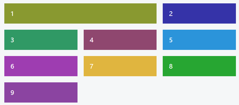
10):The grid-auto-flow property controls how grid cells flow into the grid, and its default value is row. The "grid cells" in the grid will be filled one by one until there are no remaining items
.grid {
    display: grid;
    grid-template-columns: 100px 100px 100px;
    grid-auto-flow: column;
}
11):The repeat() function helps to make the grid track list less redundant and adds a semantic layer to it
.grid {
    display: grid;
    // Repeat 1fr 2fr 3 times. It can also be: grid-template-columns: 2fr repeat(5, 1fr) 4fr;
    grid-template-columns: repeat(3, 1fr 2fr);
}
Intelligent Recommendation
CSS-grid layout -grid
CSS-grid layout -grid 1. Concept of CSS grid layout 2. How to use 2.1. Direct appearance 2.2. Key 3. Reference documentation 1. Concept of CSS grid layout The CSS grid layout is good at dividing a pag...
CSS -GRID grid layout
The three -row code to achieve your headache Jiugongge layout:Source code, Turn to Method Six, there will be This is the charm of GRID. Oops, I have not planned to study in -depth recently, first post...
【CSS】 GRID grid layout
Grid layout Specify a container to use a grid layout to control sub -class projects. Set up the post -level project will be converted toblock You can also set it up like thisinline-block characteristi...
CSS layout - Grid grid layout
CSS is getting more and more colorful, the Flex layout is so powerful, and the grid grid layout is now available. so colorful~ Be a small practice, familiar with Grid Beautify Div is a block-level ele...
CSS Grid Layout grid layout
Set the element to a grid container Definition line and column (2x4) fr: Unit I with a width, which means the available space, is similar to the extension coefficient in Flexbox, that is, the remainin...
More Recommendation
CSS grid layout grid entry
CSS grid layout grid entry CSS grid layout is a two-dimensional grid layout, use it for a two-dimensional page layout, convenient and easy to introduce the following its specific use: 1. Definitions g...
css series-grid grid layout
Introduction to grid #Glossary CSS Grid Layout (Grid Layout) is the most powerful layout system in CSS. This is a two-dimensional system, which means it can process columns and rows at the same time. ...
CSS grid realizes grid layout
Article Directory 1 Overview 2 grid 3 details 1 Overview I have been writing a web page recently and encountered a grid layout problem, so I would like to share it with you. 2 grid Mainly used in cssd...
CSS Grid implements grid layout
Learning website:http://www.ruanyifeng.com/blog/2019/03/grid-layout-tutorial.html Detailed examples:https://www.sohu.com/a/115465158_488157 grid attribute The grid attribute is an abbreviation of the ...
A taste of CSS Grid grid layout
Technology comes from life and serves life address:api.imibi.cn:8080 Simple Grid CSS style effects index.html...