Grid layout Display: grid;
tags: WEB front end css HTML html5 front end
What is a grid layout?
It is a powerful CSS layout program that divides the web page into one mesh, which can be combined with the grid (similar Excel)
Grid layout is the layout system of CSS3
Similar to the elastic layout
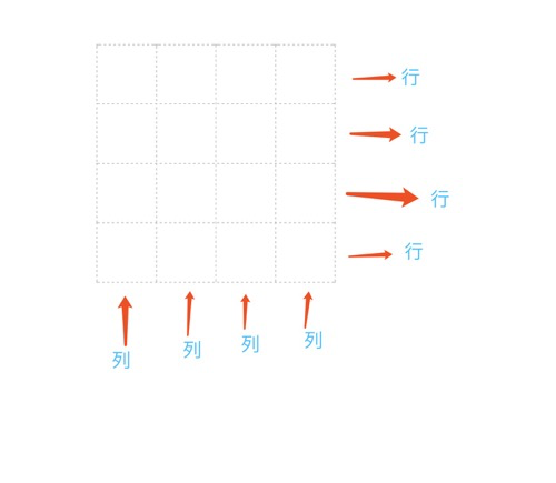
Grid can be understood as a two-dimensional layout (elastic layout is one-dimensional)
You can use Align-item Justify-Content and other properties
IE11 part support
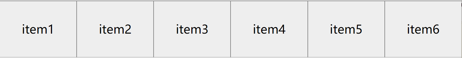
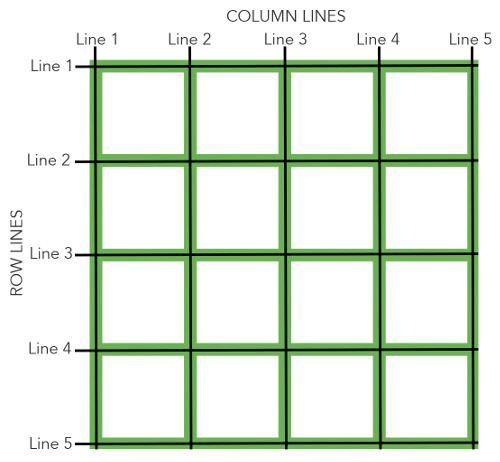
Display: Grid Setting this element is a grid container
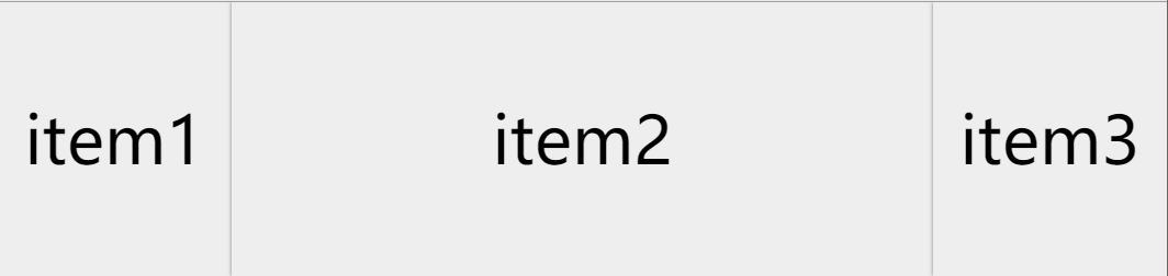
display: grid;Grid-template-columns: column width
<!DOCTYPE html>
<html>
	<head>
		<meta charset="utf-8">
		<title>grid</title>
		<style type="text/css">
			*{
				margin: 0;
				padding: 0;
				list-style: none;
			}
			ul{
				 				/* grid */
				display: grid;
				 / * Settings column width * /
				/* grid-template-columns: 200px 200px 200px; */
				/* grid-template-columns: 200px auto 200px; */
				/* grid-template-columns: auto auto auto; */
				/* grid-template-columns: repeat(3,auto); */
				/* grid-template-columns: repeat(3,100px); */
				grid-template-columns: 1fr 3fr 1fr;

			}
			li{
				height: 200px;
				background-color: #eee;
				box-shadow: 0 0 3px gray;
				font-size: 3rem;
				text-align: center;
				line-height: 200px;
			}
		</style>
	</head>
	<body>
		<ul>
			<li>item1</li>
			<li>item2</li>
			<li>item3</li>
		</ul>
	</body>
</html>
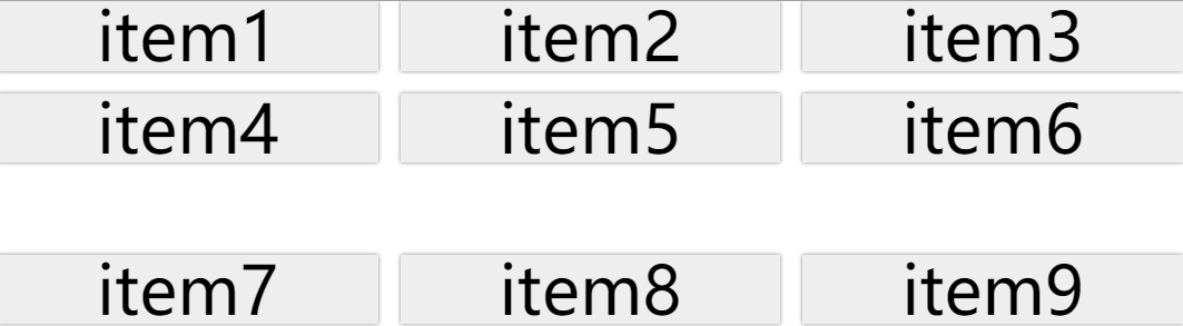
Grid-Template-Rows: High travel
<!DOCTYPE html>
<html>
	<head>
		<meta charset="utf-8">
		<title>grid</title>
		<style type="text/css">
			*{
				margin: 0;
				padding: 0;
				list-style: none;
			}
			ul{
				/* grid */
				display: grid;
				 / * Settings column width * /
				grid-template-columns: repeat(3,auto);
				 / * Setting the spacing * /
				grid-gap: 1rem;
				 / * Row height * /
				grid-template-rows: 1fr 2fr 3fr;
			}
			li{
				height: 50px;
				background-color: #eee;
				box-shadow: 0 0 3px gray;
				font-size: 3rem;
				text-align: center;
				line-height: 50px;
			}
		</style>
	</head>
	<body>
		<ul>
			<li>item1</li>
			<li>item2</li>
			<li>item3</li>
			<li>item4</li>
			<li>item5</li>
			<li>item6</li>
			<li>item7</li>
			<li>item8</li>
			<li>item9</li>
		</ul>
	</body>
</html>
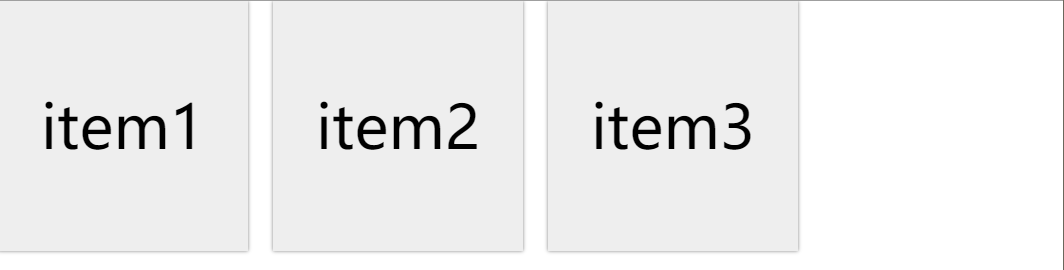
Grid-gap: spacing
<!DOCTYPE html>
<html>
	<head>
		<meta charset="utf-8">
		<title>grid</title>
		<style type="text/css">
			*{
				margin: 0;
				padding: 0;
				list-style: none;
			}
			ul{
				 				/* grid */
				display: grid;
				 / * Settings column width * /
				grid-template-columns: 200px 200px 200px;
				 / * Setting the spacing * /
				grid-gap: 20px;
			}
			li{
				height: 200px;
				background-color: #eee;
				box-shadow: 0 0 3px gray;
				font-size: 3rem;
				text-align: center;
				line-height: 200px;
			}
		</style>
	</head>
	<body>
		<ul>
			<li>item1</li>
			<li>item2</li>
			<li>item3</li>
		</ul>
	</body>
</html>
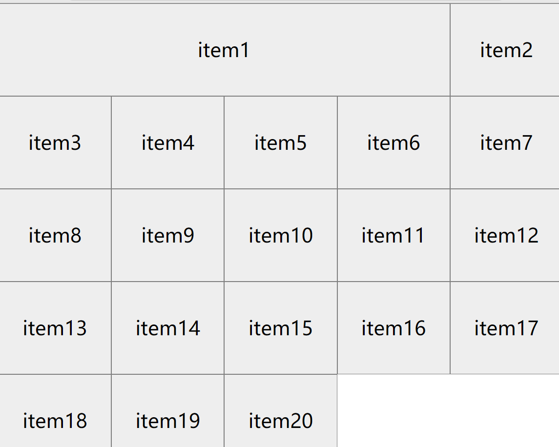
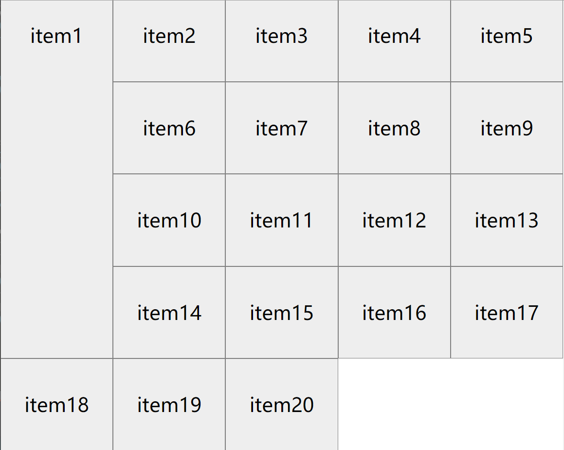
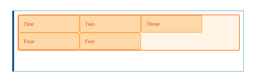
Cross line Junction
grid-column-start: 1 Which start from?
grid-column-end: 3 Which end (not included)
grid-column: 1 / span 3 Starting from the first line, merge3Cell
<!DOCTYPE html>
<html>
	<head>
		<meta charset="utf-8">
		 <title> Crossline and Cross Column </ Title>
		<style type="text/css">
			*{
				margin: 0;
				padding: 0;
				list-style: none;
			}
			ul{
				display: grid;
				grid-template-columns: repeat(5,auto);
			}
			li{
				height: 150px;
				background-color: #eee;
				border: 1px solid gray;
				font-size: 2rem;
				text-align: center;
				line-height: 150px;
			}
			li:nth-of-type(1){
				 / * Column merge * /
				/* grid-column-start: 1;
				grid-column-end: 5; */
				grid-column: 1 / span 4;
			}
		</style>
	</head>
	<body>
		<ul>
			<li>item1</li>
			<li>item2</li>
			<li>item3</li>
			<li>item4</li>
			<li>item5</li>
			<li>item6</li>
			<li>item7</li>
			<li>item8</li>
			<li>item9</li>
			<li>item10</li>
			<li>item11</li>
			<li>item12</li>
			<li>item13</li>
			<li>item14</li>
			<li>item15</li>
			<li>item16</li>
			<li>item17</li>
			<li>item18</li>
			<li>item19</li>
			<li>item20</li>
		</ul>
	</body>
</html>
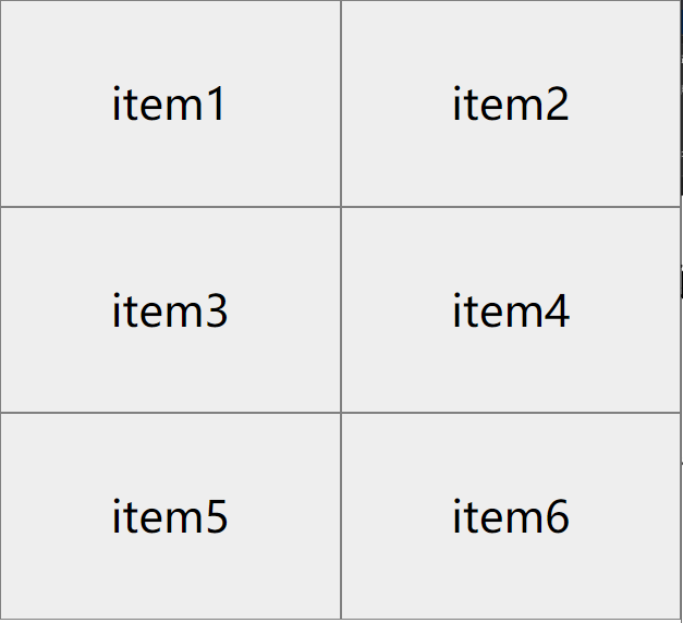
grid-row-start: 1 Which start from the line?
grid-row-end: 3 Which end (not included)
grid-row: 1 / span 3 Equally
Effect:
li:nth-of-type(1){
				 / * Row merge * /
				/* grid-row-start: 1;
				grid-row-end: 4; */
				grid-row: 1 / span 4;
}minmaxfunction
minmax(300px, 600px) not less than300px no greater than600px
Effect:
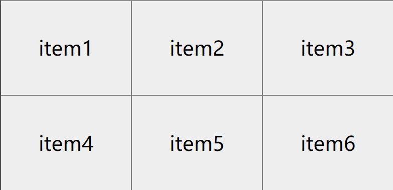
<!DOCTYPE html>
<html>
	<head>
		<meta charset="utf-8">
		<title>Document</title>
		<style type="text/css">
			*{
				margin: 0;
				padding: 0;
				list-style: none;
			}
			ul{
				display: grid;
				 / * minmax function * /
				grid-template-columns: repeat(auto-fit,minmax(200px,1fr));
			}
			li{
				background-color: #eee;
				border: 1px solid gray;
				font-size: 2rem;
				text-align: center;
				line-height: 150px;
			}
		</style>
	</head>
	<body>
		<ul>
			<li>item1</li>
			<li>item2</li>
			<li>item3</li>
			<li>item4</li>
			<li>item5</li>
			<li>item6</li>
		</ul>
	</body>
</html>
Custom Grid Template
grid-template-areas: Template style
grid-area: Select template
Effect:
<!DOCTYPE html>
<html>
<head>
<meta charset="utf-8">
<Title> Network Template </ Title>
<style type="text/css">
*{
margin: 0;
padding: 0;
list-style: none;
}
.wrap{
display: grid;
grid-template-areas: 'header header header'
'info info info'
'shi1 shi2 shi3'
'footer footer footer';
grid-gap: 1rem;
}
header,.info,article,footer{
box-shadow:0 0 3px gray;
padding: 2rem;
text-align: center;
}
header{
grid-area: header;
}
.info{
grid-area: info;
}
.shi1{
grid-area: shi1;
}
.shi2{
grid-area: shi2;
}
.shi3{
grid-area: shi3;
}
footer{
grid-area: footer;
}
</style>
</head>
<body>
<div class="wrap">
<header>
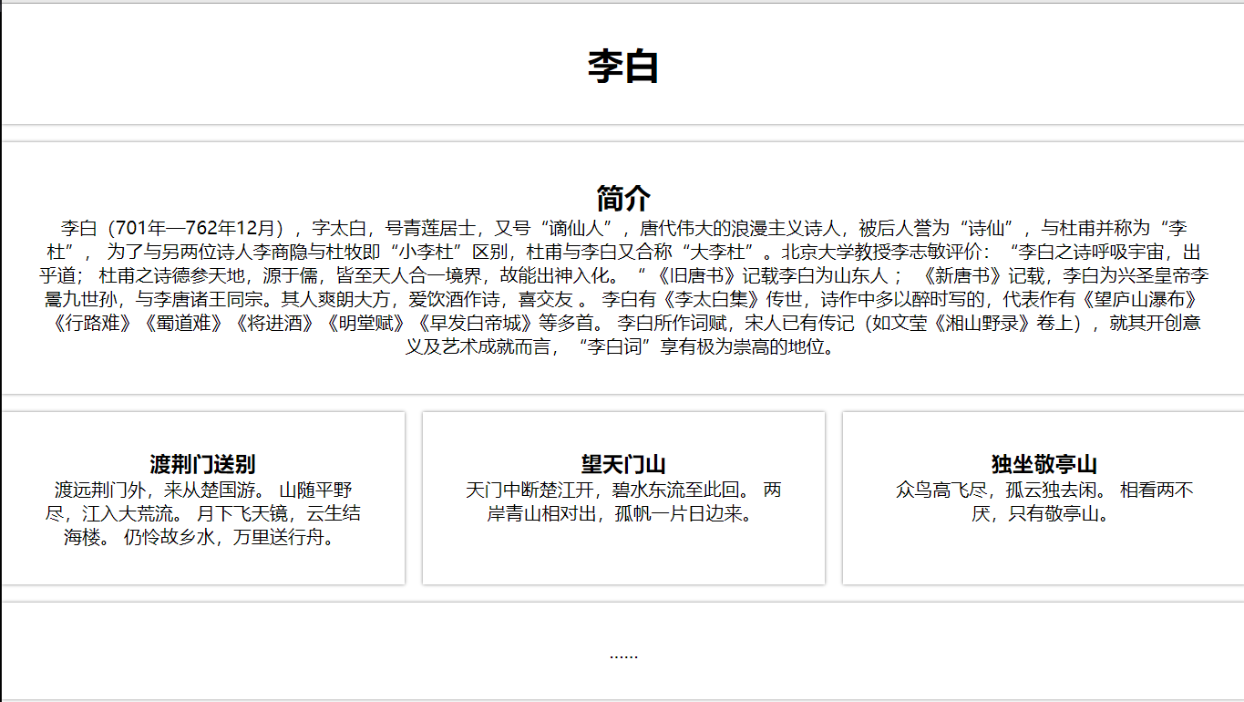
<h1> Li Bai </ h1>
</header>
<div class="info">
<H2> Introduction </ h2>
<p> Li Bai (701 - December 762), the word is too white, the number of Qinglianju, " ", the great romantic poet of the Tang Dynasty, is known as "Poetry", and Du Fu "Li Du",
In order to distinguish between another two poet Li Shangyin and Du Mu, "Little Li Du", Du Fu and Li Bai also called "Da Li Du". Li Zhimin, a professor of Peking University: "Li Bai's poetic breathing universe, unexpected;
Du Fu's poetic ginseng, originating from Confucianism, all in the world, so it can enter. "The Old Tang Book" records Li Bai as Shandong people;
"New Tang Book" records, Li Bai is the Xing Sheng Emperor Li Wei Jiucha Sun, and Li Tang Zhao Wang Tong. Its people are so late, love to drink, good, happy friends.
Li Bai has "Li Tai Bai Ji" to hand down, poetry is written in the past, and the representative is "Wang Yushan Waterfall" "road road is difficult" " " "will enter the wine" "Ming Tang" "Ming Tang Fu" Wait a lot.
Li Bai's words, Song people have already passed (such as Wen Ying "Xiangshan Nods" volume), in terms of its innovation and artistic achievements, "Li Bai" has an extremely lofty position. </ p>
</div>
<article class="shi1">
<h3> </ h3>
<p>
Dai Yuan Jingmen came from Chu State.
The mountains are in the wild, and the rivers will enter the big wildflow.
The moon is flying, Yun Sheng Jihai Building.
Still pity hometown water, Wanli sent a boat.
</p>
</article>
<article class="shi2">
<h3> Wang Tianmen Mountain </ h3>
<p>
Tianmen interrupted Chu Jiang opened, clear water to this back.
The two sides of the green hills are relatively, and there is a sunken day.
</p>
</article>
<article class="shi3">
<h3> Sitting in Jingting Mountain </ h3>
<p>
The birds are flying high, and the lonely is idle.
Seeing two doing never tired, only Jingting Mountain.
</p>
</article>
<footer>
<p>……</p>
</footer>
</div>
</body>
</html>
Media query
@media
Realize response
<!DOCTYPE html>
<html>
<head>
<meta charset="utf-8">
<title> Grid Layout Response </ Title>
<style type="text/css">
*{
margin: 0;
padding: 0;
list-style: none;
}
.wrap{
display: grid;
grid-template-columns: repeat(4,auto);
grid-gap: 1rem;
}
.item{
height: 200px;
}
@media screen and (min-width:765px) and (max-width:1200px) {
.wrap{
display: grid;
grid-template-columns: repeat(3,auto);
grid-gap: 1rem;
}
}
@media screen and (min-width:500px) and (max-width:768px) {
.wrap{
display: grid;
grid-template-columns: repeat(2,auto);
grid-gap: 1rem;
}
}
@media screen and (max-width:500px) {
.wrap{
display: grid;
grid-template-columns:1fr;
grid-gap: 1rem;
}
}
</style>
</head>
<body>
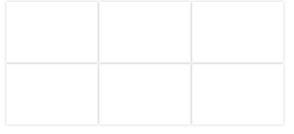
<div class="wrap">
<div class="item" style="background-color:gold;"></div>
<div class="item" style="background-color:pink;"></div>
<div class="item" style="background-color:greenyellow;"></div>
<div class="item" style="background-color:skyblue;"></div>
<div class="item" style="background-color:hotpink;"></div>
<div class="item" style="background-color:yellowgreen;"></div>
<div class="item" style="background-color:lightblue;"></div>
<div class="item" style="background-color:lightgray;"></div>
</div>
</body>
</html>
Intelligent Recommendation
Display: Basic use of Grid grid layout
New features of CSS -grid layout We declare on the elementdisplay:gridCome to create a grid container. Once we do this, all direct sub -elements of this element will become grid elements. It divides e...

Grid layout (grid layout)
Grid layout (Grid) is a layout scheme in CSS. It divides the web page into grids, and can combine different grids arbitrarily to make various layouts. Previously, the effect that could only be achieve...
Grid layout - grid layout
content First, what is Grid layout Second, the container property value 2.1 Grid-Template-Rows and Grid-Template-Columns 2.1.1 grid-template-columns 2.1.2 grid-template-rows 2.2 Row-Grap and Colu...
[Layout] GRID grid layout
GRID layout Basic knowledge and browser support As of April 2022, most browsers provide native support for CSS Grid, and there is no need to add browser prefixes. The Internet Explorer 10 and 11 also ...
More Recommendation
display properties and flex grid layout
DisplayAttribute table Flex layout Flex is the abbreviation of Flexible Box, which means "flexible layout" and is used to provide maximum flexibility for box models. The contai...
Introduction to display: grid layout in CSS3
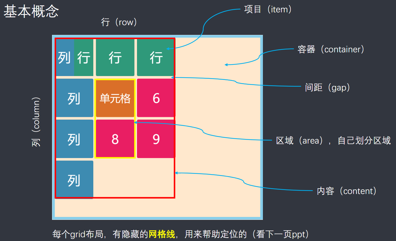
1. Grid layout (grid): It divides the webpage into grids, and can combine different grids to make a variety of layouts; 2. Basic concepts: Containers and items, as shown in the figure: Content is the ...

Grid grid layout (1)
Grid grid layout (1) The layout we have learned What are the layouts we have been learning all along? Table table layout Float float and position positioning layout, with the characteristics of the el...

Grid layout grid
Article directory Grid layout grid 1 Introduction 2. grid grid layout 2.1 Grid Container 2.2 Grid track Row and column settings Fr unit repeat() Implicit grid and explicit grid Track size and minmax()...
CSS Grid grid layout
CSS Grid is a powerful web 2D layout tool that can be laid out in rows and columns; Grid container By settingdisplayAttribute isgridorinline-gridTo create a grid container; display: grid The default l...