Bootstrap CSS -1: Grid System
1. Definition
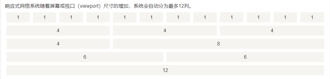
Bootstrap includes a responsive, mobile device-first, and non-fixed grid system, which can be appropriately expanded as the device or viewport size increases 12 Column. It contains predefined classes for simple layout options, as well as powerful hybrid classes for generating more semantic layouts.
2. Working principle
The grid system creates a page layout through a series of rows and columns containing content. Here is how the Bootstrap grid system works:
- Line must be placed in.containerWithin class, In order to obtain proper alignment and padding.
- Use rows to create horizontal groups of columns.
- Content should be placed in columns, and only columns can be direct children of rows.
- Predefined grid class, such as.row with .col-xs-4, Can be used to quickly create grid layouts. The LESS hybrid class can be used for more semantic layouts.
- Columns use padding to create gaps between column contents. The inner margin is passed.rowsThe margin above is negative, indicating the row offset between the first column and the last column.
- The grid system is created by specifying the twelve available columns that you want to span. For example, to create three equal columns, use three.col-xs-4。
Three, grid options
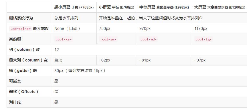
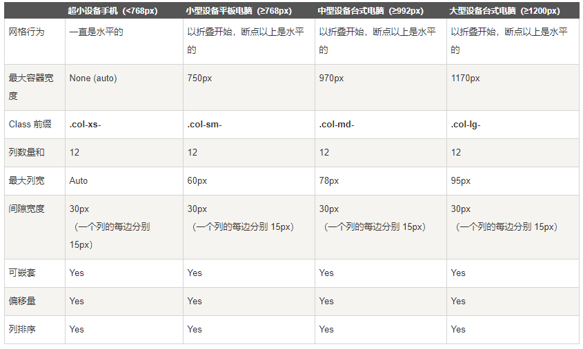
col-xs- (followed by numbers 1-12, the columns of each row must meet the requirement to add up to 12): ultra-small device (mobile phone)
col-sm-: small device (tablet)
col-md-: medium equipment (medium desktop computer)
col-lg-: large equipment (large desktop computer)
<div class="col-xs-6 col-sm-3" >Indicates that two devices are set up, xs and sm</div>
Fourth, the basic grid structure
<div class="container"> --container first
       <div class="row"> --First define a row, and then sort it out
             <div class="col-*-*"></div>--The first column
             <div class="col-*-*"></div>--The second column. . .
   </div>
       <div class="row">...</div> --- second line
</div>
<div class="container">....
Five, responsive column overlap
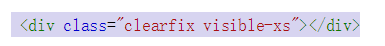
The meaning of this sentence is to clear the float. It can be seen on the phone, but the effect of the float is not clear
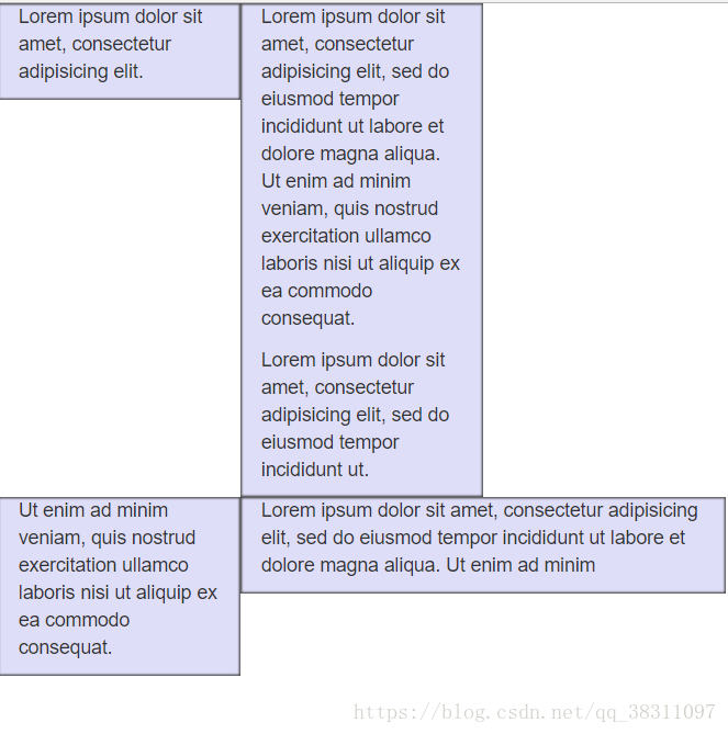
Six, nested columns
In order to nest the default grid in the content, please add a new.row, And in an existing.col-md-*Add a group to the column.col-md-*Column. The nested row should contain a set of columns, and the number of columns in this set cannot exceed 12 (in fact, there is no requirement that you must occupy 12 columns).
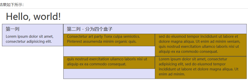
<div class="container">
<div class="row">
</div> <div class="col-md-4">First column</div>
<div class="col-md-8">Second column-divided into four boxes
<div class=“row”>
,,,,,,,,. . . . . (Continue to divide into two columns)
</div>
<div class=“row”>
,,,,,,, ... . . . (Continue to divide into the next two columns)
</div>
</div>
</div>
</div>
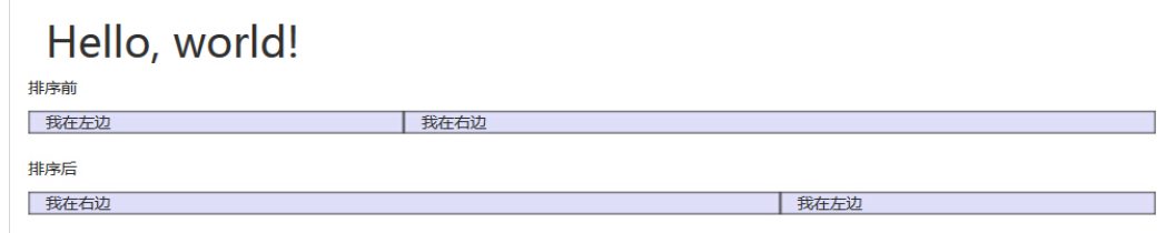
Seven, column sort
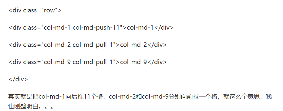
Eight, column offset


From the effectoffset andpush has the same effect, In fact, the method adopted is different,offset is the effect of offsetting the column directly on the left,Push is the effect of moving through position movement
Intelligent Recommendation

Bootstrap Note 1-Grid system layout
1. Introduction to the grid system 1. Responsive design 2. The principle of grid implementation 3. Media inquiry Second, the basic usage of grid layout 1. Layout container 2. Column combination 3. Col...
Bootstrap study notes series 1-------Bootstrap grid system
table of Contents Bootstrap Grid System Study Notes Simple grid Offset column Nested column Column sort Bootstrap Grid System Study Notes Simple grid First explain the code and then explain CSS and JS...
Bootstrap grid system (Grid System)
The grid system creates a page layout through a series of rows and columns that contain content. Here is how the Bootstrap grid system works: Line must be placed in.containerIn the class, in order to ...
[Bootstrap Getting Started] [Global CSS Style-Grid System]
[Bootstrap Getting Started] [Global CSS Style-Grid System] Label (space separated): Uncategorized Bootstrap provides a responsive, mobile device-first streaming fence system. As the screen or viewport...
Bootstrap Custom Grid Grid System
Bootstrap Custom Grid Grid System Media query Media query is very chic "Conditional CSS Rules". It is only applicable to some CSSs based on certain specified conditions. If those conditions ...
More Recommendation
[Bootstrap] (2) Bootstrap Grid System
Article Directory What is Bootstrap Grid System? The working principle of Bootstrap Grid System Grid options Responsive column reset Offset column Nested column Column sort What is the Bootstrap Grid ...

Grid system Bootstrap
Grid system self-study The grid system creates a page layout through a series of rows and columns that contain content. Here's how the Bootstrap grid system works: Rows must be placed inside the .cont...
Bootstrap grid system (2)
Media inquiry Media queries are very chic "conditional CSS rules." It only applies to some CSS based on certain specified conditions. If those conditions are met, the corresponding style is ...