Bootstrap grid system (2)
Media inquiry
Media queries are very chic "conditional CSS rules." It only applies to some CSS based on certain specified conditions. If those conditions are met, the corresponding style is applied.
Media queries in Bootstrap allow you to move, show, and hide content based on viewport size.
The following media queries are used in the LESS file to create key breakpoint thresholds in the Bootstrap grid system.
/* Ultra small device (mobile phone, less than 768px) */
 /* Bootstrap has no media queries by default */

 /* Small device (tablet, starting from 768px) */
@media (min-width: @screen-sm-min) { ... }

 /* Medium-sized equipment (desktop computer, starting from 992px) */
@media (min-width: @screen-md-min) { ... }

 /* Large equipment (large desktop computer, starting from 1200px) */
@media (min-width: @screen-lg-min) { ... }
We also sometimes include max-width in the media query code.
limits the impact of CSS to a smaller screen size.
@media (max-width: @screen-xs-max) { ... }
@media (min-width: @screen-sm-min) and (max-width: @screen-sm-max) { ... }
@media (min-width: @screen-md-min) and (max-width: @screen-md-max) { ... }
@media (min-width: @screen-lg-min) { ... }
There are two parts to the media query, first a device specification and then a size rule.
In the above case, the following rules were set:
Let's take a look at the following line of code:
@media (min-width: @screen-sm-min) and (max-width: @screen-sm-max) { ... }
For all devices with min-width: @screen-sm-min, if the width of the screen is less than @screen-sm-max, some processing is done.
responsive column reset;
can be solved using the .clearfix class and the responsive utility, as shown in the example below
<div class="container">
    <div class="row" >
        <div class="col-xs-6 col-sm-3"
            style="background-color: #dedef8;
            box-shadow: inset 1px -1px 1px #444, inset -1px 1px 1px #444;">
            <p>Lorem ipsum dolor sit amet, consectetur adipisicing elit.</p>
        </div>
        <div class="col-xs-6 col-sm-3"
        style="background-color: #dedef8;box-shadow:
        inset 1px -1px 1px #444, inset -1px 1px 1px #444;">
            <p>Lorem ipsum dolor sit amet, consectetur adipisicing elit, sed do
            eiusmod tempor incididunt ut labore et dolore magna aliqua. Ut
            enim ad minim veniam, quis nostrud exercitation ullamco laboris
            nisi ut aliquip ex ea commodo consequat.
            </p>
            <p>Lorem ipsum dolor sit amet, consectetur adipisicing elit, sed do
            eiusmod tempor incididunt ut.
            </p>
        </div>

        <div class="clearfix visible-xs"></div>

        <div class="col-xs-6 col-sm-3"
        style="background-color: #dedef8;
        box-shadow:inset 1px -1px 1px #444, inset -1px 1px 1px #444;">
            <p>Ut enim ad minim veniam, quis nostrud exercitation ullamco
            laboris nisi ut aliquip ex ea commodo consequat.
            </p>
        </div>
        <div class="col-xs-6 col-sm-3"
        style="background-color: #dedef8;box-shadow:
        inset 1px -1px 1px #444, inset -1px 1px 1px #444;">
            <p>Lorem ipsum dolor sit amet, consectetur adipisicing elit, sed do
            eiusmod tempor incididunt ut labore et dolore magna aliqua. Ut
            enim ad minim
            </p>
        </div>
    </div>
</div>
Offset column
The offset is a useful feature for more professional layouts. They can be used to make more space for the columns. For example, the .col-xs-* class does not support offsets, but they can do so simply by using an empty cell.
To use offsets on large screen displays, use the .col-md-offset-* class. These classes increase the left margin of a column by * columns, where * ranges from 1 to 11.
In the example below, we have
Instance
<div class="container">
    <h1>Hello, world!</h1>
    <div class="row" >
        <div class="col-md-6 col-md-offset-3"
        style="background-color: #dedef8;box-shadow:
        inset 1px -1px 1px #444, inset -1px 1px 1px #444;">
            <p>Lorem ipsum dolor sit amet, consectetur adipisicing
            elit.
            </p>
        </div>
    </div>
</div>
Nested column
To nest the default grid in the content, add a new .row and add a set of .col-md to an existing .col-md-* column. -* column. Nested rows should contain a set of columns. The number of columns in this group cannot exceed 12 (in fact, you are not required to fill 12 columns).
In the example below, the layout has two columns, and the second column is divided into two rows of four boxes.
Instance
<div class="container">
    <h1>Hello, world!</h1>
    <div class="row">
        <div class="col-md-3" style="background-color: #dedef8;box-shadow: inset 1px -1px 1px #444, inset -1px 1px 1px #444;">
                         <h4>First column</h4>
            <p>
                Lorem ipsum dolor sit amet, consectetur adipisicing elit.
            </p>
        </div>
        <div class="col-md-9" style="background-color: #dedef8;box-shadow: inset 1px -1px 1px #444, inset -1px 1px 1px #444;">
                         <h4>Second column - divided into four boxes</h4>
            <div class="row">
                <div class="col-md-6" style="background-color: #B18904; box-shadow: inset 1px -1px 1px #444, inset -1px 1px 1px #444;">
                    <p>
                        Consectetur art party Tonx culpa semiotics. Pinterest
        assumenda minim organic quis.
                    </p>
                </div>
                <div class="col-md-6" style="background-color: #B18904; box-shadow: inset 1px -1px 1px #444, inset -1px 1px 1px #444;">
                    <p>
                         sed do eiusmod tempor incididunt ut labore et dolore magna
        aliqua. Ut enim ad minim veniam, quis nostrud exercitation
        ullamco laboris nisi ut aliquip ex ea commodo consequat.
                    </p>
                </div>
            </div>
            <div class="row">
                <div class="col-md-6" style="background-color: #B18904; box-shadow: inset 1px -1px 1px #444, inset -1px 1px 1px #444;">
                    <p>
                        quis nostrud exercitation ullamco laboris nisi ut
        aliquip ex ea commodo consequat.
                    </p>
                </div>
                <div class="col-md-6" style="background-color: #B18904; box-shadow: inset 1px -1px 1px #444, inset -1px 1px 1px #444;">
                    <p>
                        Lorem ipsum dolor sit amet, consectetur adipisicing elit,
        sed do eiusmod tempor incididunt ut labore et dolore magna
        aliqua. Ut enim ad minim.
                    </p>
                </div>
            </div>
        </div>
    </div>
</div>
Column sort
Another perfect feature of the Bootstrap grid system is that you can easily write columns in one order and then display the columns in another order.
You can easily change the order of the built-in grid columns with the .col-md-push-* and .col-md-pull-* classes, where * ranges from 1 to 11.
In the example below, we have a two-column layout with a narrow left column as a sidebar. We will use the .col-md-push-* and .col-md-pull-* classes to interchange the order of the two columns.
Instance
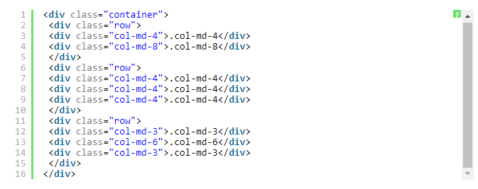
<div class="container">
    <h1>Hello, world!</h1>
    <div class="row">
        <p>
                         Before sorting
        </p>
        <div class="col-md-4" style="background-color: #dedef8; box-shadow: inset 1px -1px 1px #444, inset -1px 1px 1px #444;">
                   I am on the left
        </div>
        <div class="col-md-8" style="background-color: #dedef8; box-shadow: inset 1px -1px 1px #444, inset -1px 1px 1px #444;">
                   I am on the right
        </div>
    </div>
    <br>
    <div class="row">
        <p>
                         After sorting
        </p>
        <div class="col-md-4 col-md-push-8" style="background-color: #dedef8; box-shadow: inset 1px -1px 1px #444, inset -1px 1px 1px #444;">
                   I am on the left
        </div>
        <div class="col-md-8 col-md-pull-4" style="background-color: #dedef8; box-shadow: inset 1px -1px 1px #444, inset -1px 1px 1px #444;">
                   I am on the right
        </div>
    </div>
</div>
Intelligent Recommendation

Grid system Bootstrap
Grid system self-study The grid system creates a page layout through a series of rows and columns that contain content. Here's how the Bootstrap grid system works: Rows must be placed inside the .cont...

Bootstrap - Grid System Instance
One: grid layout Explanation: Each row in the grid is composed of 12 units, you can use these units to define the size of the column, that is, to ensure that the sum of the columns is 12. Bootstrap In...
(4) Bootstrap grid system
Bootstrap layout knowledge point Bootstrap layout container Bootstrap grid system Layout container Container Columns and rows are divided into 12 columns by default in bootstrap. If the split column i...
More Recommendation
Bootstrap grid system (layout)
Basic usage The grid system is used for layout, which is actually a combination of columns. There are four basic uses in the Bootstrap framework's grid system. Since the Bootstrap framework uses diffe...

The principle of the grid system in bootstrap
1, the basic structure Bootstrap adopts a 12-column grid system, which is segmented according to the size of mainstream devices. Each segment has a fixed width, and a responsive layout is achieved by ...

bootstrap grid system review
Bootstrap provides a responsive, mobile device priority streaming grid system, with the increase of the screen or viewport (the viewport) size, the system will automatically be divided into a maximum ...
Learn Bootstrap - Grid system
Response page layout: Page i.e., the same set of devices compatible with different resolutions. Bootstrap implementation-dependent response to a grid system layout, the line 12 divided into a grid, th...
Bootstrap grid system and typesetting
Bootstrap provides a responsive, mobile device priority streaming grid system, with the increase of the screen or viewport (the viewport) size, the system will automatically be divided into a maximum ...