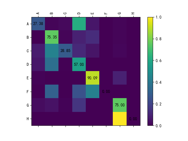
Python confusion matrix visualization (heat map)
tags: Visualization
code show as below:
import numpy as np
import matplotlib.pyplot as plt
from matplotlib.ticker import MultipleLocator

plt.rcParams['font.sans-serif'] = ['SimHei'] # Used to display Chinese labels normally
 plt.rcParams['axes.unicode_minus'] = False # Used to display the negative sign normally


def plotCM(classes, matrix, savname):
    """classes: a list of class names"""

    # Normalize by row
    matrix = matrix.astype(np.float)
    linesum = matrix.sum(1)
    linesum = np.dot(linesum.reshape(-1, 1), np.ones((1, matrix.shape[1])))
    matrix /= linesum

    # plot
    plt.switch_backend('agg')
    fig = plt.figure()

    ax = fig.add_subplot(111)
    cax = ax.matshow(matrix)
    fig.colorbar(cax)

    ax.xaxis.set_major_locator(MultipleLocator(1))
    ax.yaxis.set_major_locator(MultipleLocator(1))

    for i in range(matrix.shape[0]):
        ax.text(i, i, str('%.2f' % (matrix[i, i] * 100)), va='center', ha='center')

    ax.set_xticklabels([''] + classes, rotation=90)
    ax.set_yticklabels([''] + classes)

    # save
    plt.savefig(savname)


if __name__ == '__main__':
    classes = ["A", "B", "C", "D", "E", "F", "G", "H"]

    matrix = np.array([[23, 1, 2, 52, 5, 0, 1, 0],
                       [0, 107, 2, 13, 18, 0, 2, 0],
                       [4, 23, 15, 6, 3, 0, 1, 0],
                       [12, 73, 1, 114, 0, 0, 0, 0],
                       [1, 0, 0, 0, 100, 0, 10, 0],
                       [0, 5, 0, 4, 7, 0, 0, 0],
                       [7, 10, 2, 31, 0, 0, 150, 0],
                       [0, 0, 0, 0, 0, 0, 5, 0]]
                     )
    savename = "test.png"

    plotCM(classes, matrix, savename)
The result chart is as follows:
Intelligent Recommendation
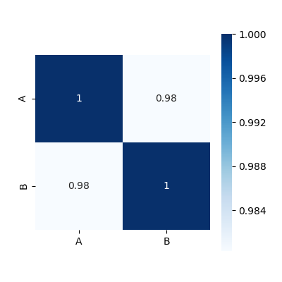
Python correlation coefficient matrix heat map (2)
The above picture is implemented by the following code Simultaneously df The internal data is: A B 0 0.180270 0.019475 1 0.463219 0.724934 2 0.420204 0.485427 Since I set a random number seed, your da...
Confusion matrix and its visualization
Confusion Matrix is used in machine learningSummarize the prediction results of the classification modelAn analysis table of is a commonly used expression in the field of pattern recognition. It dep...

Quant visualization-----Heat map
I was deeply impressed after listening to Nividia's technology on visual computing. If you can present a transaction or data in a graphical way, you can give the most direct feeling. The amount of dat...
More Recommendation

Heat map of data visualization
Reposted from the originalHeat map of data visualization I recently took a look at Baidu'sHeat mapThrough Baidu Maps, it is indeed an image expression form of real-time big data rendering. I just take...
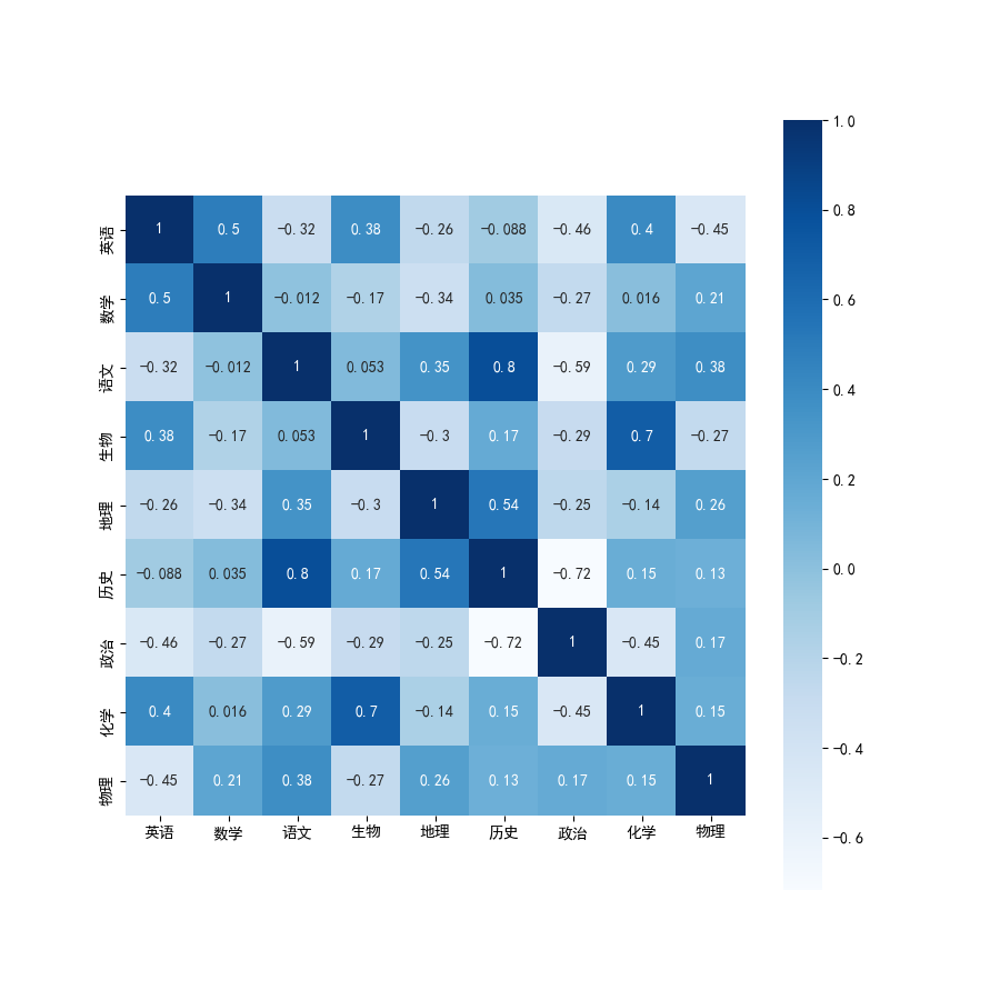
Python draw heat map (correlation coefficient matrix map)
The method of displaying a two-dimensional matrix including a matrix diagram of correlation coefficients in the form of a heat map, currently found two: The first is to use the functions of the pandas...

Python visualization: advanced use of Seaborn library heat map
Foreword In daily work, you can often see all kinds of exquisite heat maps. The heat maps are widely used. Let's learn how to use heat maps in Python's Seaborn library. The environment for this run is...

Python visualization advanced --- seaborn1.9 timeline chart, heat map tsplot () / heatmap ()
Timeline charts, heat maps tsplot() / heatmap() 1. Timeline chart-tsplot () Example 1: Example 2: Example 3: 2. Heatmap-heatmap () Example 1: Example 2: Setting parameters Example 3: Drawing a half-ed...
Python is based on PyeCharts custom latitude and longitude heat map visualization
background In the analysis of business data statistical analysis, the analysis of the provinces and regions will be basically involved. Data visualization is a tool for data analysis. The data of thes...