matplotlib draws multiple subgraphs and confusion matrix heat map drawing
Code: Draw multiple subgraphsMain return value
ax.flat After searching for a long time, I don’t know what it means, so let’s write it down herefig, ax = plt.subplots(4, 6)
for i, axi in enumerate(ax.flat):
axi.imshow(Xtest[i].reshape(62, 47), cmap='bone')
axi.set(xticks=[], yticks=[])
axi.set_ylabel(faces.target_names[yfit[i]].split()[-1],
color='black' if yfit[i] == ytest[i] else 'red')
fig.suptitle('Predicted Names; Incorrect Labels in Red', size=14);
plt.show()Finally, to draw a picture, you must plt.show, imshow only processes the matrix and does not make a picture
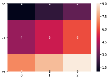
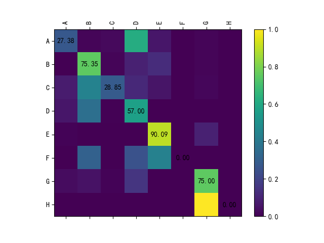
2. Confusion matrix heat map drawing:
from sklearn.metrics import confusion_matrix
import seaborn as sns;
mat = confusion_matrix(ytest, yfit)
sns.heatmap(mat.T, square=True, annot=True, fmt='d', cbar=False,
            xticklabels=faces.target_names,
            yticklabels=faces.target_names)
plt.ylabel('predicted label');
effect:

Intelligent Recommendation

MATPLOTLIB draws multiple subgraphs to add a label; share an X-axis
Note: If you add a legend, if you usefig.legend(handles, labels, loc='upper center') This statement will cause the legend to be unable to be placed outside the picture.plt.legend()Option can be....

Python Matplotlib draws the confusion matrix and color matching
Articles directory Step 1: Save the results of the network test results Step 2: matrix drawing Confusion matrix drawing results Step 1: Save the results of the network test results Taking pytorch as a...

Use heat map to draw confusion matrix
Use the heat map to draw the confusion matrix, and use the cmap parameter to set the heat map to the larger the value, the darker the color, which can help us clearly see the prediction effect of each...
More Recommendation
Python confusion matrix visualization [heat map]
Python confusion matrix visualization [heat map] Dependent package Compared method 1 Method 2 Method 3 discuss Color mapping Dependent package seaborn with matplotlib Many drawing methods have been pr...
Python confusion matrix visualization (heat map)
code show as below: The result chart is as follows:...