Python visualization advanced --- seaborn1.9 timeline chart, heat map tsplot () / heatmap ()
tags: python visualization seaborn python drawing Heat map Timeline diagram
Timeline charts, heat maps
tsplot() / heatmap()
1. Timeline chart-tsplot ()
Example 1:
import numpy as np
import pandas as pd
import matplotlib.pyplot as plt
import seaborn as sns

 #Set style, scale
sns.set_style('darkgrid')
sns.set_context('paper')

 #No warning
import warnings
warnings.filterwarnings('ignore')

x = np.linspace(0, 15, 31)
data = np.sin(x) + np.random.rand(10,31) + np.random.randn(10,1)
print(data.shape)
print(pd.DataFrame(data).head())

sns.tsplot(data = data,
                       err_style = 'ci_band', #Error data style, optional: ci_band, ci_bars, boot_traces,
           #boot_kde, unit_traces, unit_points
                       interpolate = True, #Set connection
                       ci = [40, 70, 90], #set error interval
                       color = 'g' #Set the color
           )
Example 2:
sns.tsplot(data = data, err_style = 'boot_traces',
                       n_boot = 300 #number of iterations
           )
Example 3:
#parameter settings
 #Import Data
gammas = sns.load_dataset('gammas')
print(gammas.head())
 print ('The amount of data is:% i'% len (gammas))
 print (The amount of data when 'timepoint is 0.0 is:% i  '% len (gammas [gammas ['timepoint'] == 0]))
 #View only specific information
 print ('timepoint has% i unique values'% len (gammas ['timepoint']. value_counts ()))

 sns.tsplot (time = 'timepoint', #time data, x-axis
                       value = 'BOLD signal', #yaxis value
                       unit = 'subject', #split, default parameter
                       condition = 'ROI', #classification
           data = gammas
           )
2. Heatmap-heatmap ()
Example 1:
df = pd.DataFrame(np.random.rand(10,12))
sns.heatmap (df, #load data
vmin = 0, vmax = 1 #Set the maximum and minimum values of the legend
)
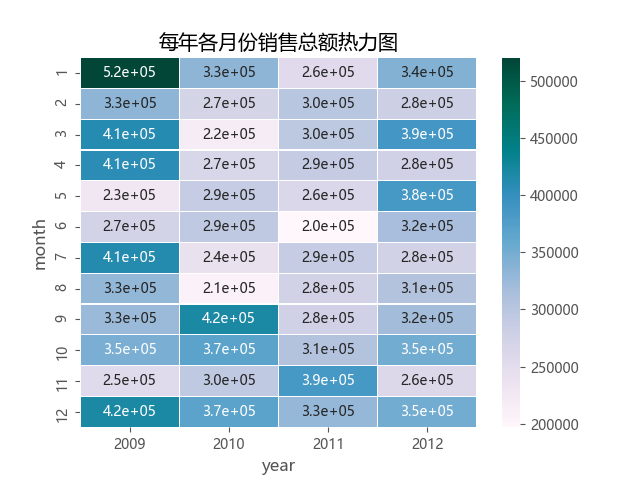
Example 2: Setting parameters
#Setting parameters
 #Download Data
flights = sns.load_dataset('flights')
flights = flights.pivot('month','year','passengers')
print(flights.head())

sns.heatmap(flights,
                         annot = True, #Whether to display the value
                         fmt = 'd', #format string
                         linewidth = 0, #Grid side line width
                         center = 100, #The color center value of the color palette, if not specified, cmap is the main
                         cmap = 'Reds', #set palette
                         cbar = True, # Whether to display the legend ribbon
                         #bar_kws = ['orientaion': 'horizaintal'], #Whether to display the legend ribbon horizontally
                         #square = True #Whether the square displays the chart
            )
Example 3: Drawing a half-edge heat map
#Set style
sns.set(style = 'white')
 #Create data
rs = np.random.RandomState(33)
d = pd.DataFrame(rs.normal(size = (100, 26)))
 corr = d.corr () #Solve the correlation matrix table
 #Set an ‘upper triangle’ mask
mask = np.zeros_like(corr, dtype = np.bool)
mask[np.triu_indices_from(mask)] = True
 #Set the palette
cmap = sns.diverging_palette(220, 10, as_cmap = True)
 #Generate half-edge heatmap
sns.heatmap(corr, mask = mask, cmap = cmap, vmax = .3, center = 0,
            square = True, linewidths = 0.2)
Intelligent Recommendation

One, python visualization-heat map
Heat map 1. Use the heat map to see the similarity of multiple features in the data table. Refer to the official API parameters and address: seaborn.heatmap(data, vmin=None, vmax=None,cmap=None, cente...
Python data visualization: Matplotlib histogram, box plot, bar chart, heat map, line chart, scatter plot. . .
Original link: https://blog.csdn.net/kevinelstri/article/details/52938604 Introduction Using Python for data analysis, data visualization is the best way to display data analysis results.Analytic Vidh...

Python data analysis (Numpy data visualization: contour map, heat map, pie chart)
Article Directory Write in front: 1. Contour map 2. Heat map Three, pie chart Write in front: import numpy as np import matplotlib.pylab as mp Therefore, np in the article stands for numpy library, mp...
[Pyecharts | heatmap] Solve the heat zone mixed into a bunch in the GEO-Heatmap chart
Foreword Do you have encountered the following situation when doing geo-heatmap: Both the thermogram area are connected to a large piece, want to passVisualMapofmin_withmax_The parameter is adjusted, ...

Python data visualization: Matplotlib Heatmap heat map, correlation coefficient matrix diagram (put into the self-written library, one line of code to get complicated detailed drawing)
This is a self-written library series, that is, a summary of the pits that the author has stepped on on the road of data visualization, and customize functions and input parameters to ach...
More Recommendation
Visualization library seaborn: swarmplot, tsplot, PairGrid, violinplot, barplot, boxplot, palplot, `Facetgrid, catplot, heatmap
1 Layout & style settings: set_style() sns.set()Use seaborn's default parameter/style combinations; seaborn's 5 theme styles are as follows: Common drawing methods sns.set_style("dark") ...

"Python Data Visualization" uses Pyecharts to make HeatMap (thermal map)
Article catalog Introduction HeatmaP: thermal map Demo Introduction This article introducesPython3 of Pyecharts MakeHeatmap (thermogram) Setting parameters and common template cases required to use, c...
Seaborn confusing matrix painting heat map heatmap heatmap
Annot: True indicator injection data on a small grid...
Python data visualization example-heatmap (heatmap)
(Visualization of relational data) Heat mapReflects the combined relationship between two discrete variables Heat map, Sometimes calledCross fill table. The most typical usage of this graphic isRealiz...
Heatmap heat map 3D application based on HTML5
Heatmap heat maps are gathered into intuitive visual color effects through numerous data points. Heat maps have been widely used in weather forecasting, medical imaging, computer room temperature moni...