Python draw heat map (correlation coefficient matrix map)
tags: python Correlation coefficient matrix Heat map Two-dimensional array
The method of displaying a two-dimensional matrix including a matrix diagram of correlation coefficients in the form of a heat map, currently found two:
The first is to use the functions of the pandas package, but the visual inspection of the pandas package cannot display the numbers?
If you want to try it, you can refer to https://zhuanlan.zhihu.com/p/26100511
So I studied the second method, which is to draw with seaborn package.
Reference
https://blog.csdn.net/a19990412/article/details/79304944
https://blog.csdn.net/sunchengquan/article/details/78573244
https://blog.csdn.net/weixin_39541558/article/details/79813936
Wait for the article, the parameters in sns.heatmap below can refer to the article in the first link. Can alsosns.heatmap?Inquire.
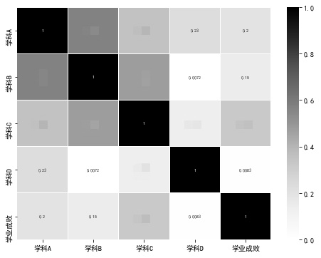
In the following sns.heatmap, annot means that we want to display the numbers in the array, because we want to display the numbers, so it is round. If you want to represent the correlation matrix, it is recommended to multiply by 10, round, then you will get -10 to 10 The figures between, look better. You can set the maximum and minimum values of the numbers in the array, or you can use the center=0 setting, depending on your understanding of the numbers in the array. If you need to display xticklabels and yticklabels, you need to set the parameter to True. The meaning of square is that each cell is a square, otherwise it is a matrix, and then finally cmap is the color of the graph. You can use the one below, as well as "Blues" and so on. You can also set the line width of which cells are divided, etc., you can query through sns.heatmap?.
import seaborn as sns
import numpy as np
import pandas as pd
a = np.random.rand(4,3)
fig, ax = plt.subplots(figsize = (9,9))
#The heat map of the two-dimensional array, if the tick labels of the horizontal axis and the number axis should be added, you can convert the array into a column
 The DataFrame of # and index are directly drawn and generated, and can be added later. If you add it later, it is more flexible, including setting the size direction of labels.
sns.heatmap(pd.DataFrame(np.round(a,2), columns = ['a', 'b', 'c'], index = range(1,5)),
                annot=True, vmax=1,vmin = 0, xticklabels= True, yticklabels= True, square=True, cmap="YlGnBu")
#sns.heatmap(np.round(a,2), annot=True, vmax=1,vmin = 0, xticklabels= True, yticklabels= True,
#            square=True, cmap="YlGnBu")
 ax.set_title('Two-dimensional array heat map', fontsize = 18)
 ax.set_ylabel('number', fontsize = 18)
 ax.set_xlabel(' Letter', fontsize = 18) #The horizontal direction becomes the y-axis, which is the same as the original layout of the matrix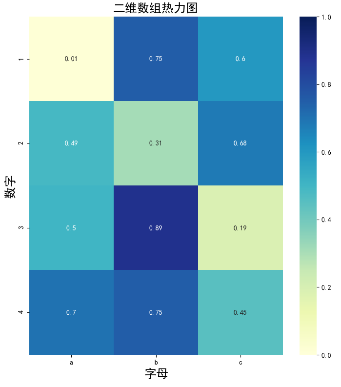
ax.set_yticklabels(['One','Two','Three'], fontsize = 18, rotation = 360, horizontalalignment='right')
ax.set_xticklabels(['a', 'b', 'c'], fontsize = 18, horizontalalignment='right')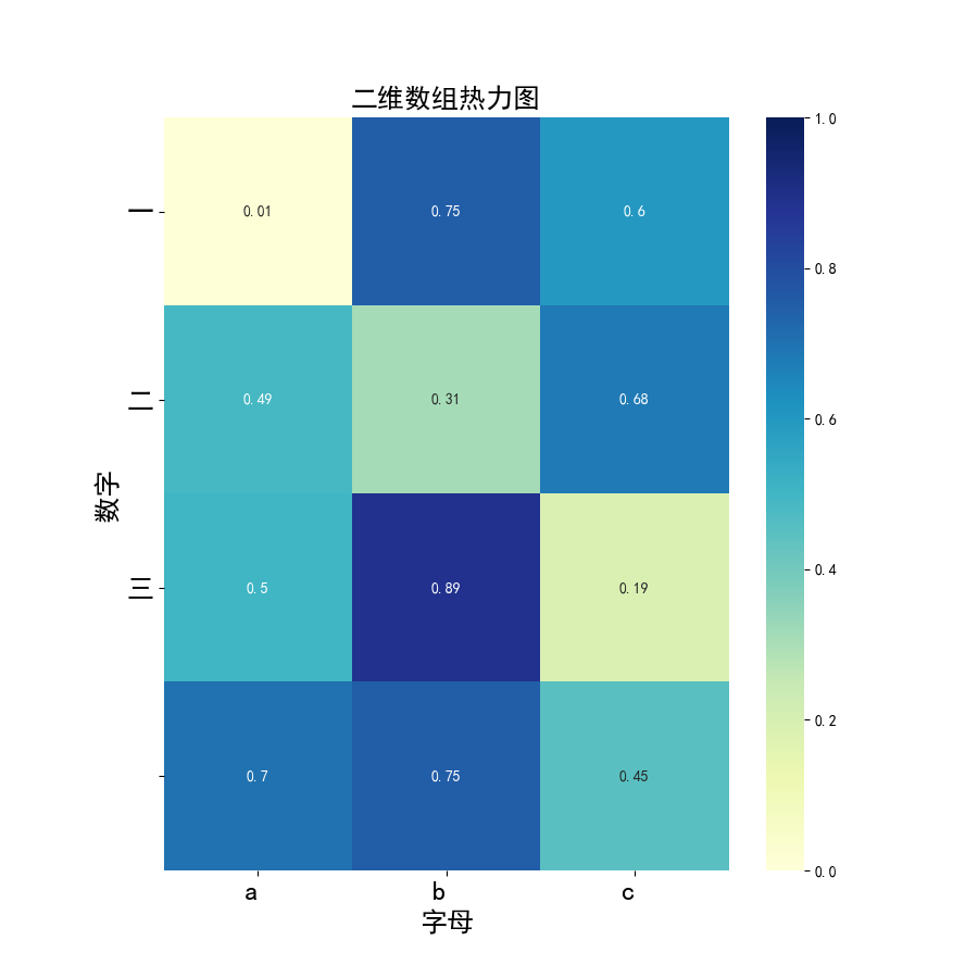
After the article is published, it cannot be modified anymore, which is really annoying.
Intelligent Recommendation
python draw heat map
Foreword Work, the boss requires some data is displayed, it is possible to continue a more intuitive view for comparison of the different thermodynamic data in the form of FIG. View the major online b...
Matlab+python heat map presentation: Pearson (Pearson) correlation coefficient and MATLAB implementation
Function according to formula Calculate coefficients based on functions Use python's seaborn to draw the heat map The number here is the Pearson correlation coefficient Reference link: https://blog.cs...

45_pandas.dataFrame calculates the correlation coefficient between each column and visualize the heat map
45_pandas.dataFrame calculates the correlation coefficient between each column and visualize the heat map Use the CORR () method to calculate the correlation coefficients between the columns in Pandas...

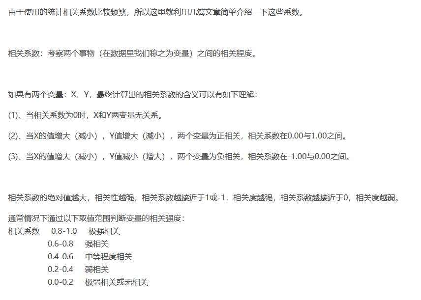
Python practice three major correlation coefficients in statistics and draw a heat map of correlation analysis
In the previous blog, I simply used the scipy module to perform the three correlation analysis methods in statistics (Pearson correlation coefficient, Spearman correlation coefficient, Kendall correla...

Python data visualization: Matplotlib Heatmap heat map, correlation coefficient matrix diagram (put into the self-written library, one line of code to get complicated detailed drawing)
This is a self-written library series, that is, a summary of the pits that the author has stepped on on the road of data visualization, and customize functions and input parameters to ach...
More Recommendation
Using python to draw heat map
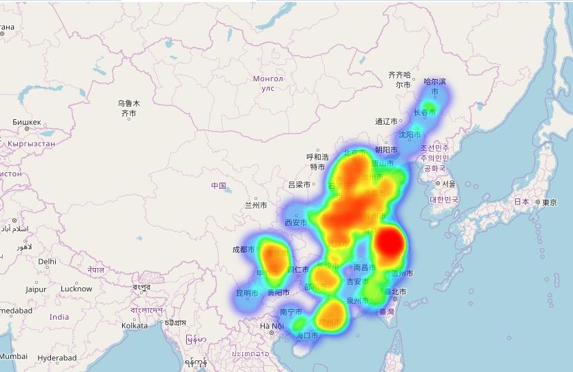
The original Great God blog: http://blog.csdn.net/ouening/article/details/78882094 import numpy as np import pandas as pd import folium import webbrowser from folium.plugins import HeatMap posi=pd.rea...

Use Python to draw the heat map
1 data preparation Definition A = (AIJ) is the subway OD matrix. The meta AIJ in the matrix is defined as the number of cards from I to J station in this period. After entering the station, the pass...

Variable correlation heat map
In order to avoid multicollinearity, we usually analyze the correlation between variables when modeling. To measure the correlation of variables, we generally calculate the Pearson correlation coeffic...
Python correlation analysis and heat map visualization
Correlation analysis can find the degree of correlation between different variables. This article takes python as an example to realize it. 1. Correlation matrix 2. Visual display of heat map...