2019 Unicorn Enterprise Heavy Glour Recruitment Python Engineer Standard >>> 
As we all know, there are many front-ends similar to Bootstrap, Foundation, which provides its own set of response layout schemes, namely grid systems. Those who have used them know that as long as the elements of the page are added to the class name specified by their raster system, they can reach the response layout effect you want to achieve, simple and elegant. The author has a long time, I don't understand what the grid system is based on what kind of principle, and I analyze the source code of the mainstream framework. I found that it is not complicated, even I can achieve a very simple grid system.
First, bootstrap
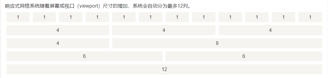
BootstrapThe raster system is used to create a page layout through a series of rows (ROW) and columns (col- *), and its raster system is divided into 12 copies:
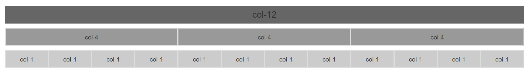
<div class="container">
	<div class="row">
		<div class="col-md-12">col-12</div>
	</div>
	<div class="row">
		<div class="col-md-4">col-4</div>
		<div class="col-md-4">col-4</div>
		<div class="col-md-4">col-4</div>
	</div>
	...
</div>
However, the [email protected] version is different from the @ 4.0 version of the raster system mode:
1. [email protected] Version In order to be compatible with IE8, it is a floating mode to implement the grid system:
[class |= col] { float: left; }
.col-md-1 { width: 8.33333333%; }
.col-md-2 { width: 16.66666667%; }
.col-md-3 { width: 25%; }
.col-md-4 { width: 33.33333333%; }
.col-md-5 { width: 41.66666667%; }
.col-md-6 { width: 50%; }
.col-md-7 { width: 58.33333333%; }
.col-md-8 { width: 66.66666667%; }
.col-md-9 { width: 75%; }
.col-md-10 { width: 83.33333333%; }
.col-md-11 { width: 91.66666667%; }
.col-md-12 { width: 100%; }
That is, a grid of each row is plated with left floating and percentage. When the window width changes, the width of the Container container is changed, and the corresponding grid width naturally follows:
@media (min-width: 768px) {
  .container {
    width: 750px;
  }
}
@media (min-width: 992px) {
  .container {
    width: 970px;
  }
}
@media (min-width: 1200px) {
  .container {
    width: 1170px;
  }
}
2. [email protected] version gives up the support for version IE, the raster system uses the latest telescopic layout:
.row {
	display: flex;
	flex-wrap: wrap;
}
.col-1 { flex: 0 0 8.333333%; }
.col-2 { flex: 0 0 16.666667%; }
.col-3 { flex: 0 0 25%; }
.col-4 { flex: 0 0 33.333333%; }
.col-5 { flex: 0 0 41.666667%; }
.col-6 { flex: 0 0 50%; }
.col-7 { flex: 0 0 58.333333%; }
.col-8 { flex: 0 0 66.666667%; }
.col-9 { flex: 0 0 75%; }
.col-10 { flex: 0 0 83.333333%; }
.col-11 { flex: 0 0 91.666667%; }
.col-12 { flex: 0 0 100%; }
The grid system can determine the typesetting sequence of each grid, and the two grid systems are different. Naturally they have different types of mode:
/*
 * [email protected] version typography
 */
[class |= col] {
	position: relative;
}
 / * Move the number of raster numbers to right * /
.col-md-pull-1 { right: 8.33333333%; }
.col-md-pull-2 { right: 16.66666667%; }
.col-md-pull-3 { right: 25%; }
...
 / * Move the number of grids to left * /
.col-md-push-1 { left: 8.33333333%; }
.col-md-push-2 { left: 16.66666667%; }
.col-md-push-3 { left: 25%; }
...

/*
   * [email protected] version typography
 */
.order-1 { order: 1; }
.order-2 { order: 2; }
.order-3 { order: 3; }
...
It can be seen that the @ 3.0 version uses the relative positioning to move the raster for typography. Of course, these two versions have the same typesetting, that is, OFFSET offset:
/ * [email protected] version offset * /
.col-md-offset-1 { margin-left: 8.33333333%; }
.col-md-offset-2 { margin-left: 16.66666667%; }
.col-md-offset-3 { margin-left: 25%; }
...

 / * [email protected] version offset * /
.offset-1 { margin-left: 8.33333333%; }
.offset-2 { margin-left: 16.66666667%; }
.offset-3 { margin-left: 25%; }
...
Both use margin-left to perform offset settings.
Second, PURE
Pure's grid system is another way to implement, it supports the raster of the maximum 24th parties:
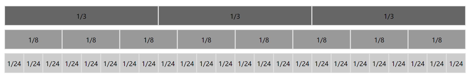
<div class="pure-g">
	<div class="pure-u-1-3">1/3</div>
	<div class="pure-u-1-3">1/3</div>
	<div class="pure-u-1-3">1/3</div>
</div>
<div class="pure-g">
	<div class="pure-u-1-8">1/8</div>
	<div class="pure-u-1-8">1/8</div>
	<div class="pure-u-1-8">1/8</div>
	...
</div>
<div class="pure-g">
	<div class="pure-u-1-24">1/24</div>
	<div class="pure-u-1-24">1/24</div>
	<div class="pure-u-1-24">1/24</div>
	...
</div>
Pure Its grid system uses a combination of telescopic and intra.
.pure-g {
        display: -webkit-box;
        display: -webkit-flex;
        display: -ms-flexbox;
        display: flex;
	    flex-flow: row wrap;
}
[class|=pure-u] {
	display: inline-block;
	*display: inline;	/*iE < 8*/
	zoom: 1;
}
.pure-u-1-24 { width: 4.1667%; }
.pure-u-2-24,.pure-u-1-12 { width: 8.3333%; }
.pure-u-3-24,.pure-u-1-8 { width: 12.5000%; }
.pure-u-4-24,.pure-u-1-6 { width: 16.6667%; }
.pure-u-5-24 { width: 20.8333%; }
...
However, it does not support the offset and specified sequence of layouts.
Third, FOUNDATION
The grid system principle of Fundation is actually the same as the [email protected] version, which is the way to use the telescopic layout, the maximum support of the 12th partial grid:
.grid-x {
  display: -webkit-box;
  display: -webkit-flex;
  display: -ms-flexbox;
  display: flex;
  -webkit-box-orient: horizontal;
  -webkit-box-direction: normal;
  -webkit-flex-flow: row wrap;
      -ms-flex-flow: row wrap;
          flex-flow: row wrap;
}

.grid-x > .small-1 { width: 8.33333%; }
.grid-x > .small-2 { width: 16.66667%; }
.grid-x > .small-3 { width: 25%; }
...
.grid-x > .small-12 { width: 100%; }
Fourth, summary
The UI frame grid system implementation is basically three:
1. Pure telescopic layout flex mode: This method is not very good to the ancient IE browser support, so there is usually on the radical frame of technology, such as Bootstrap @ 4.0, Foundation, React-based AntSign, Vue-based Elementui etc.
2. Floating mode: This way is to be compatible with the IE low version browser, such as a wide range of [email protected] versions.
3. Method of bonded in telescopic and in-line: Yahoo's Pure.