In-depth analysis of the fourth chapter of CSS grid system-reading notes
4.5 Grid System
- The reusability of code can be improved with the help of grid system
- The grid system provides a series of class names that can be added to the markup to structure a part of the web page into rows and columns. It should only set the width and positioning of the container, and not provide visual styles such as colors and borders to the web page.
- Most popular CSS frameworks include their own grid system. Their implementation details are different, but the design ideas are the same: place one or more column containers in a row container. The class of the column container determines the width of each column.
4.5.1 Understanding the grid system
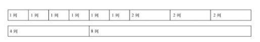
- Usually each row of a grid system is divided into a specific number of columns, usually 12, but other numbers are also possible.
- 12 is chosen as the number of columns because it can be divisible by 2, 3, 4, 6, and the combination is flexible enough
- Grid system
Each row has a row container div (column-n: n is the number of columns in the grid)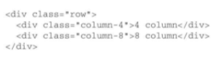
4.5.2 Build a grid system
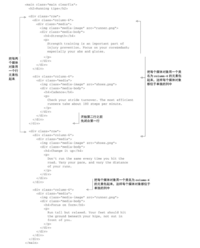
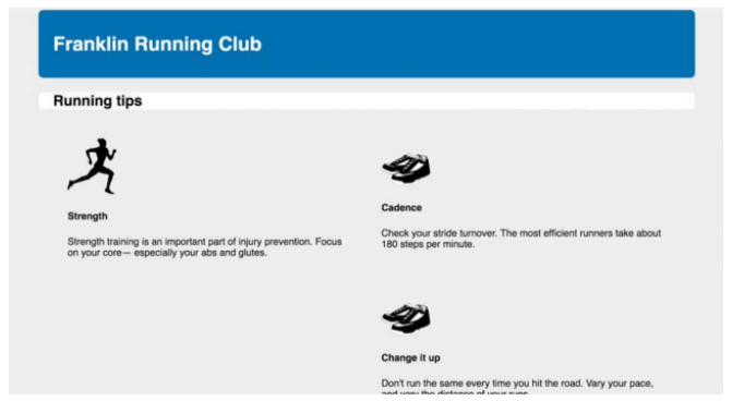
- Use the grid system to transform the previous page
- CSS for grid rows
The above code only achieves clear floats. This is to avoid adding a row element every time it is addedclearfixclass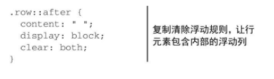
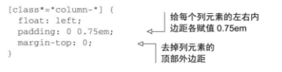
- CSS for grid columns
*=The comparison operator can match any value that contains the specified string. For example, in this example, it can match the element where column- appears anywhere in the class attribute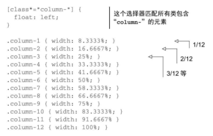
Current page:
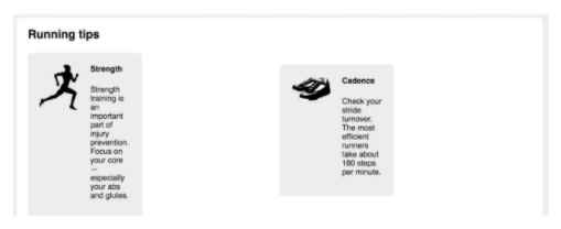
It does not seem to be an ideal effect, because the media objects repeatedly implement some styles of the grid system.
Now simplify the style of the media object. Remove the left float, because the grid system already contains this rule. Remove the width so that it can fill 100% of the width of the container. Remove the margins and the nth-child selector used to clear the float.
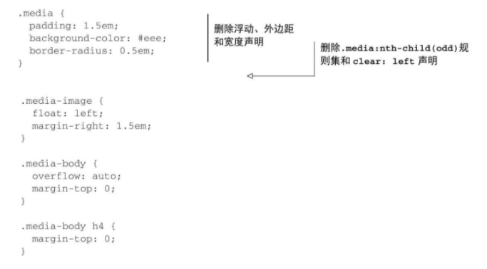
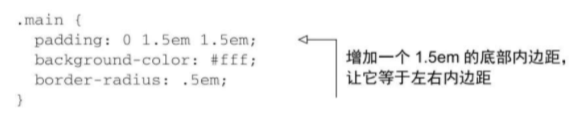
Because all the margins of the media object are deleted, including the bottom margin, the space between the media object in the last row and the bottom of the container is lost. Add bottom padding to the container to restore the spacing
4.5.3 Add interval
- Add space between each column
However, this code caused a slight misalignment of the contents of the grid columns and grid rows
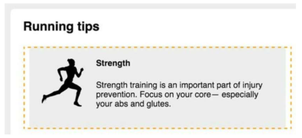
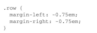
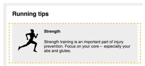
Add a left margin of −0.75em to the row element, and stretch the left side of the row element to the outside of the container. The inner margin of the column element will push the content inside by 0.75em to the right, and the first column will be left aligned with the page title (as shown in Figure 4-21.). Similarly, add a negative right margin to the row elements to stretch the right side.
Complete style
Intelligent Recommendation
In-depth analysis of the unexpected "floating trap" in Chapter 4 of CSS-reading notes
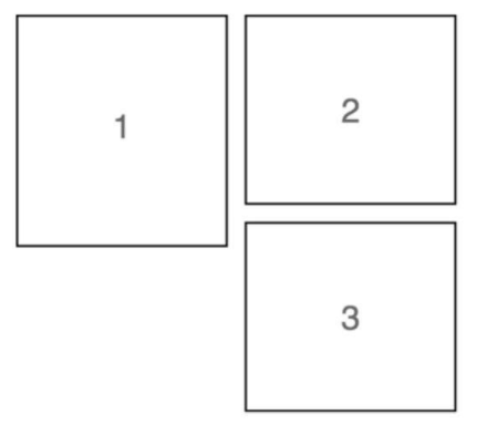
4.3 Unexpected "floating trap" The third box appeared on the right, causing a very large blank space under the first box. This is because the browser will place the floating element as high ...
In-depth analysis of CSS Chapter 5 Flexbox principles-reading notes
5.1 Principles of Flexbox Add to the elementdisplay:flex, The element becomes aFlexible container(Flex container), its direct child element becomesElastic sub-element(flex item) The height of the elas...
In-depth analysis of CSS Chapter 2 custom attributes-reading notes
Custom attributes Declare a variable, assign a value to it, and then refer to this value elsewhere in the style sheet, which can reduce duplication in the style sheet example: Define a custom attribut...
In-depth analysis of the first chapter of CSS inheritance-reading notes
If an attribute of an element does not have a cascading value, it may inherit the value of an ancestor element Properties that can be inherited Text-related attributes color, font, font-family, font-s...
In-depth analysis CSS second chapter stop pixel thinking - reading notes
2.3 Stop pixel thinking Inverse mode: global reset font-size is 10px (from the default font size 16px to 10px, easy to calculate the value of the REM) Disadvantages: Need to write a lot of repetition ...
More Recommendation
In-depth analysis of CSS Chapter 1 laminated - reading notes
Box model and border-box When specifying the width or height of an element, the size of the element content is set - any inner margin (padding), border, the outer distance (margin) is superimposed bas...

css grid depth analysis
Since the beginning of last year, six months, tutorials CSS Grid layout on the overwhelming on the Internet, it can be described as massive. It is for the Web in terms of layout, the layout will be pe...

C-depth analysis of reading the first chapter notes
Chapter One 1. The difference between declarations and definitions Statement multiple times, only once defined, allocated memory is defined at the same time. 2.static Modifying variables: Static globa...
In-depth analysis of the original design intention of CSS Chapter 4 floating-reading notes
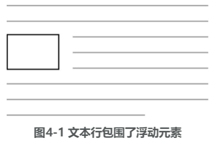
4.1 The original intention of floating design Floating can pull an element (usually an image) to the side of the container so that the document flow can surround it. If multiple elements float to the ...
In-depth analysis of CSS Chapter 4 container folding and clearing floating-reading notes
4.2.1 Understanding container folding Floating the four media boxes to the left, you can see that the white background that should have appeared at the bottom of the four media boxes only appears unde...