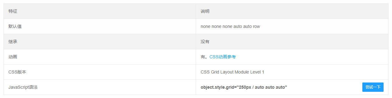
CSS: GRID grid layout common attribute
1. Specify the container to use the grid layout:display: grid
2, specify that the container is set to within the line element and use the grid layout:display: inline-grid
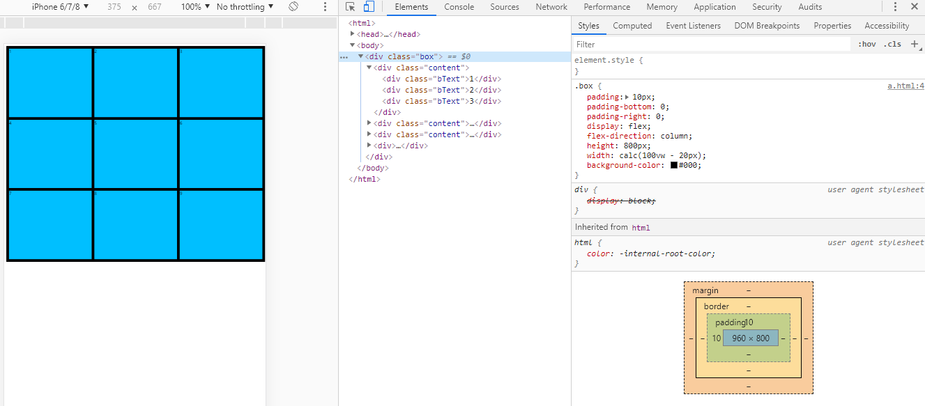
3, define the column width of each column:grid-template-columns
4, define the row of each line:grid-template-row
5, repeat assignment:REPEAT (number of times, value)
6, automatic fill: such as:repeat(auto-fill,30px)
7, proportion:fr(like grid-template-columns: 1fr 2fr;It means that the container is divided into 2 columns, and the width of the second column is 2 times that of the column)
8, the length range:minmax()
9. Automatically populate the remaining space (without setting the minimum minimum value):auto
10, the grid line name, the same line can have multiple names:grid-template-columns: [c1] 100px [c2] 100px [c3] auto [c4];
11, line spacing:grid-row-gap
12, column spacing:grid-column-gap
13, spacing:Grid-GAP: Row Potential Value Column Ports ValueThe line spacing and column pitch values can only write a value
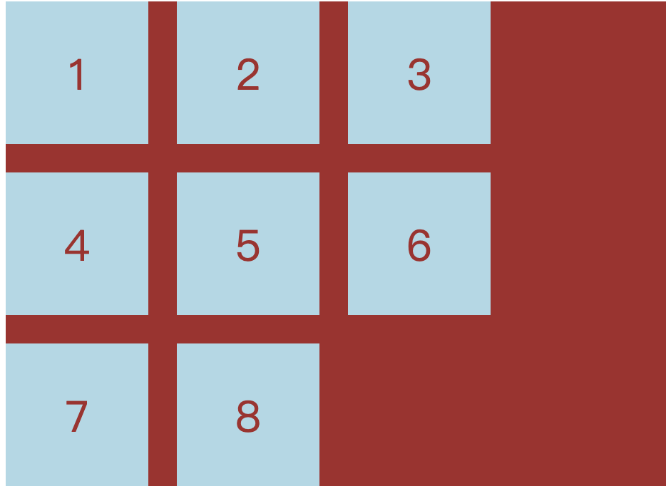
14. Regions: b to H correspond to seven regions..Indicates that the first area is not used; H represents two regions combined; the starting grid line of each area is automatically namedArea name -startTerminate the grid line automatically namedArea name -END;
grid-template-areas: '. b c'
                     'd e f'
                     'g h h';
15, filling order:grid-auto-flowBy default isrow, First fill the first line and then fill in a line;columnThe first column is filled in the second column first;row denseandcolumn denseIndicates that it is not filled with no blank
16, horizontal position, vertical position of cell content; defaultstretchMusic, filling the entire cell
justify-items: start | end | center | stretch;/*horizontal position*/
align-items: start | end | center | stretch;/ * Vertical position * /
place-items: 'horizontal position' 'Vertical position';/ * The parameter can only write only one value * /
17. Content block in the horizontal position, vertical position of the grid container; defaultstretchMusic, filling the entire cell
justify-content: start | end | center | stretch | space-around | space-between | space-evenly;
align-content: start | end | center | stretch | space-around | space-between | space-evenly;
place-content:'horizontal position' 'Vertical position';/ * The parameter can only write only one value * /
space-around  :  The interval between the cells is equal to twice the interval between the cell and the container border.
space-between :  Unit interval, etc., there is no interval between cells and container borders.
space-evenly  :  The cell interval and cells are equal to the interval between the container borders, etc.
18. Specify the unit properties outside the project:grid-auto-columns ,grid-auto-rows
19, merging attribute
grid-template: grid-template-columns grid-template-rows  grid-template-areas
grid: grid-template-rows grid-template-columns grid-template-areas  grid-auto-rows grid-auto-columns grid-auto-flow
20. The project is positioned according to the grid line.z-index
grid-column-start:2;
grid-column-end:3;
/ * Is equivalent to * /
grid-column:2 / 3

grid-row-start:4;
grid-row-end :5;
/ * Is equivalent to * /
grid-row: 4 / 5
21. Which area is specified?grid-area: a; grid-area: <row-start> / <column-start> / <row-end> / <column-end>;
22. Set the horizontal, vertical position of the cell content, only acting on a single item
justify-self: start | end | center | stretch;
align-self: start | end | center | stretch;
justify-self: start | end | center | stretch;
Intelligent Recommendation
css series-grid grid layout
Introduction to grid #Glossary CSS Grid Layout (Grid Layout) is the most powerful layout system in CSS. This is a two-dimensional system, which means it can process columns and rows at the same time. ...
CSS grid realizes grid layout
Article Directory 1 Overview 2 grid 3 details 1 Overview I have been writing a web page recently and encountered a grid layout problem, so I would like to share it with you. 2 grid Mainly used in cssd...
CSS Grid implements grid layout
Learning website:http://www.ruanyifeng.com/blog/2019/03/grid-layout-tutorial.html Detailed examples:https://www.sohu.com/a/115465158_488157 grid attribute The grid attribute is an abbreviation of the ...
A taste of CSS Grid grid layout
Technology comes from life and serves life address:api.imibi.cn:8080 Simple Grid CSS style effects index.html...
CSS Grid layout: grid area
In the previous section, I learned about the columns and spacing in the CSS Grid layout, but did not mention the grid area. So far, grid items have been placed in separate cells, but we should break t...
More Recommendation
CSS Grid grid layout (detailed)
display: gridSpecify a container to use a grid layout. By default, container elements are all block-level elements, but they can also be set as inline elements. The picture above isdisplay: inline-gri...
CSS display: grid grid layout
Main attributes: grid-template-columns: //Arrange vertically grid-template-rows: //Horizontal arrangement The Grid layout is similar to the Flex layout, and both can specify the position of multiple i...
CSS Grid Grid Layout Tutorial
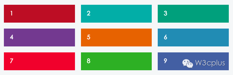
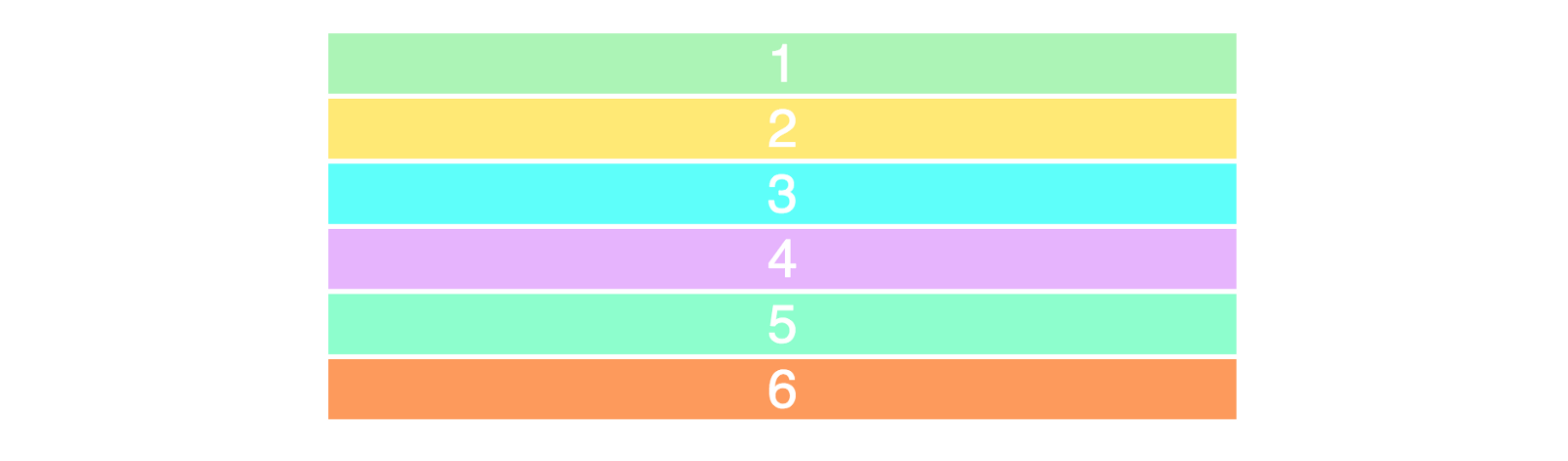
Two core elements of the CSS grid are wrapper (parent) and projects (child). The packaging is the actual grid, and the project is the content in the grid. This is the tag of the wrapper containing six...
Wonderful Grid, CSS grid layout
The Grid layout is really powerful, because the most use of the Flex layout in your project, resulting in less use of Grid. I will summarize the Grid when I am idle. Because fewer use of themselves ar...
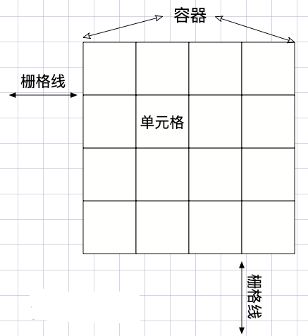
CSS GRID grid layout Note
CSS GRID grid layout I. Overview Basic concept 2.1 container and project 2.2 Line and column 2.3 cells 2.4 grid line Third, container attributes 3.1 Display attribute 3.2 Grid-Template-Columns and Gri...