----------- information display assembly of components flutter material widget
tags: flutter material widgets Information Display Components
----------- information display assembly of components flutter material widget
widget divided into two categories:widgets libraryAnd the standard widgetMaterial Components libraryDedicated widget; any application can use widgets library in the widget, but the application can use only Material Material Components library. Which Card, ListTitle Material Components is a library of components.
Image Icon Chip Tooltip
Image: a widget to display pictures,
is usually acquired image network with Image.network (String src, {}),
is loaded with the local image Image.asset (String name, {})
Image.file get image file from a file (File file, {})
unit8list image acquired from Image.memory (Uint8List bytes, {})
Icon:a Material Design icon.
Chip: tag, a Material widget. It can be a complex content displayed in a small entity, as Contacts
Tooltip: a text tool tips, help explain a button or other user interface, when the widget is pressed for a long time (when a user takes other appropriate action) displays a prompt tag
- Constructor
    Image({
        Key key,
        @required this.image,// Image object picture
        this.semanticLabel,// Standard Room semantic
        this.excludeFromSemantics = false,// display control semantic label, if it is true, will be ignored if semantiicLabel
        this.width, // Image Width
        this.height,// High Picture
        this.color,// picture color
        this.colorBlendMode,// color mixing mode
        this.fit,
        this.alignment = Alignment.center,// middle way
        this.repeat = ImageRepeat.noRepeat,// whether to repeat tile pictures
        this.centerSlice,//
        this.matchTextDirection = false,// whether to draw pictures according to the text direction
        this.gaplessPlayback = false,// if true, or display the original image is updated, or does not display anything
        this.filterQuality = FilterQuality.low,// filter quality
    })
     Image.asset(
        String name, // local name of the picture
        {
            Key key,
            AssetBundle bundle,
            this.semanticLabel,
            this.excludeFromSemantics = false,
            double scale,
            this.width,
            this.height,
            this.color,
            this.colorBlendMode,
            this.fit,
            this.alignment = Alignment.center,
            this.repeat = ImageRepeat.noRepeat,
            this.centerSlice,
            this.matchTextDirection = false,
            this.gaplessPlayback = false,
            String package,
            this.filterQuality = FilterQuality.low,
        }
    ),
    Image.network(
        String src, // url path network image
        {
            Key key,
            double scale = 1.0,//scaling ratio
            this.semanticLabel,
            this.excludeFromSemantics = false,// display control semantic label, if it is true, will be ignored if semantiicLabel
            this.width,
            this.height,
            this.color,
            this.colorBlendMode,
            this.fit,// fashion picture adaptation of the container, the equivalent backgrou-iamge-size css in, there BoxFit.fill, contain, cover the equivalent
            this.alignment = Alignment.center,
            this.repeat = ImageRepeat.noRepeat,
            this.centerSlice,// central slice? ?
            this.matchTextDirection = false,
            this.gaplessPlayback = false,
            this.filterQuality = FilterQuality.low,
            Map<String, String> headers,
        }
    )
    Icon(
        this.icon, // icons to be displayed
        {
            Key key,
            this.size,// icon size
            this.color,// color of the icon
            this.semanticLabel,// semantic tags
            this.textDirection,// text direction
        }
    )
    Chip({
        Key key,
        this.avatar,// usually the head, like the picture information on this widget in
        @required this.label,//label
        this.labelStyle,// label style
        this.labelPadding,// label within the margins
        this.deleteIcon,When onDeleted // callback function is set, add this icon
        this.onDeleted,// callback function, the callback when clicking deleteIcon
        this.deleteIconColor,// deleteIcon colors
        this.deleteButtonTooltipMessage,// Long press the delete button in the message
        this.shape,//shape
        this.clipBehavior = Clip.none,// splicing
        this.backgroundColor,// background color
        this.padding,// padding
        this.materialTapTargetSize,// materials match the target size
    })
    Tooltip({
        Key key,
        @required this.message, // Long press the tip box contents
        this.height = 32.0,// This message box is high
        this.padding = const EdgeInsets.symmetric(horizontal: 16.0),// padding prompt box
        this.verticalOffset = 24.0,// vertical offset distance is small balloon member
        this.preferBelow = true,// if the default prompt is displayed in the widget below
        this.excludeFromSemantics = false,// if the message is discharged from the semantic tree
        this.child,// press the widget
    })
- Application Examples
import 'package:flutter/material.dart';

void main()=>runApp(MyApp());

class MyApp extends StatelessWidget {
  @override
  Widget build(BuildContext context) {
    return MaterialApp(
      title: 'Flutter Demo',
      home:Scaffold(
        appBar: AppBar(
          title: Text("data"),
        ),
        body: Center(
          child: Column(
            children: <Widget>[
              new Image.network(
                'http://pic.baike.soso.com/p/20130828/20130828161137-1346445960.jpg',
                // scaling ratio
                scale: 6.0,
              ),
              new Image.asset("assets/images/2.jpg"),
              Icon(
                Icons.ac_unit,
                color: Colors.blue,// color of the icon
                size: 30,// icon size
                semanticLabel: "Icon demo",// semantic label, did not seem to use the eggs? ?
                textDirection: TextDirection.ltr,// text direction

              ),
              Chip(
                // usually the head, like the picture information on this widget in
                avatar:  CircleAvatar(
                  backgroundColor: Colors.grey.shade800,
                  child: Text('AB'),
                ),
                label: Text('chip label'),//label
                labelStyle: TextStyle(color: Colors.red),// label style
                deleteIcon: Icon(Icons.add),When onDeleted // callback function is set, add this icon
                onDeleted: (){
                  print("ondeleted..............");
                },// callback function, the callback when clicking deleteIcon
                deleteIconColor: Colors.green,// deleteIcon colors
                deleteButtonTooltipMessage: "aaaa",// Long press the delete button in the message
                backgroundColor: Colors.greenAccent,// background color
              ),

              Tooltip(
                message: "Message",// Long press the tip box contents
                height: 50,// This message box is high
                padding: EdgeInsets.all(12),// padding prompt box
                verticalOffset:60,// offset balloon 60 downward vertical offset distance here widget
                preferBelow: true,// if the default prompt is displayed in the widget below
                excludeFromSemantics: true,// if the message is discharged from the semantic tree
                child: Text("data"),// press the widget
              ),

            ],
          ),
        ),
      ),
    );
  }
}
DataTable
Data table shows the original data set. They usually appear in the desktop business product. DataTable Widget achieve this component
- Constructor
    DataTable({
        Key key,
        @required this.columns,// each column configuration
        this.sortColumnIndex,// sort key columns
        this.sortAscending = true,// have to sort columns, the default ascending sort
        this.onSelectAll,// callback is selected row
        @required this.rows,// each line configuration
    })

    DataColumn({
        @required this.label,// column headings
        this.tooltip,// press and the column headings tips
        this.numeric = false,// whether this column represent data
        this.onSort,When the callback function // sort by this column
    })
    DataRow({
        this.key,
        this.selected = false,// if the line is selected
        this.onSelectChanged,// callback when selected changes
        @required this.cells,// data in each cell line
    })
    DataCell(
        this.child,
        {
            this.placeholder = false,Whether the child is a placeholder //
            this.showEditIcon = false,// whether to show the edit icon
            this.onTap,// callback when clicking edit pictures
        }
    )
- Application Examples
import 'package:flutter/material.dart';

void main()=>runApp(MyApp());

class MyApp extends StatelessWidget {
  @override
  Widget build(BuildContext context) {
    return MaterialApp(
      title: 'Flutter Demo',
      home:Scaffold(
        appBar: AppBar(
          title: Text("data"),
        ),
        body: Center(
          child: Column(
            children: <Widget>[
              DataTable(
                columns: [
                  DataColumn(
                    label: Text("Name"),// column headings
                    tooltip: "name",// press and the column headings tips
                    numeric: false,// whether the digital
                    onSort: (inx,bool){
                      print("Click on a column ....."+inx.toString()+"...."+bool.toString());
                    } When the callback function // sort by this column
                  ),
                  DataColumn(
                    label: Text("age"),
                    numeric: true,
                    onSort: (inx,bool){
                      print("Click on a column ....."+inx.toString()+"...."+bool.toString());
                    }
                  ),
                  DataColumn(
                    label: Text("Occupation")
                  ),
                ],
                rows: [
                  DataRow(
                    cells: [
                      DataCell(
                        Text("John Doe")
                      ),
                      DataCell(
                        Text("15")
                      ),
                      DataCell(
                        Text("Mayor")
                      ),
                    ]
                  ),
                  DataRow(
                    cells: [
                      DataCell(
                        Text("John Doe")
                      ),
                      DataCell(
                        Text("95")
                      ),
                      DataCell(
                        Text("drummer")
                      ),
                    ]
                  ),
                  DataRow(
                    selected: true,// if the line is selected
                    // callback when selected changes
                    onSelectChanged: (val){
                      print("Row is selected ......"+val.toString());
                    },
                    cells: [
                      DataCell(
                        Text("Feifei")
                      ),
                      DataCell(
                        Text("55"),
                        placeholder: false,Whether the child is a placeholder //
                        showEditIcon: true,// whether to show the edit icon
                        onTap: (){
                          print("This column has been edited ...........");
                        }// callback when clicking edit pictures
                      ),
                      DataCell(
                        Text("Rider")
                      ),
                    ]
                  ),
                ],

              )
            ],
          ),
        ),
      ),
    );
  }
}
Card
Material Design a card. It has a rounded corners and shadow
- Constructor
 Card({
    Key key,
    this.color, // colour
    this.elevation,// z coordinate axes
    this.shape,//shape
    this.margin = const EdgeInsets.all(4.0),// Margin
    this.clipBehavior = Clip.none,// splicing
    this.child,//Subassembly
    this.semanticContainer = true,// This means if a single semantic container
  })
- Application Examples
import 'package:flutter/material.dart';
void main()=>runApp(MyApp());

class MyApp extends StatelessWidget {
  @override
  Widget build(BuildContext context) {
    return MaterialApp(
      title: 'Flutter Demo',
      home:Scaffold(
        appBar: AppBar(
          title: Text("data"),
        ),
        body: Center(
          child: Column(
            children: <Widget>[
              Card(
                // child
                child: Container(child: Text("data"),),
                // colour
                color: Colors.green,
                // Margin
                margin: EdgeInsets.all(55),
                // z-axis coordinate of the eggs with no ah
                elevation: 55,
                // shape
                shape:  Border.all(color: Colors.red),
                // Boolean, did not seem to use eggs
                semanticContainer: false,
                clipBehavior: Clip.antiAliasWithSaveLayer,

              )
            ],
          ),
        ),
      ),
    );
  }
}
LinearProgressIndicator
A linear progress bar, in addition to a circular progress bar CircularProgressIndicator
- Constructor
LinearProgressIndicator({
    Key key,
    double value, // indicator value
    Color backgroundColor,//background color
    Animation<Color> valueColor,/// animation type parameter used to set the value of the progress of the color, the default color theme, using the specified constant color
    String semanticsLabel,// semantic tags
    String semanticsValue,// semantic value
  })
  CircularProgressIndicator({
    Key key,
    double value,// indicator value
    Color backgroundColor,//background color
    Animation<Color> valueColor,// animation type parameter used to set the value of the progress of the color, the default color theme, using the specified constant color
    this.strokeWidth = 4.0,// width indicator
    String semanticsLabel,
    String semanticsValue,
  })
- Application Examples
import 'package:flutter/material.dart';
void main()=>runApp(MyApp());

class MyApp extends StatelessWidget {
  @override
  Widget build(BuildContext context) {
    return MaterialApp(
      title: 'Flutter Demo',
      home:Scaffold(
        appBar: AppBar(
          title: Text("data"),
        ),
        body: Column(
          children: <Widget>[
            LinearProgressIndicator(
              value: 0.6,// value of the progress indicator
              backgroundColor: Colors.greenAccent,// background color of the track
              semanticsLabel: "60%",
              semanticsValue: "6",
              valueColor: new AlwaysStoppedAnimation<Color>(Colors.red),// bar animation color into the map
              // valueColor: CurvedAnimation(),
            ),
            Text("Round indicator"),
            CircularProgressIndicator(
              value: 0.5,
              backgroundColor: Colors.black,// background color does not work? ?
              valueColor: new AlwaysStoppedAnimation<Color>(Colors.red)
            ),

          ],
        ),
      ),
    );
  }
}
Intelligent Recommendation

Flutter Widget display and hide
In Android we can usevisibilityTo control the display and hiding of the control, how do we control it in Flutter? In fact, there are 3 ways to control the display and hiding of Widget in Flutter: Howe...
Widget information in Flutter
Flutter Gets Widget Information FLUTTER getsWidgetInformation is givenWidgetSet oneGlobalKey,pass throughGlobalKeyObtain correspondingRenderObjectTo get the appropriate information. Get renderObject G...
----------- form component assembly of flutter widget
----------- form component assembly of flutter widget widget divided into two categories:widgets libraryAnd the standard widgetMaterial Components libraryDedicated widget; any application can use widg...
Flutter converts Widget components into images
Flutter converts Widget components into images For convenience, I have added the package into a plugin directly, and the kit can be used. Note: You need to use file read and write permissions, you nee...
More Recommendation
Get data in Flutter and display it on the widget
Obtaining data from the Internet is one of the most common operations that every developer should master. In Flutter, this operation is very simple. In this article, we will learn how to process data ...
Flutter learning widget display and hidden
Flutter learning widget display and hidden 1. VISBILITY component 2. OffStage component 3. OPACITY component 4. SIZE control through the component 5. Portal component occupation method In the developm...
----------- interactive components of the model components flutter widget
----------- interactive components of the model components flutter widget widget divided into two categories:widgets libraryAnd the standard widgetMaterial Components libraryDedicated widget; any appl...
----------- asynchronous communication component assembly of flutter widget
----------- asynchronous communication component assembly of flutter widget widget divided into two categories:widgets libraryAnd the standard widgetMaterial Components libraryDedicated widget; any ap...
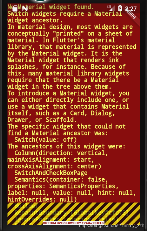
Flutter gives an error: No Material widget found Switch widgets require a Material widget ancestor
In the development of Flutter, if the following error message appears No Material widget found Switch widgets require a Material widget ancestor I. Analysis of the cause of the problem: 1. First you s...