Python makes beautiful pie charts using Matplotlib
tags: python
table of Contents
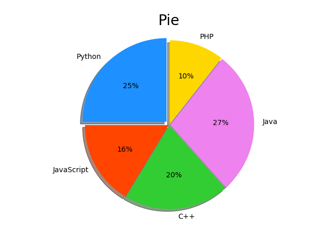
Finished product
First final product
Code
Figure 1 show
# Reset font size
proptease = fm.FontProperties()
proptease.set_size('xx-large')
# font size include: ‘xx-small’,x-small’,'small’,'medium’,‘ large’,‘x-large’,‘xx-large’ or number, e.g. '12'
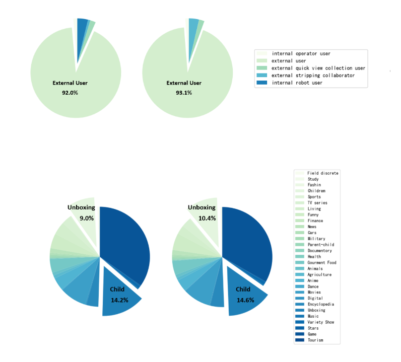
labels = 'internal operator user', 'external user', 'external quick view collection user', 'external stripping collaborator', 'internal robot user'
sizes = [62, 4048, 88, 36, 168]
colors = cm.GnBu(np.arange(len(sizes)) / len(sizes)) # colormaps: Paired, autumn, rainbow, gray,spring,Darks
explode = (0, 0.2, 0, 0, 0) # only "explode" the 2nd slice (i.e. 'Hogs')
fig, axes = plt.subplots(figsize=(10, 4), ncols=3) # Set the size of the drawing area
ax1, ax2, ax3 = axes.ravel()
plt.subplot(1, 3, 1)
# plt.pie(sizes, explode=explode, labels=labels, colors=colors,
# autopct='%1.1f%%', shadow=False, startangle=90)
patches, texts = ax1.pie(sizes, explode=explode, colors=colors,
shadow=False, startangle=90)
# plt.setp(autotexts, fontproperties=proptease)
# Set aspect ratio to be equal so that pie is drawn as a circle.
plt.axis('equal')
ax3.axis('off')
ax3.legend(patches, labels, loc='center left')
plt.tight_layout()
sizes = [60, 4402, 92, 172, 0] #-2, 354, 4, 136, -168 = 324 324 = a-f = 4726 - 4402 A = 4402 F = 4048
plt.subplot(1, 3, 2)
patches, texts= ax2.pie(sizes, explode=explode, colors=colors,
shadow=False, startangle=90)
# plt.setp(autotexts, fontproperties=proptease)
# plt.setp(texts, fontproperties=proptease)
# Set aspect ratio to be equal so that pie is drawn as a circle.
plt.axis('equal')
plt.show()
Figure 2 show
# 2021-02-22 User Class
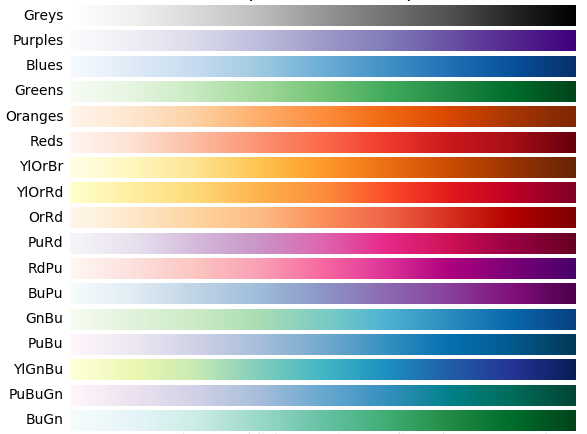
labels = 'Field discrete', 'Study', 'Fashin', 'Childrem', 'Sports', 'TV series', 'Living', 'Funny', 'Finance', 'News', 'Cars', 'Military', 'Parent-child', 'Documentory', 'Health', 'Gourment Food', \
'Animals', 'Agriculture', 'Anime', 'Dance', 'Movies', 'Digital', 'Encyclopedia', 'Unboxing', 'Music', 'Variety Show', 'Stars', 'Game', 'Tourism'
sizes = [28, 8, 0, 432, 12, 156, 200, 232, 0, 72, 28, 28, 28, 0, 12, 212, 48, 48, 200, 12, 420, 16, 188, 680, 16, 48,
12, 1668, 0]
colors = cm.GnBu(np.arange(len(sizes)) / len(sizes)) # colormaps: Paired, autumn, rainbow, gray,spring,Darks
explode = (0, 0, 0, 0.2, 0, 0, 0, 0, 0, 0, 0, 0, 0, 0, 0, 0, 0, 0, 0, 0, 0, 0, 0, 0.2, 0, 0, 0, 0,
0) # only "explode" the 2nd slice (i.e. 'Hogs')
fig, axes = plt.subplots(figsize=(10, 4), ncols=3) # Set the size of the drawing area
ax1, ax2, ax3 = axes.ravel()
plt.subplot(1, 3, 1)
patches, autotexts = ax1.pie(sizes, explode=explode, colors=colors,
shadow=False, startangle=90)
# Set aspect ratio to be equal so that pie is drawn as a circle.
plt.axis('equal')
ax3.axis('off')
ax3.legend(patches, labels, loc='center left')
plt.tight_layout()
sizes = [24, 4, 0, 540, 12, 164, 148, 284, 0, 76, 32, 32, 28, 4, 12, 236, 52, 48, 200, 12, 468, 12, 232, 756, 20, 52,
12, 1712, 4] # 372 Children 540-432 = 108 out of the box 756-680 = 76 5176 - 4804 = 372
plt.subplot(1, 3, 2)
patches, autotexts = ax2.pie(sizes, explode=explode, colors=colors, shadow=False, startangle=90)
# Set aspect ratio to be equal so that pie is drawn as a circle.
plt.axis('equal')
plt.show()
detailed analysis
First, declare that the percentage in the figure is marked is that I have been added with Visio later, not the code is done.
Before running the code, you need to guide the library, if you need to display the Chinese, you need to adjust the settings:
import matplotlib.pyplot as plt
import pandas as pd
import numpy as np
from matplotlib import font_manager as fm
from matplotlib import cm

plt.rcParams['font.sans-serif'] = ['SimHei']  #. Used to normalize Chinese label
Font size setting
proptease = fm.FontProperties()
proptease.set_size('xx-large')
Setting this part of the content can be adjusted on the text size displayed on the figure, for example, I am set up when drawingautopct='%1.1f%%', Automatically display the percentage in the pie chart, the size of the percentage can be set by the above line code.
The size that can be set includes:(xx-small, x-small, small, medium, large, x-large, xx-large, larger, smaller)
Set the tag value
labels = 'internal operator user', 'external user', 'external quick view collection user', 'external stripping collaborator', 'internal robot user'
sizes = [62, 4048, 88, 36, 168]
Enter the label and numerical value of the pie chart you want to draw.
Color setting
colors = cm.GnBu(np.arange(len(sizes)) / len(sizes))
This part sets the color of each module of the pie chart, you need to note that you don't need to set the color for each element, you can even join two colors, let these two colors circulate.
The method I used here is that the CM library, the gradient effect of the CM library is quite nice, I set up a given color for each element, the method is the code above. In addition to the blue gradient I use, you can also use:
Specific use can refer to other blogs:How to use CM library
highlight
explode = (0, 0.2, 0, 0, 0)
Explode is used to highlight the pie chart, the part separated from the figure is set by this code, set the second set to 0.2, indicating that the element in the second Label is separated, the greater the value, indicating the degree of separation Higher
Set the drawing area
fig, axes = plt.subplots(figsize=(10, 4), ncols=3)  # Set the size of the drawing area
ax1, ax2, ax3 = axes.ravel()
This section sets the drawing area because I contain three pictures, so set the above parameters.
Drawing of the first sub-figure
plt.subplot(1, 3, 1)
# plt.pie(sizes, explode=explode, labels=labels, colors=colors,
#         autopct='%1.1f%%', shadow=False, startangle=90)
patches, texts = ax1.pie(sizes, explode=explode, colors=colors,
                                     shadow=False, startangle=90)
# plt.setp(autotexts, fontproperties=proptease)
Nothing to say, Subplot draws multiple subgraphs, set to three
Parameters in PIE: Sizes indicates that the incoming parameters, expLode indicates whether there is highlighted display, colors represents color, shadow indicates whether to draw a functions, there is a shadow display (set to True is not good to see, Startangle means the first element started. Start location)
Here, I will assume that I will cancel other comments, and the code annotation of the drawing can be displayed, but it is not recommended, but it is difficult to adjust the size, aesthetic degree big discount
Set scale
plt.axis('equal')
ax3.axis('off')
The first line is X, Y axis scale, etc., enter this option in the pie chart, you can make the circle more like a circle
The second line is to close the coordinate axis
onaxisDetailed usage, reference
Location
ax3.legend(patches, labels, loc='center left')
plt.tight_layout()
Legend is primarily used to set the legendary content, where LOC is used to represent the specific location of the legend, and his optional parameters can be characters, or numbers, by default, 0, here choosing'center left', Detailed usage reference:Usage of loc in matplotlib-legend()-stack overflow
Tight_Layout automatically adjusts the sub-map parameters to fill it over the entire image area. Essentially is a simpler beautification of the entire picture
Last remember
plt.show()
This article has a lot of reference.Content.
Happy figure
Intelligent Recommendation

★ Python uses the Matplotlib library to draw point, line, bar and pie charts
★ Use Python third party librarymatplotlib(2DPaint Gallery) Draw common: Dot plot line chart Bar chart Pie chart ★Introduced: Commonly used color c="???": 1: red ‘red’ 2: Blue &l...

Python Matplotlib series of tutorials (6)-drawing pie charts
This chapter discusses the drawing of pie charts Pie charts are often used to show the proportion of each part in the whole. We choose the data of this picture: appendix: Type of parameter plt.stackpl...
python matplotlib draw multiple pie charts on one graph!
python matplotlib draw multiple pie charts on one graph! data demonstration The data source can refer to my blog https://blog.csdn.net/qq_45058254/article/details/104195171 python code Refer to https:...
07 Python Matplotlib library draws pie charts and histograms
Draw a pie chart Output result: is too ugly~~~~~ Draw a histogram Output result Output result:...
Python matplotlib draw multiple pie charts on one canvas
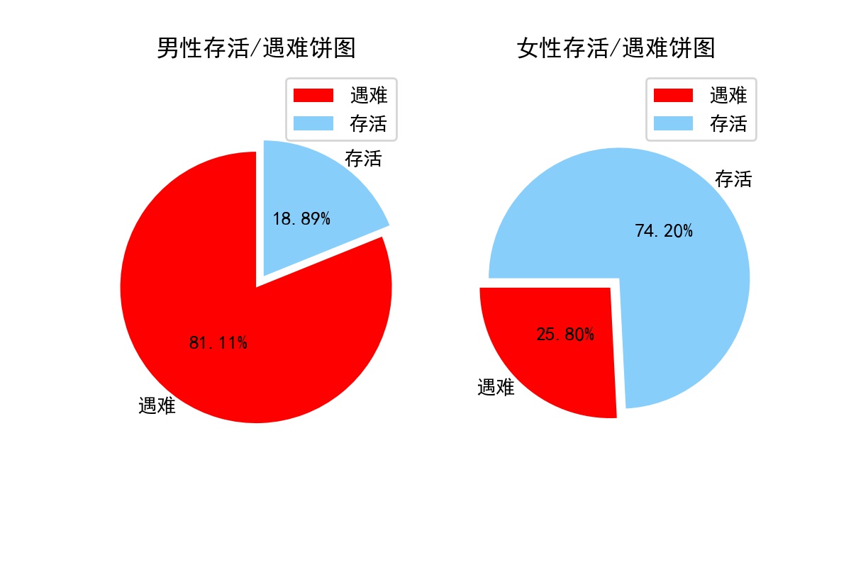
Drawing purpose: to draw a pie chart of the survival rates of men and women on the Titanic to visually show the different survival rates of men and women Data source download link:https://www.kaggle.c...
More Recommendation
python (matplotlib) draws pie charts, scatter plots and polar plots
Here we will introduce ordinary pie charts and pie charts with legends, as well as scatter charts displayed in different shapes. Finally, we will introduce the less commonly used polar charts. Pie cha...
Python uses matplotlib to visualize and simulate student performance pie charts
The renderings are as follows: ...
Tableau makes beautiful doughnut charts
Completion effect: step: Please paste and copy the data to excel source data One: Drag the record number to the row twice, and mark the dual axis (the reason for marking the dual axis: just to make th...
matplotlib drawing series: merge multiple histograms and drawing details to draw beautiful pie charts
Matplotlib combined histogram What do we do when we need multiple histograms for one graph? See the effect Note: In fact, this kind of graph is not difficult. We need to set the width of the histogram...
matplotlib-pie charts, contour plots
Article Directory First introduce the pie chart Next, let’s draw a contour map plt.contour plt.contourf note Let’s learn to draw pie charts and contour maps today. In fact, our drawing ski...