Visualization package for deep learning Python – Matplotlib
5.4 Python visualization package – Matplotlib
Matplotlib is one of the most commonly used visualization tools in Python. It can easily create massive types of 2D charts and some basic 3D charts. Matplotlib was first developed to visualize the signals related to electroencephalogram of epilepsy patients. Because it refers to MATLAB in the design of the function, it is called Matplotlib. Matplotlib was first published in 2007. Driven by open source and the community, it is now widely used in Python-based scientific computing fields. Matplotlib's original author, Dr. John D. Hunter, is a neurobiologist who unfortunately died of cancer in 2012. Thanks to him for creating such a great library.
The way to install Matplotlib is very similar to numpy, you can directly through Unix/Linux software management tools, such as Ubuntu 16.04 LTS, enter:
>> sudo apt install python-matplotlib
Or install via pip:
>> pip install matplotlib
Under Windows, you can also download it via pip or go to the official website:
python plotting – Matplotlib 1.5.3 documentation
Matplotlib is very powerful, but in fact, only some basic functions are commonly used in deep learning. This section mainly introduces 2D charts, 3D charts and image display.
5.4.1 2D chart
The most basic module in Matplotlib is pyplot. Let's start with the simplest point chart and line chart. For example, we have a set of data and a fitted model, which is visualized by the following code chart:
The common aliases of matplotlib and pyplot are mpl and plt, respectively, and the image generated by the above code is as follows:


The basic drawing method is so simple, if you want to learn more about the properties and methods of pyplot to draw images with various styles, you can refer to the official website:
pyplot – Matplotlib 1.5.3 documentation
Point and line charts are just the most basic usage. Sometimes we obtain grouped data for comparison. Column or pie charts may be more suitable:
In this code, there is a new thing called, an object named after ax. In Matplotlib, there are two common concepts when drawing. One is a window that pops up when drawing normally. This is called a figure. Figure is equivalent to a large canvas. In each figure, there can be multiple subgraphs. This subgraph is called axes. As the name implies, a horizontal and vertical axis is a simple chart. In the above code, first define figure as a large canvas with one row and two columns, and then add two new subplots through figure.add_subplot(). The definition format of subplot is very interesting. The first two digits of the number define the number of rows and columns, respectively, and the last digit defines the order of the newly added sub-pictures. Of course, it is no problem to write clearly. Separate them with a comma. . The image generated by the above code is as follows:

5.3.1 3D chart
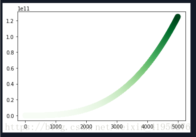
Matplotlib can also support some basic 3D charts, such as surface charts, scatter charts and histograms. These 3D charts need to use the mpl_toolkits module. Let's first look at a simple example of a surface chart:
In this example, a complex array with all values 0 is first generated as the initial spectrum, and then the central part of the spectrum is randomly generated, but at the same time, the conjugate sub-matrix with concentric symmetry about the center is filled. This is equivalent to a random spectrum with only low-frequency components. Finally, an inverse Fourier transform is performed to obtain a randomly fluctuating surface. The image is as follows:

3D scatter plots are also a method often used to view the distribution of spatial samples, and it is easier to draw than surface plots and network plots. Let's look at examples:
In this example, for convenience, a bunch of 3-dimensional normal distribution samples are directly sampled first to ensure the uniformity in the direction. Then normalize, so that the distance from each sample to the origin is 1, which is equivalent to obtaining a sample uniformly distributed on the sphere. Then, each sample is multiplied by a uniformly distributed random number raised to the third power, so that a sample uniformly distributed in the sphere is obtained, and finally according to the discrimination plane 3x+2y-z-1=0, the samples on both sides of the plane Drawing with different shapes and colors, the image is as follows:

5.3.1 Image display
Matplotlib also supports image access and display, and compared with interfaces such as OpenCV, it is much more convenient to visualize the general two-dimensional matrix. Let's look at an example:
The first example in this code is to read a local image and display it. In the second example, the matrix generated by the inverse Fourier transform in the previous section is directly taken as an image. The original image and the image converted by multiplying 3 and adding 4 directly draw two patterns with the same shape but different value ranges. When displaying, imshow will automatically normalize, displaying the brightest value as pure white and the darkest value as pure black. This is a very convenient setting, especially when looking at the response graph of a convolutional layer in deep learning. Get the image as follows:


only talks about the most basic and commonly used charts and the simplest examples. More interesting and beautiful examples can be found on the official website of Matplotlib:
Intelligent Recommendation
Python Learning Data Visualization Drawing - MatPlotlib (1)
I also entered the pit Python, following you to learn Python duck Note: You need to do some advance preparations, which is to install Numpy, Matplotlib, etc., there are many blog owners, I also learne...
Machine Learning Science Data Package (5)------Introduction to Data Visualization Matplotlib
Introduction to Data Visualization Matplotlib table of Contents Introduction to Data Visualization Matplotlib One, scatter plot 1. Concept 2. Practice 3. Appearance adjustment Second, the line chart 1...
Python implements linear regression visualization and other operations based on Matplotlib package
First, the MATPLOTLIB package is installed first through the command prompt. Implement linear regression visualization The above is some other operations about matplotlib ...

Data visualization-matplotlib learning
Hi everybody! Last week the company went out to build a group and did not do my own learning and sharing. This week I will share with you how to use matplotlib. I hope to help you a little bit. If you...
Python visualization matplotlib
Common sentence summary: import matplotlib pyplot as plt 1.plt.plot( input_x , input_y , linewidth=5 )=> given the x and y of the input, and adjust the line width drawing 2.plt.title( ' name ' )=&g...
More Recommendation

Matplotlib drawing visualization - Python
Today, I encountered a problem when drawing the curve. After the drawing is completed, after the image is saved, I found that the show() method cannot display the drawing window. Later, I debugged it ...

Python drawing and visualization of Matplotlib
Install Matplotlib reference: Case X is a list, Y is also a list, and each value in Y corresponds to the value of the corresponding position in X. ie Y(i)=sin( X(i) ) effect...

Python Visualization Pack – Matplotlib
It is boring to use NumPy for learning statistics. A lot of data makes us a headache, so we need to graphically display it. Matplotlib is a Python graphics framework. Install via pip: >> pip ins...
Python Visualization Library - Matplotlib
Official tutorial Line drawing Submap operation Draw a multi-line diagram plt.legend(loc=‘best’) Location String Location Code ‘best’ 0 ‘upper right’ 1 ‘upper...
Python data visualization -- matplotlib
Abstraction|concrete: such as box plot | real map Functionality | Decorative: no decoration and rendering | contains artistic aesthetic decorations Deep expression | shallow expression: in-dept...