Python sets the axis scale interval and scale range of matplotlib.plot
tags: Digital image processing
Python sets the axis scale interval and scale range of matplotlib.plot
1. Use the default settings to draw a line chart
import matplotlib.pyplot as plt
 I have more learning materials and a lot of dry goods about Python here, + 688244617 for free, come on
x_values=list(range(11))
 #x-axis numbers are 11 integers from 0 to 10
y_values=[x**2 for x in x_values]
 #y-axis number is the square of x-axis number
plt.plot(x_values,y_values,c='green')
 #Draw a line chart with the plot function, and set the line color to green
plt.title('Squares',fontsize=24)
 #Set chart title and title font size
plt.tick_params(axis='both',which='major',labelsize=14)
 #Set the font size of the scale
plt.xlabel('Numbers',fontsize=14)
 #Set the x-axis label and its font size
plt.ylabel('Squares',fontsize=14)
 #Set the y-axis label and its font size
plt.show()
 #Display chart
The chart created in this way is shown below:
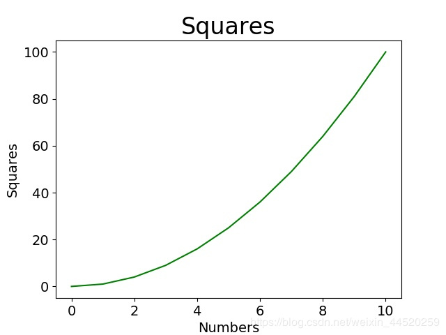
We hope that the scale of the x-axis is 0,1,2,3,4..., the scale of the y-axis is 0,10,20,30..., and we hope that the range of the two coordinate axes can be larger, so we Need to be set manually.
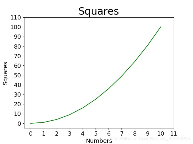
2. Manually set the coordinate axis scale interval and scale range
import matplotlib.pyplot as plt
from matplotlib.pyplot import MultipleLocator
#Import the MultipleLocator class from pyplot, this class is used to set the scale interval

x_values=list(range(11))
y_values=[x**2 for x in x_values]
plt.plot(x_values,y_values,c='green')
plt.title('Squares',fontsize=24)
plt.tick_params(axis='both',which='major',labelsize=14)
plt.xlabel('Numbers',fontsize=14)
plt.ylabel('Squares',fontsize=14)
x_major_locator=MultipleLocator(1)
 #Set the scale interval of the x-axis to 1, and store it in the variable
y_major_locator=MultipleLocator(10)
 #Set the y-axis scale interval to 10 and store it in the variable
ax=plt.gca()
 #ax is an example of two coordinate axes
ax.xaxis.set_major_locator(x_major_locator)
 #Set the main scale of the x-axis to a multiple of 1
ax.yaxis.set_major_locator(y_major_locator)
 #Set the main scale of the y-axis to a multiple of 10
plt.xlim(-0.5,11)
 #Set the scale range of the x-axis to -0.5 to 11, because 0.5 is less than a scale interval, the number will not be displayed, but a little blank can be seen
plt.ylim(-5,110)
 #Set the y-axis scale range from -5 to 110. Similarly, -5 will not be marked, but a little blank can be seen
plt.show()
The drawn result is shown in the figure:
Intelligent Recommendation
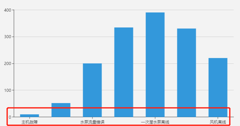
Echarts histogram x-axis scale interval display
When I first contacted Echarts, I often encountered the problem of incomplete display of the coordinate scale of the histogram, as shown below: This problem is generally caused by the length of the sc...
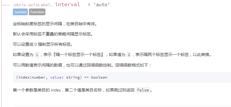
echarts axis scale label display interval problem
The display interval of echarts axis scale labels is valid in category axis. Originally, the previous article also said that these configuration items can be viewed in the official documents, but the ...

Matplotlib tick sets the transparency of the axis scale
As shown in the figure, because the line is too thick, part of the scale in the coordinate system is blocked: Traverse the coordinate points of the coordinate axis, respectively set the transparency o...
Python X / Y axis scale
need Reference official website:Scales — Matplotlib 3.4.3 documentation When a routine drawing, sometimes the X-axis or Y axis, it is desirable that a certain area can be enlarged, and an area c...
More Recommendation
echart manually calculates the maximum value and interval of the y-axis scale and removes the y-axis because the data is too large and exceeds the chart display range
Problem Description: 1. The y-axis data exceeds the display range of the icon because it is too large. 2. Automatically calculate the maximum and minimum values of the y-axis, and change the distanc...

An operation proved that python data visualization is a hundred times stronger than excel: X-axis scale interval display
An operation proved that python data visualization is a hundred times stronger than excel: X-axis scale interval display Code:...

Python sets the number of X-axis scales, scales are converted into other text, scale rotation
The main function is Here MultipleLocator is used to set how many ticks interval to display a tick value The function xticks is used to convert the numeric scale to any character scale plt.xticks(rota...

Python x axis display specified time scale
Set the x axis as the time axis Set the x axis as the time axis Show specified date Precautions: Pay attention to the time conversion of the x axis: -datetime.date2num(): counting from 1,1,1, the unit...