Detailed wpf LiveCharts
tags: WPF
This article mainly introduces how to use charts in LiveChart.WPF. Classes: data binding, data display styles, etc.
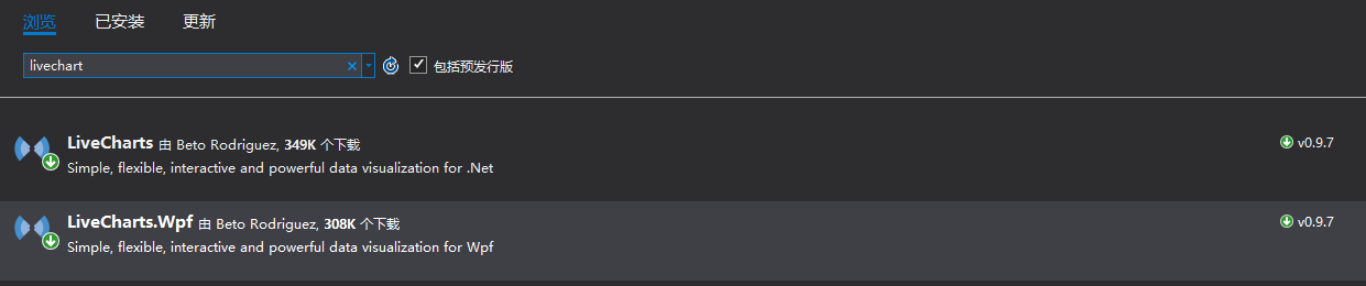
Import LiveChart.Wpf#
NuGet searches for the LiveChart package and installs LiveChart.Wpf.
Quote LiveChart.Wpf#
Reference the LiveChart.Wpf class library in the interface used
xmlns:lvc="clr-namespace:LiveCharts.Wpf;assembly=LiveCharts.Wpf"Take the histogram and the line chart as examples, they all belong to a Series type under CartesianChart, such as a line chart, as follows:
<lvc:CartesianChart>
<lvc:CartesianChart.Series>
<!--Set the type of Series to Line type, which provides some line chart implementations-->
<lvc:LineSeries/>
</lvc:CartesianChart.Series>
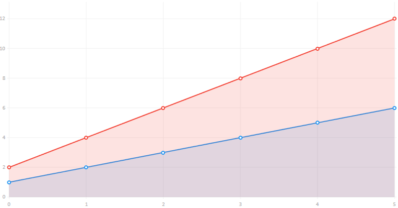
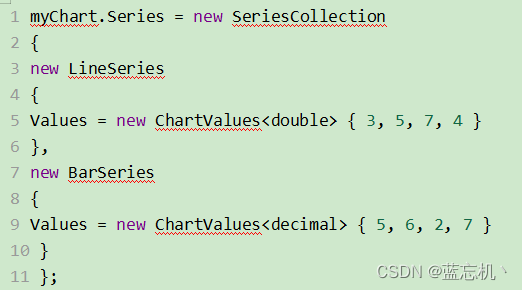
</lvc:CartesianChart>Just set the Values for the LineSeries binding data. You can see the s, which means that this is a complex number collection type, inherited from IChartValues, so the final bound data conforms to ChartValues. The figure below is bound to a numeric type. Collection:
<lvc:CartesianChart>
    <lvc:CartesianChart.Series>
         <!--Set the type of Series to Line type, which provides some line chart implementations-->
         <lvc:LineSeries Values="1,2,3,4,5,6"/>
         <lvc:LineSeries Values="2,4,6,8,10,12"/>
    </lvc:CartesianChart.Series>
</lvc:CartesianChart>
The interface is presented as follows:
Next, take LineSeries as an example to expand and add the definition display of X and Y coordinates.
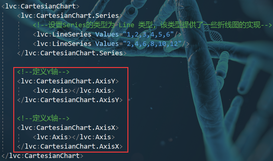
Add titles to the X and Y axes of LiveChart
<!--Define Y axis-->
<lvc:CartesianChart.AxisY>
           <!-- Define Y axis name -->
     <lvc:Axis Title="Value"></lvc:Axis>
</lvc:CartesianChart.AxisY>

 <!--Define X axis-->
<lvc:CartesianChart.AxisX>
           <!-- Define X axis name -->
     <lvc:Axis Title="Type"></lvc:Axis>
</lvc:CartesianChart.AxisX>
The effect is as follows:
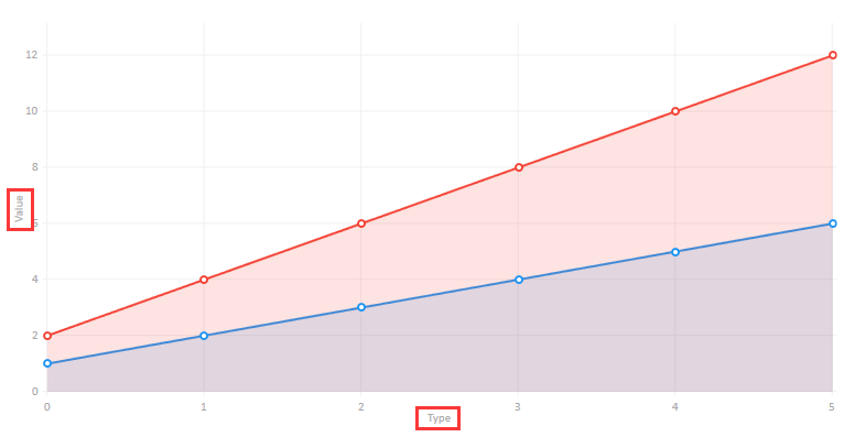
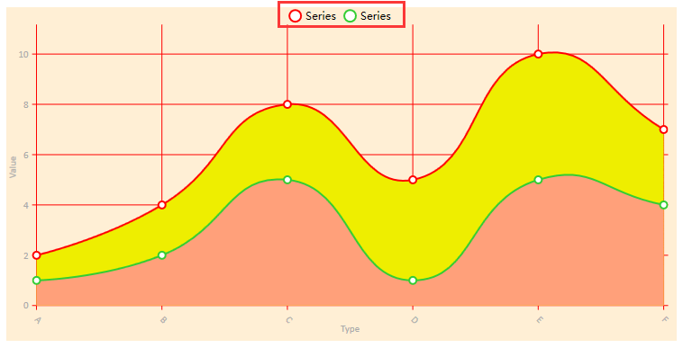
Chart display settings
1. The display position of the legend: LegendLocation="Top" //displayed at the top
 2. The background color of the chart: Background="#FFEFD5"
As follows:
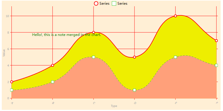
3. Add visual elements: VisualElements, add a text to the chart as shown below:
<lvc:CartesianChart.VisualElements>
     <lvc:VisualElement X="0.5" Y="8">
          <lvc:VisualElement.UIElement>
               <TextBlock Foreground="Green">
                    Hello!, this is a note merged in the chart.
               </TextBlock>
          </lvc:VisualElement.UIElement>
     </lvc:VisualElement>
</lvc:CartesianChart.VisualElements>
display effect:
LineSeries style settings
1. Line display value: DataLabels="True"
 2. Whether the line is curved: LineSmoothness="0" or "1"
 3. The color of the line: Stroke="Red" //Set the color of the line to red
 4. The color below the line: Fill="Pink" //The color below the line
 5. Each point of the line: PointGeometrySize="20" //Set the data point size
 6. Display data font color: Foreground="Red"
 7. The color of the data point: PointForeground="#FF6347"
 8. Dotted line: StrokeDashArray="5" //The larger the value, the larger the interval, as shown by the green dashed line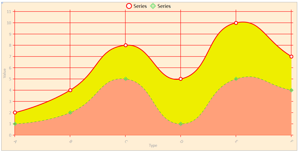
9. The shape of the line point: PointGeometry //As shown below, set the data point as a rectangle
<lvc:LineSeries DataLabels="False" Stroke="#32CD32" StrokeThickness="1"   StrokeDashArray="5"
                                LineSmoothness="1" Foreground="Red"
                                Fill="#FFA07A" PointGeometrySize="10"
                                Values="1,2,5,1,5,4">
     <lvc:LineSeries.PointGeometry>
           <GeometryGroup>
                <RectangleGeometry Rect="50,50,25,25" />
           </GeometryGroup>
     </lvc:LineSeries.PointGeometry>
</lvc:LineSeries>
X and Y coordinate style settings
1. Whether to display coordinate points: ShowLabels="False"
 2. Rotation angle of coordinate point: LabelsRotation="45"
 3. Coordinate axis labels: Labels="A,B,C,D,E,F" //Example
 4. Custom display format: LabelFormatter
Whether the chart shows the background X and Y lines:
The following code sets the color red solid line with the width of the X and Y axes as 1:
                        <!--Define Y axis-->
            <lvc:CartesianChart.AxisY>
                <lvc:Axis Title="Value"  ShowLabels="True">
                    <lvc:Axis.Separator>
                        <lvc:Separator StrokeThickness="1" Stroke="Red"  />
                    </lvc:Axis.Separator>
                </lvc:Axis>
            </lvc:CartesianChart.AxisY>

                         <!--Define X axis-->
            <lvc:CartesianChart.AxisX>
                <lvc:Axis Title="Type"  LabelsRotation="45" Labels="A,B,C,D,E,F" ShowLabels="True" >
                    <lvc:Axis.Separator>
                        <lvc:Separator StrokeThickness="1" Stroke="Red"  />
                    </lvc:Axis.Separator>
                </lvc:Axis>
            </lvc:CartesianChart.AxisX>
The effect is as follows:

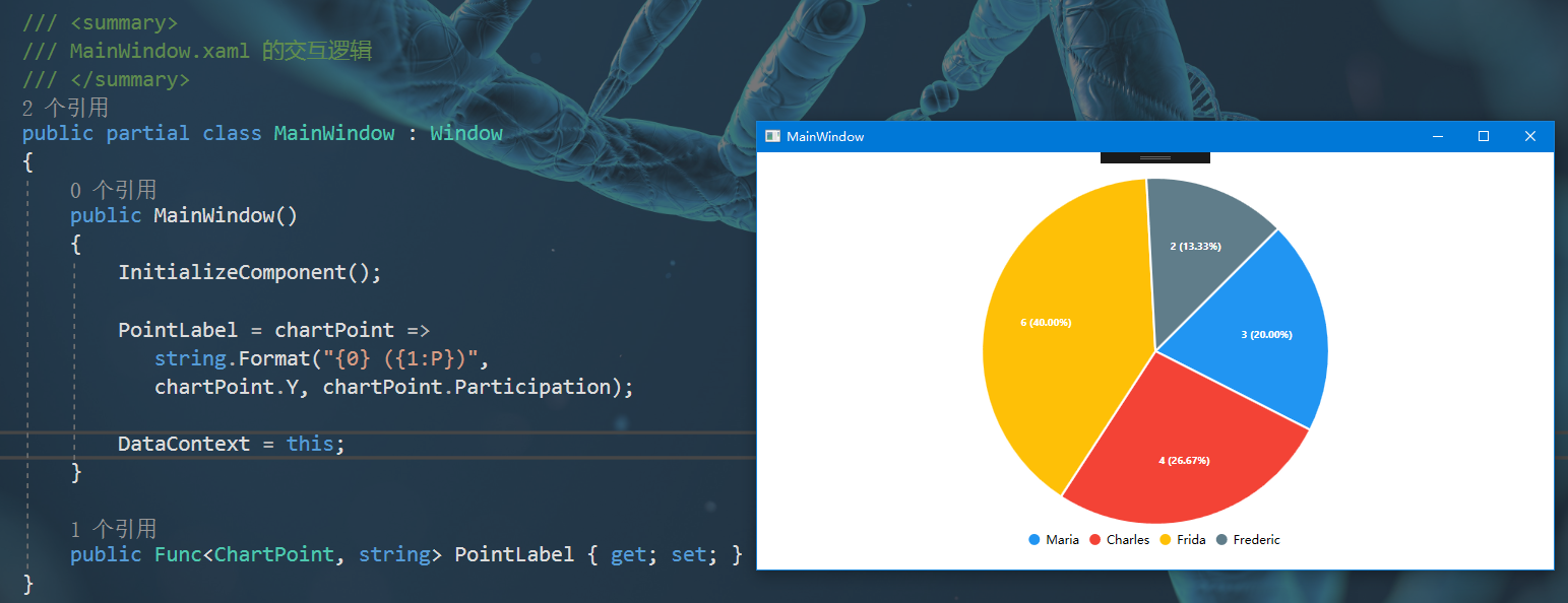
Define a pie chart
Since the pie chart does not have the concept of X and Y axes, so if you need to use a pie chart, use PieChart.
1. Set the format of the displayed data: LabelPoint //The binding is a Func delegate
Xaml binding:
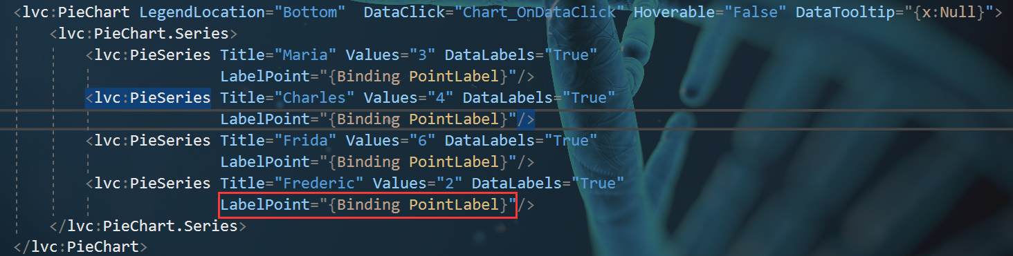
Background code and display effect:
Intelligent Recommendation

The problem of incomplete labels in LIVECHARTS in LiveCharts
content I. Introduction Source code Third, solve the problem Finish I. Introduction When displaying the column -like diagram, the binding Labels array is obviously complete, but in the chart, only the...
Problems encountered and solutions LiveCharts
Problems encountered and solutions LiveCharts Problems encountered and solutions LiveCharts 1. How to set horizontal and the vertical axis as a dotted line delimiter 2. How to add horizontal longitudi...
LiveCharts background use
basic use LiveCharts is designed to be easy to use, everything can be automatically updated and animated, the library will update when it feels it is necessary to update, not every time you change the...
WPF DrawingVisual Detailed
In WPF, if you need to draw a large number of graphic elements, and demanding performance, it is best to use DrawingVisual, of course, you can also use Path Path class and class more than the lightwei...
The WPF DependencyProperty storage Detailed
Foreword WPF contacted for some time, although frequently used before, but for the DependencyProperty been in a smattering of state. Today spent the whole afternoon to sort out a bit this concept, con...
More Recommendation
WPF PATH syntax Detailed
WPF offers two methods described in the Path graphical data, a method of representation by StreamGeometry XAML code, the most compact representation. Examples are as follows: Another approach is descr...
WPF animation detailed
Article Directory One, WPF animation and traditional objects Second, the basic process of WPF animation (horizontal moving painting) Three, gradient animation and rotation animation One, WPF animation...
WPF dependent properties detailed
Foreword If you read the text version, you don't have patient, click below to view the video explanation. Click to watch the video review Before explaining the dependency, we are first familiar with t...
WPF Detailed template
There are three major templates in WPF. Templates ControlTemplate, ItemSPanelTemplate, DataTemplate. Where ControlTemplate and ItemsPanelTemplate are control templates, DataTemplate is a data template...
<WPF> Data Detailed Usage
DataGrid 1 Introduction 2. Datagrid introduce use Operate the row and column of DataGrid Increase Checkbox 1 Introduction This blog is to record a question that is encountered in front of WPF, and its...