Angular: Use echarts to make gradient radar charts
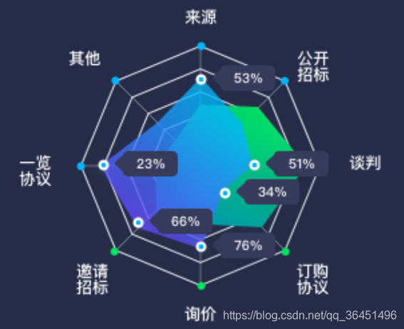
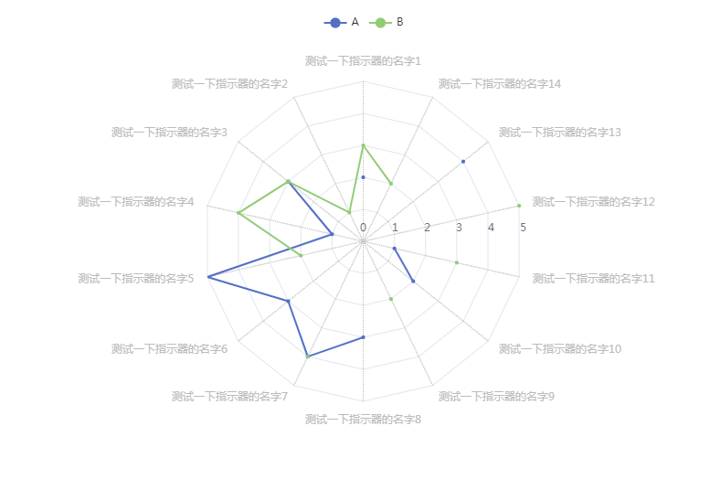
The chart corresponding to the radar chart, which shows two sets of data: contract amount and amount:
legend: {
        x: 'center',
                 data: ['Contract Amount','Amount'],
        textStyle: {
          color: '#fff'
        }
      },
Set the meaning of each coordinate axis of the radar chart, the position of the coordinate axis, the style of the coordinate axis interval, etc.:
radar: {
        indicator: (function () {
          const res = [
                         {text:'Source', max: 100 },
                         {text:'Other', max: 100 },
                         {text:'Overview Agreement', max: 100 },
                         {text:'Invitation to tender', max: 100 },
                         {text:'Inquiry', max: 100 },
                         {text:'Subscription Agreement', max: 100 },
                         {text:'Negotiate', max: 100 },
                         {text:'Open bidding', max: 100 },
          ];
          return res;
        })(),
                 center: ['68%', '56%'], // Center coordinates of the coordinate axis
                 radius: '58%', // The ratio of the radius of the coordinate axis to the displayable area
                 axisLine: {// coordinate axis style
          lineStyle: {
            color: '#E9EBF1'
          }
        },
                 splitArea: {// The color of the axis separation area: the default is the color of the interval between dark and light, here we set the space between the gaps
          areaStyle: {
            opacity: 0
          }
        }
      },
Set the radar chart data and data display style:
      series: [
        // 1. Contract volume:
        {
                     type:'radar', // radar chart
          data: [
            {
                             name:'Contract volume',
              value: [21.6, 15.9, 40, 23.6, 32.2, 48.7, 18.8, 22.3],
                             emphasis: {// Highlight when the mouse is hovering, and show the data style of the radar chart
                label: {
                  show: true,
                  color: '#fff',
                  fontSize: 14,
                  backgroundColor: '#0D1B42',
                  borderRadius: 5,
                  padding: 3,
                                     shadowBlur: 3 // Shadow width
                }
              }
            }
          ],
          itemStyle: {
                         color: new echarts.graphic.LinearGradient( // set gradient color
              0, 0, 0, 1,
              [
                { offset: 0, color: 'rgba(0, 230, 98, 1)' },
                { offset: 1, color: 'rgba(0, 155, 171, 1)' }
              ]
            )
          },
                     areaStyle: // The style of the radar radiation area
          {
            color: new echarts.graphic.LinearGradient(
              0, 0, 0, 1,
              [
                { offset: 0, color: 'rgba(0, 230, 98, 1)' },
                { offset: 1, color: 'rgba(0, 155, 171, 1)' }
              ]
            )
          },
        },

                 // 2. Amount:
        {
          type: 'radar',
          data: [
            {
                             name:'Amount',
              value: [24.0, 42.9, 71.0, 23.2, 22.2, 20.0, 46.4, 32.3],
              emphasis: {
                label: {
                  show: true,
                  color: '#fff',
                  fontSize: 14,
                  backgroundColor: '#0D1B42',
                  borderRadius: 5,
                  padding: 3,
                  shadowBlur: 3
                }
              }
            }
          ],
          itemStyle: {
            color: new echarts.graphic.LinearGradient(
              0, 0, 0, 1,
              [
                { offset: 0, color: 'rgba(1, 184, 252, 1)' },
                { offset: 1, color: 'rgba(100, 74, 255, 1)' }
              ]
            )
          },
          areaStyle:
          {
            color: new echarts.graphic.LinearGradient(
              0, 0, 0, 1,
              [
                { offset: 0, color: 'rgba(1, 184, 252, 1)' },
                { offset: 1, color: 'rgba(100, 74, 255, 1)' }
              ]
            )
          },
        }
      ],
Note that we set the gradient color like this:
new echarts.graphic.LinearGradient(
0, 0, 0, 1,
[
{ offset: 0, color: 'rgba(0, 230, 98, 1)' },
{ offset: 1, color: 'rgba(0, 155, 171, 1)' }
]
)
In this way, a radar data display is realized.
Intelligent Recommendation
Echarts use charts (bar charts, pie charts)
Due to the need to meet the needs of a lot of UI, and now the Echarts configuration records it. First, the standard bar chart Main achievement: 1, a standard histogram display a plurality of colors, o...

echarts make 3D column charts
1. Introduce eCharts 2. Main.js introduces 3. Page production options.js 4. The final achievement effect...

Angular: echarts makes a gradient dashboard
The display effect of the instrument panel is shown in the figure above. The color requires a gradual change. The scale is divided into 4 pieces. The name of the instrument panel is displayed below. L...

Use of Echarts charts
I learned about the Echarts plugin at a sharing session. I just need to use it to understand it. It is very convenient to generate various charts. Here is a simple sharing of how to generate pie chart...
Use eCharts to draw charts
Primary scholar steps: 1.https://www.jsdelivr.com/package/npm/echartsSelect the distal/echarts.js and eCharts.min.js click and save them as eCharts.js and echarts.min.js files. 2. Create a new index.h...
More Recommendation
Realization of Echarts gradient and interval between pie charts
Summarize the problems encountered in Echarts recently and find the solutions. 1. Echarts gradient writing Second, the middle interval of the pie chart In fact, the phase method is very simple, just a...
Use Echarts3.0 to make charts
It mainly includes the following steps: 1. The first step is to introduce<script src="../lib/echarts.min.js"></script> 2. In the second step, add a dom to the body: 1 2 3 3...
Perfect combination of Echarts radar chart polar coordinates and line charts
Practice real Renderings Card history Most of the time, using echarts is the reference sample diagram, which is transformed according to the requirements, and more research is to configure the configu...
Advanced! Use pyecharts to draw world maps, rose charts, and radar charts
I have posted a blog post that basically explained the basic method of drawing a map. Here I plan to call the API directly to create a real-time dynamic map, and analyze the data to draw a rose chart ...