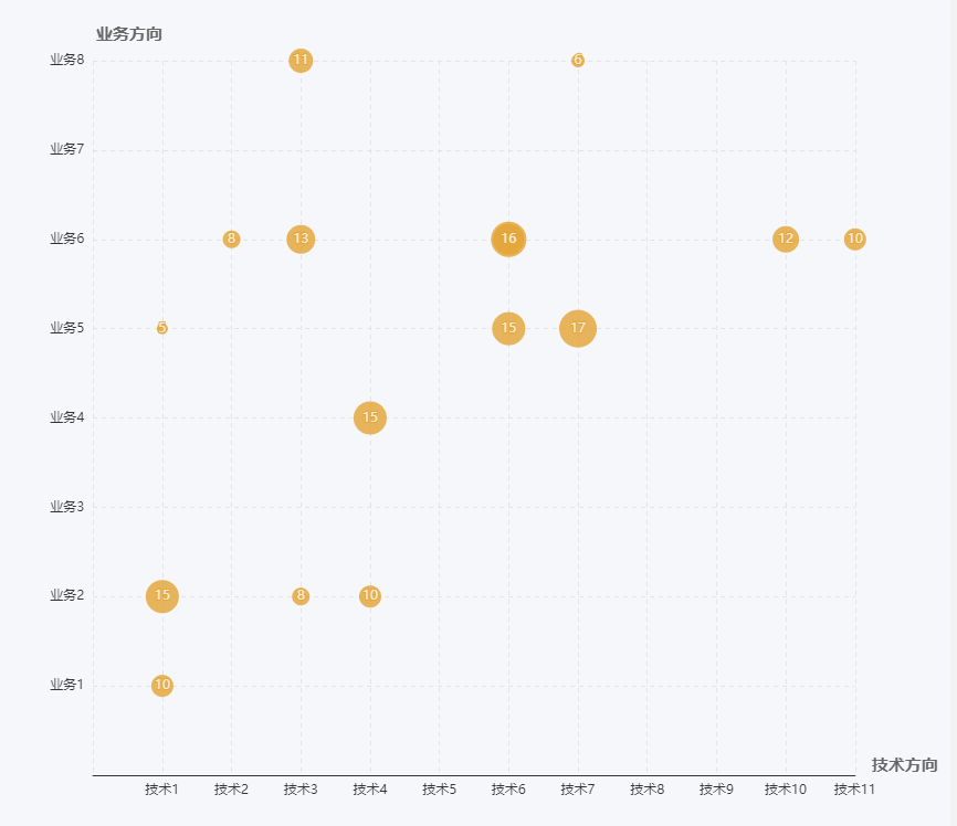
echarts chapter VI-scatter chart (bubble chart), the horizontal and vertical axis are in Chinese
Chart features and problems:
1. It needs to be two types of intersections. The horizontal axis and the vertical axis are both character types. The scatter chart found on the echarts official website, the horizontal and vertical axes are all numeric types. After the result is matched with characters, the intersection cannot appear. Become an area. The last way is to change the value of the horizontal and vertical axis to a numeric value, and then display it as the original character through the formatter
2. The number of intersections needs to be displayed, and the bubble size is displayed according to the number. Use symbolSize to achieve
The configuration is as follows:
var data = [
    {tech:'Technology 1', business:'Business 5', num: 5},
         {tech:'Technology 1', business:'Business 2', num: 15},
         {tech:'Technology 1', business:'Business 1', num: 10},
         {tech:'Technology 11', business:'Business 6', num: 10},
         {tech:'Technology 3', business:'Business 2', num: 8},
         {tech:'Technology 2', business:'Business 6', num: 8},
         {tech:'Technology 4', business:'Business 2', num: 10},
         {tech:'Technology 4', business:'Business 4', num: 15},
         {tech:'Technology 3', business:'Business 8', num: 11},
         {tech:'Technology 10', business:'Business 6', num: 12},
         {tech:'Technology 3', business:'Business 6', num: 13},
         {tech:'Technology 6', business:'Business 6', num: 14},
         {tech:'Technology 6', business:'Business 5', num: 15},
         {tech:'Technology 6', business:'Business 6', num: 16},
         {tech:'Technology 7', business:'Business 5', num: 17},
         {tech:'Technology 7', business:'Business 8', num: 6}
];
 var xData = ['Technology 1','Technology 2','Technology 3','Technology 4',
         'Technology 5','Technology 6','Technology 7','Technology 8',
         'Technology 9','Technology 10','Technology 11'];
 var yData = ['','Business 1','Business 2','Business 3','Business 4',
         'Business 5','Business 6','Business 7','Business 8']
var option = {
    backgroundColor: 'rgb(245,247,251)',
    padding: 10,
    xAxis: {
                 name:'Technical direction',
        boundaryGap: ['10%', '0%'],
        nameTextStyle: {
            fontSize: 15,
            color: '#666',
            verticalAlign: 'bottom',
            fontWeight: 'bold'
        },
        scale: true,
        axisTick: {
            show: false
        },
        axisLabel: {
            formatter: function(params){
                return xData[params];
            }
        },
        interval: 1,
        splitNumber: xData.length,
        splitLine: {
            show: true,
            lineStyle: {
                type: 'dashed',
                color: '#e3e3e3'
            }
        }
    },
    color: ['rgb(228, 164, 52)'],
    yAxis: {
                 name:'Business direction',
        boundaryGap: ['5%', '0%'],
        nameTextStyle: {
            align: 'right',
            fontSize: 15,
            color: '#666',
            fontWeight: 'bold'
        },
        interval: 1,
        splitNumber: yData.length,
        scale: true,
        axisLine: {
            show: false
        },
        axisTick: {
            show: false
        },
        axisLabel: {
            show: true,
            formatter: function(idx){
                console.log(idx); //
                return yData[idx];
            }
        },
        splitLine: {
            show: true,
            lineStyle: {
                type: 'dashed',
                color: '#e3e3e3'
            }
        }
    },
    series: data.map((d, i)=>{
        return {
            type: 'scatter',
            label: {
                show: true,
                formatter: function(params){
                    return data[params.seriesIndex].num;
                }
            },
            symbolSize: d.num*2,
            data: [
                [
                    xData.indexOf(d.tech),
                    yData.indexOf(d.business)
                ]
            ]
        }
    })
};
The effect is as follows:
Intelligent Recommendation

Experience of echarts scatter chart
Note: Due to work needs, I drew several echart charts, studied the official configuration files in a simple way, and designed scatter charts, column charts, and Nandinger charts. Let’s show the ...
echarts scatter chart
e c h a r t s Scattered point Figure echarts scatter chart echartsScatteredpointFigure...
ECharts scatter chart configuration
There are only some configuration items here,For more detailed configuration items click here...
ECharts learning-scatter chart
(1) Scatter chart A scatter chart is a chart composed of some scattered points. The position of these points is determined by the x value and the y value, so it is also called an xy scatter chart. Adv...

[Front-end chart] echarts implements scatter chart x-axis time axis
Not much to say, the old rules, the first picture, to achieve echarts to achieve a scatter plot, the x-axis data is time, month, and day. Picture.png The implementation code is as follows: During the ...
More Recommendation
matplotlib chart scale size, horizontal and vertical axis label size settings
The size of the coordinate scale, the size of the legend, and the size of the label on the horizontal and vertical axis are as follows: ...

Echarts visualization drawing scatter map bubble map Radar chart
The scatter plot is a foundation visual pattern. In Echarts, it is necessary to change the Type parameter value in Echarts to Scatter when making a scatter graph. Article catalog Foreword First, the b...

Echarts horizontal column chart leads to the right Y axis display
When using the Echarts chart, sometimes the column graph is displayed in the right Y-axis display, which can be implemented by setting the Inverse: True property. Not much nonsense, the last code! Ren...
ECharts realizes the pillar chart of the dual vertical axis-folding diagram
ECharts realizes the pillar chart of the dual vertical axis-folding diagram...