Performance analysis with flame graph under Linux
| CSDN | GitHub |
|---|---|
| Performance analysis with flame graph under Linux | LDD-LinuxDeviceDrivers/study/debug/tools/perf/flame_graph |
This work usesCreative Commons Attribution-Non-commercial Use-Same Way Sharing 4.0 International License AgreementFor permission, please indicate the source for reprinting, thank you for your cooperation
Due to my limited technical level and knowledge, if there are any errors or needs to be corrected in the content, I welcome everyone to correct me, and I also welcome you to provide some other good debugging tools for inclusion, I thank you here
Software performance analysis, often need to checkCPU Time-consuming, understand where the bottleneck is.
Flame graph (flame graph) Is a powerful tool for performance analysis
1 Introduction to flame diagram
When many people have a cold and fever, they often imitate Shennong's way of tasting Baicao: first try antiviral drugs, then antibacterial drugs, don't control what medicines at home, what Chinese medicine and western medicine, the blind cat will always In the event of dead mice, this is naturally not advisable.The correct approach should be to go to the hospital for a blood test, and then prescribe the right medicine after the diagnosis.
Let us recall how we debug programs in general: usually relying on subjective assumptions to blindly blind them when there is no data, rather than thinking about what caused the problem!
There is no doubt that when tuning program performance problems, you also need to prescribe the right medicine. The good news is [Brendan D. Gregg]((http://www.brendangregg.com/perf.html#FlameGraphs) inventedFlame graph
1.1 Flame graph
Common flame graph types areOn-CPU, Off-CPU, and also Memory, Hot/Cold, Differential and many more.
For a detailed introduction to the flame diagram, please refer toBlazing Performance with Flame Graphs, In short: the entire graphic looks like a ball of beating flames, which is the origin of its name. Burning at the tip of the flame isCPU The operation being performed, but it needs to be explained that the color is random and has no special meaning in itself. The vertical indicates the depth of the call stack, and the horizontal indicates the time consumed. Because the call stack will be sorted alphabetically in the horizontal, and the same call stack It will be merged, so the larger the width of a grid, the more it may be a bottleneck. In summary, the main thing is to look at those relatively large flames, and pay special attention to those similar to Pingdingshan.
To generate a flame graph, you must have a handyTracer Tool, if the operating system isLinux , Then the choice is usuallyperf, systemtap One of theperf Relatively more commonly used because it isLinux Kernel Built-in performance tuning tools, mostLinux It is included, interested readers can refer to it laterLinux Profiling at Netflix In the introduction, especially in how to deal withBroken stacks The description of the problem, it is recommended to read it several times, andsystemtap Relatively more powerful, but the disadvantage is that you need to learn its own programming language first.
The early flame diagram isNginx And the community is more active, if you are aNginx Developers or optimizers, then I strongly recommend you to useSpring brother of nginx-systemtap-toolkit, At first glance at the name, you might mistakenly think this kit isnginx Dedicated, in fact, many tools are suitable for anyC/CPP Program written in language:
| program | Features |
|---|---|
sample-bt |
Sampling data used to generate the On-CPU flame graph (DEMO) |
sample-bt-off-cpu |
Sampling data used to generate Off-CPU flame graph (DEMO) |
1.2 On/Off-CPU flame diagram
So when to useOn-CPU Flame diagram? When to useOff-CPU What about the flame graph?
Depends on what the current bottleneck is, if it isCPU Then useOn-CPU Flame graph, if it isIO Or lock useOff-CPU Flame diagram. If you are not sure, you can use the pressure test tool to confirm: Use the pressure test tool to see if you canCPU Utilization rate tends to be saturated, if you can use itOn-CPU Flame diagram, if no matter how you press,CPU Utilization rate has never come up, so it mostly means that the program isIO Or the lock is stuck, suitable for use at this timeOff-CPU Flame diagram.
If you still can’t confirm, then you might as wellOn-CPU Flame graph andOff-CPU The flame diagrams are all messed up. Under normal circumstances, the difference between them will be relatively large. If the two flame diagrams are similar, it is usually consideredCPU Preempted by other processes.
When sampling data, it is best to continue to pressure the program through a pressure measurement tool to collect enough samples. Regarding the choice of pressure measurement tool, if you chooseab , Then remember to turn on-k Option to avoid exhausting the available ports of the system. In addition, I recommend trying to use something likewrk Such more modern stress testing tools.
1.3 Flame graph visualization generator
Brendan D. Gregg of Flame Graph The project implemented a set of scripts to generate flame graphs.
Flame Graph Project is locatedGitHubon
use git Put itcloneCome down
git clone https://github.com/brendangregg/FlameGraph.gitThe following steps are required to generate and create a flame graph
| Process | description | script |
|---|---|---|
| Capture stack | Useperf/systemtap/dtrace And other tools to grab the running stack of the program |
perf/systemtap/dtrace |
| Folded stack | trace The stack information of the system and program captured by the tool at each moment of running, they need to be analyzed and combined, and the repeated stacks are accumulated together to reflect the load and critical path |
FlameGraph middle stackcollapse program |
| Generate flame graph | Analyze the stack information output by stackcollapse to generate a flame graph | flamegraph.pl |
Different trace tools capture different information, soFlame Graph Provides a series ofstackcollapse tool.
stackcollapse |
description |
|---|---|
| stackcollapse.pl | for DTrace stacks |
| stackcollapse-perf.pl | for Linux perf_events “perf script” output |
| stackcollapse-pmc.pl | for FreeBSD pmcstat -G stacks |
| stackcollapse-stap.pl | for SystemTap stacks |
| stackcollapse-instruments.pl | for XCode Instruments |
| stackcollapse-vtune.pl | for Intel VTune profiles |
| stackcollapse-ljp.awk | for Lightweight Java Profiler |
| stackcollapse-jstack.pl | for Java jstack(1) output |
| stackcollapse-gdb.pl | for gdb(1) stacks |
| stackcollapse-go.pl | for Golang pprof stacks |
| stackcollapse-vsprof.pl | for Microsoft Visual Studio profiles |
2 Use perf to generate flame graph
2.1 Perf collects data
Let us start fromperf command(performance Abbreviation for), it isLinux The performance analysis tools provided by the system will returnCPU The name of the function being executed and the call stack (stack)
sudo perf record -F 99 -p 3887 -g -- sleep 30perf record Indicates that system events are collected, not used-e Specify the collection event, the default collectioncycles(which is CPU clock Period),-F 99 Means per second99 Times,-p 13204 Is the process number, which process is analyzed,-g Indicates that the call stack is recorded,sleep 30 Is continuous30 second.
-FSpecify the sampling frequency as99Hz(Per second99Times), if99 timesAll return the same function name, that meansCPUThe same function is being executed this second, and there may be performance problems.
After running, a huge text file will be generated. If a server has16 ACPU, Samples per second99 Times, lasting30 Seconds, you get47,520 A call stack, up to hundreds of thousands or even millions of lines.
For ease of reading,perf record The command can count the percentage of each call stack appearing, and then sort from high to low.
sudo perf report -n --stdio
2.2 Generate flame graph
First useperf script Tool pairperf.data Parse
# Generate folded call stack
perf script -i perf.data &> perf.unfold
Save the parsed information for generating flame graphs
First usestackcollapse-perf.pl The content parsed by perfperf.unfold The symbols in are folded:
# Generate flame graph
./stackcollapse-perf.pl perf.unfold &> perf.folded
Finally generatedsvg Figure
./flamegraph.pl perf.folded > perf.svgWe can use pipelines to simplify the above process into one command
perf script | FlameGraph/stackcollapse-perf.pl | FlameGraph/flamegraph.pl > process.svg
3 Analyze the flame graph
Finally, you can use the browser to open the flame graph for analysis.
3.1 The meaning of the flame graph
The flame graph is based onstack Information generatedSVG Picture, used to showCPU Call stack.
y The axis represents the call stack, each layer is a function. The deeper the call stack, the higher the flame, the top is the function being executed, and the bottom is its parent function.
x The axis represents the number of samples, if a function isx The wider the width occupied by the axis, the more times it has been drawn, that is, the longer the execution time. Note,x The axis does not represent time, but all the call stacks are combined and arranged in alphabetical order.
The flame graph is to see which function on the top layer occupies the largest width. As long as there is a "flat top" (plateaus), it means that the function may have performance problems.
The color has no special meaning, because the flame diagram representsCPU It’s busy, so warm colors are generally chosen.
3.2 Interactivity
The flame graph isSVG Pictures, you can interact with users.
- Mouse hover
Each layer of the flame will be marked with the function name. When the mouse is hovered, the complete function name, the number of samplings and the percentage of the total sampling times will be displayed
- click enlarge
Click on a certain layer, the flame graph will be enlarged horizontally, this layer will occupy all the width and display detailed information.
The upper left corner will also display "Reset Zoom", click on the link, the picture will be restored to its original shape.
- search for
Press Ctrl + F to display a search box, users can enter keywords or regular expressions, and all the function names that meet the criteria will be highlighted.
3.3 Limitations
In both cases, the flame graph cannot be drawn, and the system behavior needs to be corrected.
- Incomplete call stack
When the call stack is too deep, some systems only return the previous part (such as the first 10 layers).
- Function name is missing
Some functions have no names, and the compiler only uses memory addresses to represent them (such as anonymous functions).
3.4 The flame graph of the browser
Chrome The browser can generate the flame diagram of the page script forCPU analysis.
Open developer tools, switch toPerformance Panel. Then, click the "Record" button to start recording data. At this time, you can perform various operations on the page, and then stop "Recording".
At this time, the developer tool will display a timeline. Below it is the flame graph.
There are two differences between the browser's flame graph and the standard flame graph: it is inverted (that is, the function at the top of the call stack is at the bottom);x The axis is the time axis, not the number of samples.
4 Red and blue bifurcation flame diagram
Referencehttp://www.brendangregg.com/blog/2014-11-09/differential-flame-graphs.html
FortunatelyCPU Flame graph (flame graphs), CPU The problem of utilization rate is generally better positioned. But to deal with the problem of performance regression, it is necessary to constantly switch and compare the flame graphs before and after the modification or between different periods and scenes to find the problem. This feels like Search for Pluto in the solar system. Although this method can solve the problem, I think there should be a better way.
So, here is a grand introductionRed/blue differential flame graphs
4.1 Example of red and blue differential flame diagram

Above isA pair of interactiveSVG Format pictureIn the figure, two colors are used to represent the state, red represents growth, and blue represents decay.
The shape and size of each flame in this flame picture are the same as the second grabprofile File correspondingCPU The flame graph is the same. (where,y The axis represents the depth of the stack,x The axis represents the total number of samples, and the width of the stack frame representsprofile The proportion of the function that appears in the file, the top layer represents the function that is running, and the stack that calls it further down).
The following case shows that after the system upgrade, a workload ofCPU Utilization rate has increased. The following is the correspondingCPU Flame graph (SVG format)

Usually, the colors of the stack frame and the stack tower in the standard flame diagram are randomly selected. In the red/blue differential flame diagram, different colors are used to represent the twoprofile The difference in the file.
In the secondprofile Middledeflate_slow( ) The function and its subsequent calls run more times than the previous one, so the stack frame is marked in red in the above figure. It can be seen that the cause of the problem is that the ZFS compression function is enabled, and before the system upgrade This feature is turned off.
This example is too simple, I can even analyze it without using the differential flame graph. But imagine that if you are analyzing a small performance degradation, such as less than 5%, and the code is more complex, the problem is so good. Dealt with.
4.2 Introduction to red and blue differential flame diagram
I have been discussing this matter for several years, and finally I wrote an implementation that I personally think is valuable. It works like this:
Grab the stack before modification
profile1fileGrab the modified stack
profile2fileUse
profile2To generate the flame graph. (So the width of the stack frame isprofile2Document-based)Use the "2-1" difference to recolor the flame image. The coloring principle is that if the stack frame is in
profile2If it appears more frequently, it is marked as red, otherwise it is marked as blue. The color is filled according to the difference before and after modification.
The purpose of this is to use both before and after the modificationprofile File comparison is very useful when performing functional verification tests or evaluating the impact of code modifications on performance. The new flame diagram is based on the revisedprofile File generation (so the width of the stack frame still shows the current CPU consumption). Through the color comparison, you can understand the reason for the difference in system performance.
Only functions that have a direct impact on performance will be marked with colors (for example, functions that are running), and the sub-functions it calls will not be marked repeatedly.
4.3 Generate red/blue differential flame graph
author's GitHub WarehouseFlameGrdph A program script is implemented indifffolded.pl Used to generate red and blue differential flame graphs. To show how the tool works, use Linux perf_events to demonstrate the steps. You can also use otherprofiler/tracer.
- Grab the profile 1 file before modification:
#   dedicate data
perf record -F 99 -a -g -- sleep 30
# Analyze data to generate stack information
perf script > out.stacks1
# Fold stack
./stackcollapse-perf.pl ../out.stacks1 > out.folded1- After a period of time (or after the program code is modified), grab the profile 2` file
#   dedicate data
perf record -F 99 -a -g -- sleep 30
# Analyze data to generate stack information
perf script > out.stacks2
# Fold stack
./stackcollapse-perf.pl ../out.stacks2 > out.folded2
Generate red and blue differential flame map
./difffolded.pl out.folded1 out.folded2 | ./flamegraph.pl > diff2.svgdifffolded.pl Only the "folded" stackprofile File operations,Folding operation From the frontstackcollapse The series of scripts are completed. The scripts are output3 Column data, one column represents the folded call stack, and the other two columns are before and after modificationprofile File statistics.
func_a;func_b;func_c 31 33
[...]
In the above example, "funca()->funcb()->func_c()" represents the call stack, which is in profile1Document CCP appeared31Times atprofile2Document CCP appeared33Times. Then, useflamegraph.plThe script handles this3` column data, a red/blue differential flame graph will be automatically generated.
Here are some useful options:
| other options | description |
|---|---|
| difffolded.pl -n | This option will normalize the data in the two profile files so that they can match each other. If you don't do this, the statistics of all the stacks captured will definitely be different, because the crawling time and CPU load are different. In this case, it looks either red (increased load) or blue (decreased load). The -n option balances the first profile file so that you can get a complete red/blue map |
| difffolded.pl -x | This option will delete the hexadecimal address. The profiler often fails to convert addresses to symbols, so there will be hexadecimal addresses in the stack. If this address is different in the two profile files, the two stacks will be considered different stacks, but in fact they are the same. Use the -x option to solve this problem |
| flamegraph.pl –negate | Used to reverse the red/blue color scheme. In the following chapters, this function will be used |
4.4 Shortcomings
Although the red/blue differential flame diagram is useful, there is actually a problem: if a code execution path disappears completely, then there is no place to mark blue in the flame diagram. You can only see the currentCPU Usage, and don't know why it becomes like this.
One way is to reverse the order of comparison and draw an opposite differential flame diagram. For example:

The flame diagram above is based on before modificationprofile The file is the benchmark, and the color expresses what will happen. The part highlighted in blue on the right shows the modifiedCPU Idle Consumed CPU Time will be less. (Actually, usuallycpuidle To filter out, use the command linegrep -v cpuidle)
In the figure, the disappeared code is also highlighted (or it should be said that it is not highlighted), because the compression function was not enabled before the modification, so it did not appear before the modificationprofile The file is gone, and there is no part marked in red.
The following is the corresponding command line:
./difffolded.pl out.folded2 out.folded1 | ./flamegraph.pl --negate > diff1.svgIn this way, the previous generationdiff2.svg Together, we can get:
| Flame graph information | description |
|---|---|
| diff1.svg | The width is based on the profile file before modification, and the color indicates what will happen |
| diff2.svg | The width is based on the modified profile file, and the color indicates what has happened |
If you are doing functional verification tests, I will generate these two images at the same time.
4.5 CPI flame graph
These scripts were initially used inCPI flame graph Analysis. Compare with before and after modificationprofile File is different, in analysisCPI When the flame graph, you can analyzeCPU The difference between the work cycle and the pause cycle changes, which can highlight the working status of the CPU.
4.6 Other differential flame diagrams

There are others who have done similar work.Robert Mustacchi He also made some attempts not long ago. The method he used is similar to the color code style during code inspection: only the differences are displayed. Red indicates the newly added (rising) code path, and blue indicates the deleted (descending) code. path. A key difference is that the width of the stack frame only reflects the number of different samples. An example is on the right. This is a very good idea, but it feels a bit strange in actual use, because the context of the complete profile file is missing as a background, this picture is a bit difficult to understand.

Cor-Paul Bezemer also made a differential display methodflamegraphdiff, He placed 3 flame graphs in the same graph at the same time, one for each of the standard flame graphs before and after the modification, and a differential flame graph is added below, but the stack frame width is also the number of different samples. The picture above is aexample. Move the mouse to the stack frame in the difference graph, the same stack frame in the three graphs will be highlighted. This method adds two standard flame diagrams, so the context problem is solved.
The difference flame diagrams of the three of us all have their own advantages. The three can be used in combination: the two images above in the Cor-Paul method can use my diff1.svg and diff2.svg. The flame diagram below can use Robert's way. To maintain consistency, I can use my coloring method for the flame map below: blue->white->red.
The flame map is widely spread, and now many companies are using it. If you know of other ways to implement differential flame graphs, I wouldn't be surprised. (Please tell me in the comments)
4.7 Summary
If you have a performance regression problem, the red/blue differential flame graph is the fastest way to find the root cause. In this way, two ordinary flame pictures were captured, and then compared, and the differences were color-coded: red means rising, blue means falling. The differential flame graph is based on the current ("modified") profile file, and the shape and size remain unchanged. Therefore, you can find the difference intuitively through the difference in color, and you can see why there is such a difference.
The differential flame graph can be applied to the daily construction of the project, so that the performance regression problem can be discovered and corrected in time.
via: http://www.brendangregg.com/blog/2014-11-09/differential-flame-graphs.html
5 Reference
Use linux perf tool to generate java program flame diagram
Use perf to generate Flame Graph (flame graph)
The site of the great god brendangregg
This work/blog post (AderStep-Purple Night-Qingling Lane Grass Copyright 2013-2017 ), byCheng Jian (gatieme) creation.
useCreative Commons Attribution-Non-commercial Use-Same Way Sharing 4.0 International License AgreementGet permission. Welcome to reprint, use, and republish, but be sure to keep the article's signatureCheng Jian gatieme (Include link: ), not for commercial purposes.
Modified works based on this article must be published under the same license. If you have any questions, please contact me.
Intelligent Recommendation
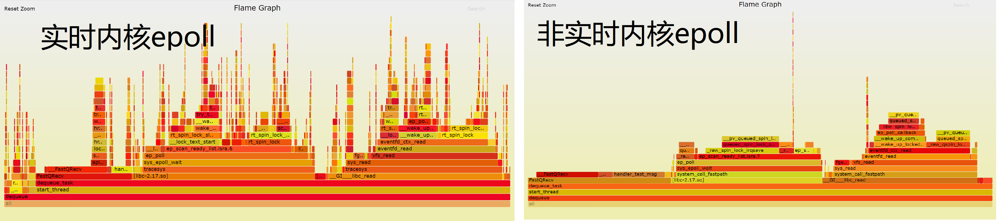
CentOS 7 Linux Real-Time Nuclear Epoll Performance Analysis Subsequent | Flame Graph Analysis
in"Performance Analysis of CentOS 7 Linux Real - Nuclear Nucleus"From the source code, the difference between EPOLL is between real-time kernels and non-real kernels. In order to better disp...

[Performance tuning] flame graph flame graph
Software performance analysis often requires checking the CPU time consumption and understanding where the bottleneck is.Flame graph(Flame graph) is a powerful tool for performance analysis Perf comma...
Linux program performance analysis and flame map
Linux program performance analysis and flame map The number of performance analysis tools for Linux programs is relatively large, involving all aspects of the entire operating system. It may be the re...

LINUX PERF performance analysis tool and flame map
Perf EVENT subsystem Perf is a PROFILING tool in the Linux kernel source tree. It is based on the principle of event sampling, based on performance incident, supports performance analysis of the perfo...

Linux Perf Performance Analysis Flame Map
1. Install Perf 2. Generate DATA: Taking a plurality of procedures to be sorted as an example, the flame graph analysis is aligned. Perf Record represents the acquisition system event, and does not us...
More Recommendation
Flame diagram of Linux program performance analysis
Analyze a software performance bottleneck, there are many ways, The simplest is the function of important or frequently called, before and after adding timestamps, the success is executed twice, the f...
C++: detailed explanation of perf + Flame Graph flame graph analysis program performance
Because of project requirements, C++ and Java are working on it at the same time. Recently I learned about the Flame Graph tool. I checked the information on the Internet and recorded it here. 1 Intro...

[Program quality] perf + flame graph analysis program performance
table of Contents One, perf command Generate flame graph Second, the meaning of the flame diagram 3. Interactivity Four, flame diagram example Five, limitations 6. Flame graph of Node application Seve...
java performance test-flame graph
Flame graph: As a java performance test indicator, the following will focus on the use of flame graph and how to generate svg files The generation of flame graph requires two sets of codes: lightweigh...
Code performance display Flame graph
Article Directory ubuntu install perf Sampling the usage of the specified process Get process number sampling Download project Generate svg analysis graph Generate the folded call stack ubuntu install...