Matlab drawing, editing axis axis, a scale facing
tags: matlab Development language
1. No displayxCoordinate shaft scale
set(gca,'xtick',[]);2. The scale of the coordinate axis is outward
set(gca,'TickDir','out')3. Draw a single point
x=100;
y=100;
plot(x, y, '+')
4. The y -axis reverse (0 scales on the upper, increasing downward)
ax = gca; % current axes
ax.YDir = 'reverse';
5. Display the scale of the X -axis on the top
ax.XAxisLocation = 'top';6. Only on the left, and the upper side display the labeling degree
ax.Box = 'off';7. Set the restriction range of the current coordinate shaft X and Y axis
axis([xmin xmax ymin ymax])8. Remove the border of Legend
legend('boxoff')Example:
clear;
close all;
v=[3 3 6 6 5 5 7 7];
z=[0 2 2 10 10 12 12 20];
figure;
plot(v,z)
xlabel('P-VELOCITY KM/SEC');
ylabel('DEPTH IN KM');
ax = gca; % current axes
ax.YDir = 'reverse';
axis([2 9 0 20]);
ax.XTick = 2:1:9;
ax.YTick = 0:10:20
ax.XTickLabel = {'2','','4','','6','','8',''};
ax.XAxisLocation = 'top';
ax.TickDir = 'out';
ax.Box = 'off';
print('./V-Z.eps','-depsc')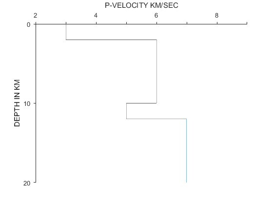
7. Draw a picture without white edge with MATLAB
imshow(image,'border','tight')Intelligent Recommendation
MATPLOTLIB drawing removes coordinate axis and coordinate axis scale
** Note: ** These three lines of code should be placed before plt.show (), and then PLT.IMSHOW ()...
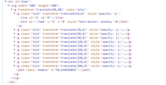
Drawing method of D3.js axis, adding scale of coordinate axis and axis of each scale (V3 version)
Axis (Axis) Axis axes (Axis) are visible in many charts, such as column charts, line charts, scatter charts, and more. A coordinate axis consists of a set of line segments and text, and the poi...
D3.js coordinate axis drawing method, adding coordinate axis scale and coordinate axis of each scale (V3 version)
D3.js coordinate axis drawing method, adding coordinate axis scale and coordinate axis of each scale (V3 version) Axis Axis can be seen in many charts, such as column chart, line chart, scatter...

Python drawing summary (Matplotlib) axis and scale
Learnhttps://matplotlib.org/gallery/index.html Records, descriptions may not be accurate, please refer to the official website for details Matplotlib use summary chart New hidden axis Scale and mark S...
R drawing control the number and label of the axis scale
Control the number and direction of the scale in the coordinate axis, the label of the scale, and the label of the scale use the xaxt, yaxt and axis low drawing parameters in plot(). There is no map h...
More Recommendation
python matplotlib drawing, modify the axis scale to text
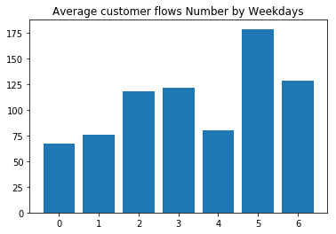
Occasionally, you need to do passenger flow analysis and draw with the pyplot library. In general, the x-axis scale is displayed as a number by default. E.g: I want the x-axis scale to display the day...

Python matplotlib drawing sets the axis scale, text
A function of implementing coordinate scale applications in matplotlib is: matplotlib.pyplot.xtickswithmatplotlib.pyplot.yticks 3 parameters in Xticks (): The LOCS parameter is array parameters (array...
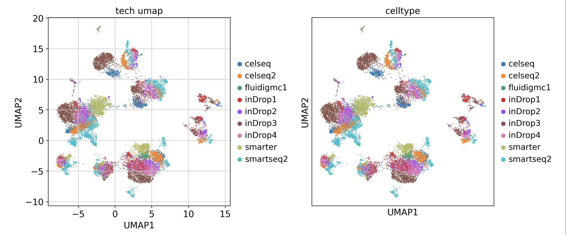
scanpy drawing shows the coordinate axis scale
The result is as follows Ordinary drawing results are as follows...
Matlab changes the scale and size of the coordinate axis
Take the x-axis as an example. limits the range of the x-axis: Name the x-axis scale Custom x-axis scale interval If you need to define the names of these scales, you can use xticklabels Name the x-ax...
How to adjust the scale of coordinate axis in Matlab
1. The source code is shown in the figure. 2. The graph generated by the code is as shown in the figure. You can see that the axis scale is actually wrong. 3. As shown in the figure, add the following...