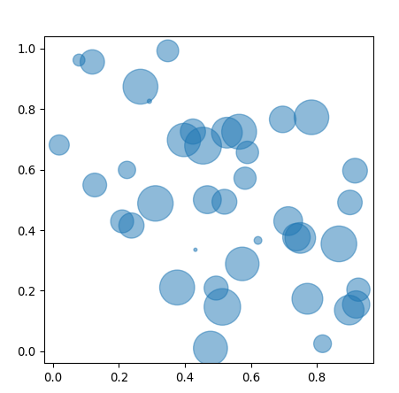
D3.V4 (two)-bubble chart
tags: d3.js data visualization
It is very simple to draw a bubble chart. D3 provides a layout algorithm. You only need to input the data to get the position of the bubble, and then draw it.
data
{
    "children": [{
            "name": "D3.js",
            "weight": 100
        },
        {
            "name": "Echarts.js",
            "weight": 77
        },
        {
            "name": "JavaScript",
            "weight": 70
        },
        {
            "name": "C/C++",
            "weight": 66
        },
        {
            "name": "Java",
            "weight": 66
        },
        {
            "name": "PHP",
            "weight": 56
        },
        {
            "name": "Ruby",
            "weight": 69
        },
        {
            "name": "Python",
            "weight": 73
        },
        {
            "name": "Windows",
            "weight": 44
        },
        {
            "name": "Linux",
            "weight": 90
        },
        {
            "name": "Unix",
            "weight": 85
        },
        {
            "name": "JSON",
            "weight": 40
        },
        {
            "name": "XML",
            "weight": 20
        },
        {
            "name": "JQuery",
            "weight": 44
        },
        {
            "name": "AngularJS",
            "weight": 44
        },
        {
            "name": "ajax",
            "weight": 20
        },
        {
            "name": "Node.js",
            "weight": 78
        },
        {
            "name": "Go",
            "weight": 54
        },
        {
            "name": "Swift",
            "weight": 24
        },
        {
            "name": "HTTP",
            "weight": 8
        },
        {
            "name": "Android",
            "weight": 14
        },
        {
            "name": "iOS",
            "weight": 10
        }
    ]
}
Here is the code:
d3.json("js/newsAndrumor/data/themeBubble.json", function (error, root) {
        // Define the layout
        let pack = d3.pack()
            .size([width, height])
            .padding(2);

        let data = d3.hierarchy(root)
            .sum(function (d) {
                return d.weight;
            });
        let nodes = pack(data).descendants();
        drawBubbleChart(nodes, pack);
   });

function drawBubbleChart(nodes, pack) {
    let color = d3.scaleOrdinal(d3.schemeCategory20);

    let bubbles = d3.select("#theme_svg").selectAll(".bubble")
        .data(nodes)
        .enter()
        .filter(function (d) {
            return !d.children;
        })
        .append("g")
        .attr("class", "bubble")
        .on("click",bubble_click);

    bubbles.append("circle")
        .style("fill", function (d, i) {
            return color(i);
        })
        .attr("cx", function (d) {
            return d.x;
        })
        .attr("cy", function (d) {
            return d.y;
        })
        .attr("r", function (d) {
            return d.r;
        })
        .append("svg:title")
        .text(function(d){
            return d.data.name + ":" + d.data.weight;
        });

    bubbles.append("text")
        .attr("dy", ".2em")
        .style("text-anchor", "middle")
        .attr("x", function (d) {
            return d.x;
        })
        .attr("y", function (d) {
            return d.y;
        })
        .text(function (d) {
            return d.data.name.substring(0, d.r / 3);
        })
        .style("font-size",function(d){
            return d.r / 2.5;
        });
}
Intelligent Recommendation


Thingworx-Chart-Bubble Chart
Bubble chart is a multivariate chart, a variant of a scatter chart. It is usually used to compare and display the relationship between different types of dots (bubbles), by the position and area size ...
D3 Two-dimensional chart drawing series (two) basic histogram
Next: Multi-column histogram Code structure and Chart object initialization canvas introduction, please look first The complete source address of this picture:https://github.com/zjw666/D3_demo/tree/ma...
Kibana: Combine two indicators into one visualization through bubble chart
In many cases, in our visualization, we can display more than two indicators at the same time, such as: In the above visualization, we showed the following two indicators: The number of documents in e...
More Recommendation
D3 v4
Geomapping Map to provide vertical and horizontal arrow keys, pressing the corresponding button, the map where to edge shift; But in fact, the movement direction of the map is the opposite of the dire...
D3 Two-dimensional chart drawing series (31) Heat map (heatMap.js)
Previous: Parallel coordinate system line chart The code structure and the introduction of the Chart object to initialize the canvas, please see firstHere The complete source code address of this pict...
Python draw bubble chart Bubble
This blogger has opened a new public account. I hope you can scan the QR code and follow it. Thank you very much. This article comes from:https:...
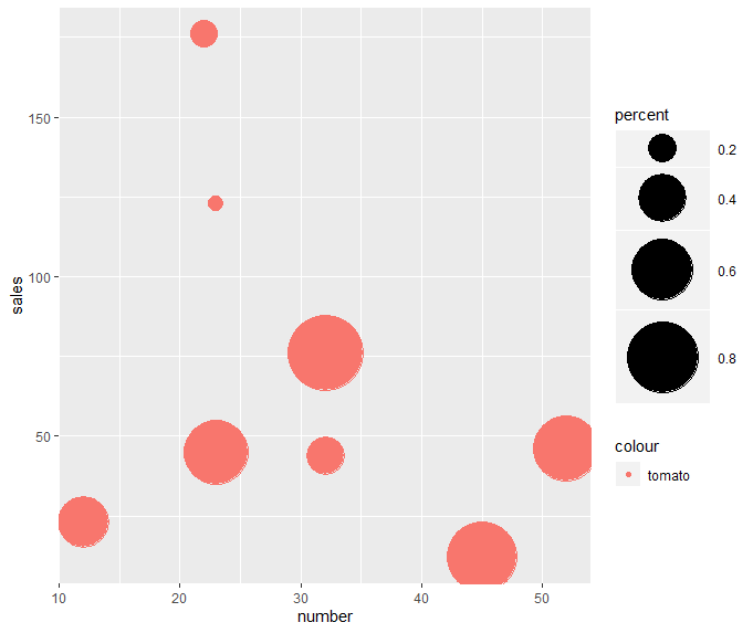
R language bubble chart bubble chart
Introduction The bubble chart can show the relationship between three numerical variables. It is based on the scatter chart, and uses the size of the bubble to display the third numerical variable. ge...

javaFX learning bubble chart (Bubble Chart) (reprinted)
Reference original address:DOC-03-34 Bubble Chart | JavaFX Chinese Materials Bubble chart, a biaxial chart that draws bubbles based on grouped data points. Each data item is defined by two to three pa...