Button components in Flutter RaisedButton, FlatButton, OutlineButton, IconButton, ButtonBar and custom button components
tags: Button components RaisedButton, FlatButt in Flutter RaisedButton、FlatButton、OutlineButt IconButton、ButtonBar Flutter Button
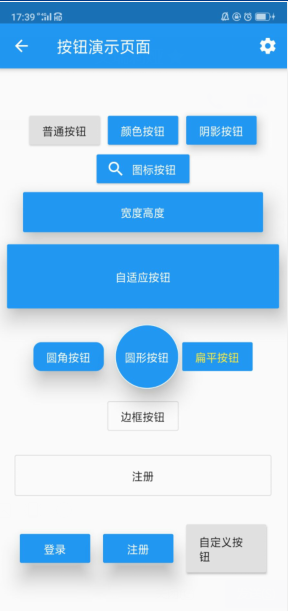
Effect picture:
import 'package:flutter/material.dart';
class ButtonDemoPage extends StatelessWidget {
@override
Widget build(BuildContext context) {
return Scaffold(
appBar: AppBar(
title: Text('Button demo page'),
actions: <Widget>[
IconButton( // Icon button
icon: Icon(Icons.settings),
onPressed: (){
},
)
],
),
body: Column(
mainAxisAlignment: MainAxisAlignment.center, // center vertically
children: <Widget>[
Row(
mainAxisAlignment: MainAxisAlignment.center, // center horizontally
children: <Widget>[
RaisedButton(
child: Text('Normal button'),
onPressed: (){
print('Normal button');
},
),
SizedBox(width: 10,),
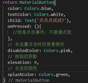
RaisedButton(
child: Text('Color button'),
color: Colors.blue, //background color
textColor: Colors.white, // font white
onPressed: (){
print('Color button');
},
),
SizedBox(width: 10,),
RaisedButton(
child: Text('Shadow button'),
color: Colors.blue, //background color
textColor: Colors.white, // font white
elevation: 10, // Set the shadow effect, the larger the value, the better the shadow effect
onPressed: (){
print('Shadow button');
},
),
],
),
RaisedButton.icon(
// onPressed: null,
icon: Icon(Icons.search),
label: Text('Icon button'),
color: Colors.blue,
textColor: Colors.white,
onPressed: (){
print('Icon button');
},
),
SizedBox(height: 5,),
Row(
mainAxisAlignment: MainAxisAlignment.center,
children: <Widget>[
Container( // Use the container to set the width and height of the button
height: 50,
width: 300,
child: RaisedButton(
child: Text('Width Height'),
color: Colors.blue,
textColor: Colors.white,
elevation: 20,
onPressed: (){
print('Width Height');
},
),
)
],
),
SizedBox(height: 5,),
Row(
mainAxisAlignment: MainAxisAlignment.center,
children: <Widget>[
Expanded( // Full screen width
child: Container( // Use the container to set the height
height: 80,
margin: EdgeInsets.all(10), // Set: left and right spacing 10
child: RaisedButton(
child: Text('Adaptive button'),
color: Colors.blue,
textColor: Colors.white,
elevation: 20,
onPressed: (){
print('Adaptive button');
},
),
)
)
],
),
SizedBox(height: 10,),
Row(
mainAxisAlignment: MainAxisAlignment.center,
children: <Widget>[
RaisedButton(
child: Text('Round corner button'),
color: Colors.blue,
textColor: Colors.white,
elevation: 20,
shape: RoundedRectangleBorder( // Round corner button
borderRadius: BorderRadius.circular(10) // Round angle radian
),
onPressed: (){
print('Round corner button');
}),
SizedBox(width: 10,),
Container(
height: 80, // Set: height, can also be understood as diameter
child: RaisedButton(
child: Text('Round button'),
color: Colors.blue,
textColor: Colors.white,
elevation: 20,
splashColor: Colors.red, // When setting the button for a long time, the water ripple color
shape: CircleBorder( // Round corner button
side: BorderSide(
color: Colors.white
)
),
onPressed: (){
print('Round button');
}),
),
FlatButton( // Flat button, there is no shadow by default, and there is no background color by default
child: Text('Flat button'),
color: Colors.blue,
textColor: Colors.yellow,
onPressed: (){
print('Flat button');
},
)
],
),
SizedBox(height: 10,),
OutlineButton( // Button with border
child: Text('Border button'),
// color: Colors.red, no effect, this is the characteristic of the border button, not only comes with a border, but also cannot set its background color, I guess it may be that the author is afraid that the background color set is the same as the border color
// textColor: Colors.yellow, // has an effect
onPressed: (){
print('Border button');
},
),
SizedBox(height: 5,),
Row(
mainAxisAlignment: MainAxisAlignment.center,
children: <Widget>[
Expanded( // Adaptive horizontal tiling
child: Container(
margin: EdgeInsets.all(20), // The distance between top, bottom, left and right is 20
height: 50,
child: OutlineButton(
child: Text('registered'),
onPressed: (){
},
),
),
)
],
),
Row(
mainAxisAlignment: MainAxisAlignment.center,
children: <Widget>[
ButtonBar(
children: <Widget>[
RaisedButton(
child: Text('log in'),
color: Colors.blue,
textColor: Colors.white,
elevation: 20,
onPressed: (){
print('log in');
},
),
RaisedButton(
child: Text('registered'),
color: Colors.blue,
textColor: Colors.white,
elevation: 20,
onPressed: (){
print('registered');
},
),
MyButton(text:'Custom Button',height: 60.0,width: 100,pressed: (){
print('Custom Button');
})
],
)
],
)
],
),
);
}
}
// Custom button component
class MyButton extends StatelessWidget {
final text;
final pressed;
final double width;
final double height;
const MyButton({this.text="",this.pressed=null,this.width=80.0,this.height=30.0});
@override
Widget build(BuildContext context) {
return Container(
height: this.height,
width: this.width,
child: RaisedButton(
child: Text(this.text),
onPressed: this.pressed,
),
);
}
}
Intelligent Recommendation
Flutter Assembly - Button-RaisedButton - Raised Button
Anti-collection mark:Yan Shaojun's courses and materials Sample code Flutter technology entry and combat:http://product.dangdang.com/26485813.html Flutter exchange learning group: 894109159 Flutter op...

React Custom Components --Button
React Custom Components --Button This is the main JS code This is a style code Last reference example Outcome Leave yourself an impression and a lot of insufficient places I hope everyone will progres...
flutter FlatButton basic use and set button size
The FlatButton button has a size by default, FlatButton does not provide the problem of setting the button size, how to set the size then just wrap the SizedBox...
FLUTTER FLATBUTTON button fills full Container
FLUTTER FLATBUTTON button fills Container:...
More Recommendation

Multiple button components in Flutter Checkbox
There are two types of button components in the Flutter. 1. Checkbox Multiple buttons, generally used to express some simple information. Common properties are as follows: (1). Value multi-select...

Syll Button Components in Flutter Radio
The radial button assembly in the flutter has two. 1. Radio The radio button is generally used to express some simple information. Common properties are as follows: (1). Value radical; (2). ONCHANGED ...
FLUTTER Development - Basic Components - Button
I. Overview Flutter provides more than 10 kindsButton Class components, this article Simple classification for buttons Common properties and methods of Button Button's simple usage example and effect ...
Flutter basic components common button
Flutter comes with a button including MaterialButton, RaisedButton, FlosetiveButton, FlatButton, IconButton, ButtonBar, DropdownButton, etc. For example: MaterialButton, IconButton, FloatingActionButt...
13. Flutter - AppBAR button components
1. Button components in Flutter RaisedButton : The raised button is actually the MATERIAL Design style button FlatButton : Flat button OutlineButton: Wireframe button IconButton : Icon button ButtonBa...