Vue organization tree diagram component vue-org-tree use
tags: vue-org-tree Organization Chart
Description
Recently, I need to make an organizational chart to visualize it. Finally, I found the vue-org-tree component. I think the effect is not bad~, optional node color, horizontal/vertical expansion, open/close, record the usage method here. The effect chart is as follows:

Quick start
installation
npm install --save-dev less less-loader
npm install --save-dev vue2-org-tree
(You may need to install other components. If you report an error, follow the prompts and install it again.)
Then introduced in main.js
import Vue2OrgTree from 'vue2-org-tree';
Vue.use(Vue2OrgTree)
use
<template>
  <div>
    <div class="container">
      <div class="col-md-10 col-md-offset-1">
        <div class="page-header">
          <h3>Vue-based organization tree component</h3>
        </div>
        <div class="row">
          <div class="col-md-8 col-md-offset-2">
            <form class="form-horizontal row">
              <div class="col-md-4">
                <div class="checkbox">
                  <label>
                    <input
                      type="checkbox"
                      v-model="horizontal"
                    > Horizontal
                  </label>
                </div>
              </div>
              <div class="col-md-4">
                <div class="checkbox">
                  <label>
                    <input
                      type="checkbox"
                      v-model="collapsable"
                    > Collapsable
                  </label>
                </div>
              </div>
              <div class="col-md-4">
                <div class="checkbox">
                  <label>
                    <input
                      type="checkbox"
                      v-model="expandAll"
                      @change="expandChange"
                    > Expand All
                  </label>
                </div>
              </div>
              <p><br></p>
              <p><br></p>
              <div class="col-md-6">
                <div class="form-group">
                  <label class="control-label col-md-5">labelClassName:</label>
                  <div class="col-md-7">
                    <select
                      class="form-control"
                      v-model="labelClassName"
                    >
                      <option value="bg-white">bg-white</option>
                      <option value="bg-orange">bg-orange</option>
                      <option value="bg-gold">bg-gold</option>
                      <option value="bg-gray">bg-gray</option>
                      <option value="bg-lightpink">bg-lightpink</option>
                      <option value="bg-chocolate">bg-chocolate</option>
                      <option value="bg-tomato">bg-tomato</option>
                    </select>
                  </div>
                </div>
              </div>
            </form>
          </div>
        </div>
        <p><br></p>
        <div class="text-center">
          <vue2-org-tree name="test"
            :data="data"
            :horizontal="horizontal"
            :collapsable="collapsable"
            :label-class-name="labelClassName"
            :render-content="renderContent"
            @on-expand="onExpand"
            @on-node-click="onNodeClick"
          />
        </div>
      </div>
    </div>
  </div>
</template>
<script>
export default {
  data() {
    return {
      data: {
        id: 0,
                 Label: "XXX Technology Co., Ltd.",
        children: [
          {
            id: 2,
                         Label: "Product Development Department",
            children: [
              {
                id: 5,
                                 Label: "R & D - front end"
              },
              {
                id: 6,
                                 Label: "R&D - backend"
              },
              {
                id: 9,
                                 Label: "UI Design"
              },
              {
                id: 10,
                                 Label: "Product Manager"
              }
            ]
          },
          {
            id: 3,
                         Label: "Sales",
            children: [
              {
                id: 7,
                                 Label: "sales one"
              },
              {
                id: 8,
                                 Label: "Sales 2"
              }
            ]
          },
          {
            id: 4,
                         Label: "finance department"
          },
          {
            id: 9,
                         Label: "HR Personnel"
          }
        ]
      },
      horizontal: false,
      collapsable: true,
      expandAll: false,
      labelClassName: "bg-white"
    };
  },
  methods: {
    renderContent(h, data) {
      return data.label;
    },
    onExpand(data) {
      if ("expand" in data) {
        data.expand = !data.expand;
        if (!data.expand && data.children) {
          this.collapse(data.children);
        }
      } else {
        this.$set(data, "expand", true);
      }
    },
    onNodeClick(e, data) {
      alert(data.label);
    },
    collapse(list) {
      var _this = this;
      list.forEach(function(child) {
        if (child.expand) {
          child.expand = false;
        }
        child.children && _this.collapse(child.children);
      });
    },
    expandChange() {
      this.toggleExpand(this.data, this.expandAll);
    },
    toggleExpand(data, val) {
      var _this = this;
      if (Array.isArray(data)) {
        data.forEach(function(item) {
          _this.$set(item, "expand", val);
          if (item.children) {
            _this.toggleExpand(item.children, val);
          }
        });
      } else {
        this.$set(data, "expand", val);
        if (data.children) {
          _this.toggleExpand(data.children, val);
        }
      }
    }
  }
};
</script>
<style type="text/css">
.org-tree-node-label {
  white-space: nowrap;
}
.bg-white {
  background-color: white;
}
.bg-orange {
  background-color: orange;
}
.bg-gold {
  background-color: gold;
}
.bg-gray {
  background-color: gray;
}
.bg-lightpink {
  background-color: lightpink;
}
.bg-chocolate {
  background-color: chocolate;
}
.bg-tomato {
  background-color: tomato;
}
</style>
API
-
props
prop descripton type default data Objectprops configure props Object{label: 'label', children: 'children', expand: 'expand'}labelWidth node label width String|Number.autocollapsable children node is collapsable BooleantruerenderContent how to render node label Function- labelClassName node label class Function|String- -
events
-
on-expand
well be called when the collapse-btn clicked
-
on-node-click
well be called when the node-label clicked
-
See the html example:https://github.com/hukaibaihu/vue-org-tree/blob/gh-pages/index.html
Component github:https://github.com/hukaibaihu/vue-org-tree
Intelligent Recommendation
Vue tree display diagram
Reprinted from: https://www.cnblogs.com/steamed-twisted-roll/p/10731862.html Sub -component Treedata.vue m; // height: 4em; top:35px; left: 12px; width: 110px; } } .el-popover { .el-button { padding: ...

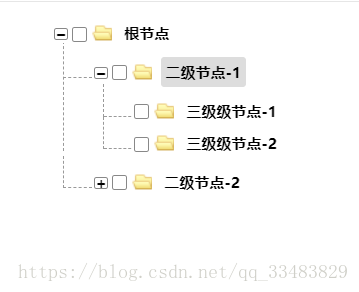
vue makes a tree diagram
I thought about making a tree map, and I realized a three-layer tree map through the v-for set of 3 layers. Later I suddenly realized that the form of vue components can be used to set components, whi...
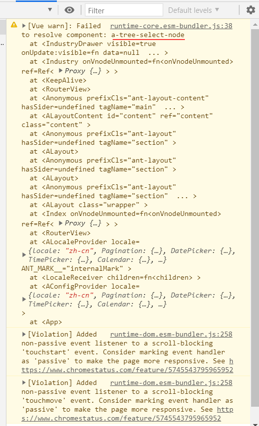
Tree-select use in the ANTDV (VUE) component
Official website tutorial:Component Tree-Select Effect: 1. Basic usage: Directly use data in VUE layer Note: The registration component wants to include Treeselect and the node ATREESELECTNODE Not reg...
More Recommendation
vue package tree component tree
Many of our projects need to use tree components. I used ztree when I wrote jq. Now I write vue. I don’t think I can find a tree component that is as easy to use as ztree. I don’t w...
Vue custom TREE tree component
Component content Parent component use If the back end does not give an open field, add it by yourself...

Vue tree component
Because of the use of more tree components in the project, I tried the iview and element-ui tree components. Both component libraries are excellent, but they are not satisfied with their tree componen...
Vue tree recursive component
//This is the parent component. The parent component is a div. At the beginning, the root node is obtained in created and rendered. If there is a subset of the root node, the subset must have a differ...
Vue component tree
1. Global Components Instructions: Experimental convenience, in the above code is inserted in main.js In html page, such as inserting the code index.html <my-header></my-header> 2. compone...