Data Analysis-"Age of Abalone" Data Set
tags: python data analysis
Article Directory
0. Data set introduction
The abalone dataset can be obtained from the UC Irvine data warehouse at http://archive.ics.uci.edu/ml/machine-earning-database/abalone/abalone.data. The data in this dataset are separated by commas and there is no column header. The name of each column is stored in another file. The data needed to establish a predictive model include gender, length, diameter, height, overall weight, weight after shelling, organ weight, shell weight, and ring number. The last column of "ring numbers" is very time-consuming to obtain, you need to saw the shell, and then observe under a microscope. This is a preparation that a supervised machine learning method usually requires. Build a predictive model based on a data set with a known answer, and then use this predictive model to predict data that does not know the answer.
1. Reading and analysis of abalone data set
import pandas as pd
from pandas import DataFrame
from pylab import *
import matplotlib.pyplot as plot

target_url =  ("http://archive.ics.uci.edu/ml/machine-learning-databases/abalone/abalone.data")
## Data set read
abalone = pd.read_csv(target_url,header=None,prefix="V")
abalone.columns= ['Sex', 'Length', 'Diameter', 'Height', 'Whole weight','Shucked weight', 'Viscera weight', 'Shell weight', 'Rings']
print(abalone.head())
print(abalone.tail())

## Statistics
summary = abalone.describe()
print(summary)

## Box plot of real-valued attributes
array = abalone.iloc[:,1:9].values
boxplot(array)
plot.xlabel("Attribute Index")
plot.ylabel("Quartile Ranges")
show()

## The last column is out of proportion to the others, remove and then replot
array2 = abalone.iloc[:,1:8].values
boxplot(array2)
plot.xlabel("Attribute Index")
plot.ylabel("Quartile Ranges")
show()

## All columns are normalized
abaloneNormalized = abalone.iloc[:,1:9]

for i in range(8):
    mean = summary.iloc[1,i]
    sd = summary.iloc[2,i]
    abaloneNormalized.iloc[:,i:(i+1)] = (abaloneNormalized.iloc[:,i:(i + 1)] - mean) / sd

array3 = abaloneNormalized.values
boxplot(array3)
plot.xlabel("Attribute Index")
plot.ylabel("Quartile Ranges - Normalized ")
show()
  Sex  Length  Diameter  Height  Whole weight  Shucked weight  Viscera weight  \
0   M   0.455     0.365   0.095        0.5140          0.2245          0.1010
1   M   0.350     0.265   0.090        0.2255          0.0995          0.0485
2   F   0.530     0.420   0.135        0.6770          0.2565          0.1415
3   M   0.440     0.365   0.125        0.5160          0.2155          0.1140
4   I   0.330     0.255   0.080        0.2050          0.0895          0.0395

   Shell weight  Rings
0         0.150     15
1         0.070      7
2         0.210      9
3         0.155     10
4         0.055      7
     Sex  Length  Diameter  Height  Whole weight  Shucked weight  \
4172   F   0.565     0.450   0.165        0.8870          0.3700
4173   M   0.590     0.440   0.135        0.9660          0.4390
4174   M   0.600     0.475   0.205        1.1760          0.5255
4175   F   0.625     0.485   0.150        1.0945          0.5310
4176   M   0.710     0.555   0.195        1.9485          0.9455

      Viscera weight  Shell weight  Rings
4172          0.2390        0.2490     11
4173          0.2145        0.2605     10
4174          0.2875        0.3080      9
4175          0.2610        0.2960     10
4176          0.3765        0.4950     12
            Length     Diameter       Height  Whole weight  Shucked weight  \
count  4177.000000  4177.000000  4177.000000   4177.000000     4177.000000
mean      0.523992     0.407881     0.139516      0.828742        0.359367
std       0.120093     0.099240     0.041827      0.490389        0.221963
min       0.075000     0.055000     0.000000      0.002000        0.001000
25%       0.450000     0.350000     0.115000      0.441500        0.186000
50%       0.545000     0.425000     0.140000      0.799500        0.336000
75%       0.615000     0.480000     0.165000      1.153000        0.502000
max       0.815000     0.650000     1.130000      2.825500        1.488000

       Viscera weight  Shell weight        Rings
count     4177.000000   4177.000000  4177.000000
mean         0.180594      0.238831     9.933684
std          0.109614      0.139203     3.224169
min          0.000500      0.001500     1.000000
25%          0.093500      0.130000     8.000000
50%          0.171000      0.234000     9.000000
75%          0.253000      0.329000    11.000000
max          0.760000      1.005000    29.000000

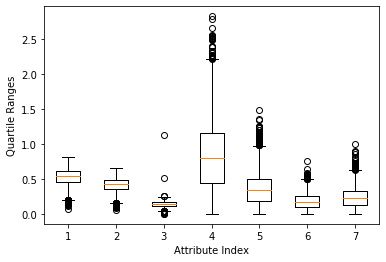
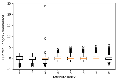
The box plot shown in Figure 1 is a faster and more direct method to find abnormal points than printing out the data, but the last loop number attribute (the rightmost box) The value range causes other attributes to be "compressed" (which makes it difficult to see clearly). A simple solution is to delete the attribute with the largest value range. The result is shown in Figure 2. This method is not satisfactory because it does not implement automatic scaling (adaptive) according to the value range. A better way is to normalize the attribute values before drawing the box plot. Normalization here refers to determining the center of each column of data, and then scaling the value so that a unit value of attribute 1 is the same as a unit value of attribute 2. There are a considerable number of algorithms in data science that require this kind of normalization. For example, the K-means clustering method performs clustering based on the vector distance between row data. The distance is the subtraction of points on the corresponding coordinates and then the sum of squares. The calculated distance will be different if the unit is different. The distance to a grocery store is 1 mile in miles and 5280 feet in feet. The normalization in this example is to convert all attribute values into a distribution with a mean of 0 and a standard deviation of 1. The normalization calculation uses the result of the function summary(). The effect after normalization is shown in Figure 3. Note: Note that normalization to standard deviation 1 does not mean that all data are between -1 and +1. The top and bottom sides of the box will be around -1 and +1, but there is still a lot of data outside this boundary.
3. Visualization of variable relationships
The next step is to look at the relationship between attributes and between attributes and tags. For classification problems, the polyline represents a row of data, and the color of the polyline indicates the category it belongs to. This is useful for visualizing the relationship between attributes and categories. The abalone problem is a regression problem, and different colors should be used to correspond to the level of the label value. That is, to realize the mapping from the real value of the label to the color value, the real value of the label needs to be compressed to the interval [-1,1].
import pandas as pd
from pandas import DataFrame
from pylab import *
import matplotlib.pyplot as plot
from math import exp

target_url =  ("http://archive.ics.uci.edu/ml/machine-learning-databases/abalone/abalone.data")
## Data set read
abalone = pd.read_csv(target_url,header=None,prefix="V")
abalone.columns= ['Sex', 'Length', 'Diameter', 'Height', 'Whole weight','Shucked weight', 'Viscera weight', 'Shell weight', 'Rings']

## Statistics
summary = abalone.describe()
minRings = summary.iloc[3,7]
maxRings = summary.iloc[7,7]
nrows = len(abalone.index)
print(nrows)

for i in range(nrows):
    #plot rows of data as if they were series data
    dataRow = abalone.iloc[i,1:8]
    labelColor = (abalone.iloc[i,8] - minRings) / (maxRings - minRings) ## min-max normalization
    dataRow.plot(color=plot.cm.RdYlBu(labelColor), alpha=0.5)

plot.xlabel("Attribute Index")
plot.ylabel(("Attribute Values"))
plot.show()

#Mean-variance normalization
meanRings = summary.iloc[1,7]
sdRings = summary.iloc[2,7]
for i in range(nrows):
    #plot rows of data as if they were series data
    dataRow = abalone.iloc[i,1:8]
    normTarget = (abalone.iloc[i,8] - meanRings)/sdRings
    labelColor = 1.0/(1.0 + exp(-normTarget))
    dataRow.plot(color=plot.cm.RdYlBu(labelColor), alpha=0.5)
plot.xlabel("Attribute Index")
plot.ylabel(("Attribute Values"))
plot.show()
4177
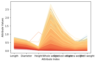
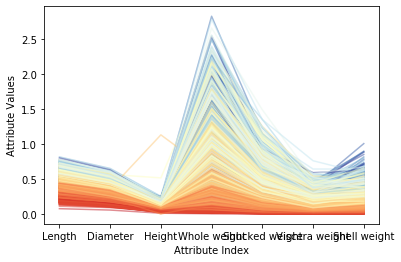
Figure 1 above shows the correlation between each attribute and the target ring number. Where the attribute value is similar, the color of the polyline is also relatively close, and it will be concentrated. These correlations all suggest that a fairly accurate prediction model can be constructed. Compared with the attributes and target ring numbers that reflect good correlation, some faint blue polylines are mixed with dark orange areas, indicating that these examples may be difficult to predict correctly. Figure 2 shows the result after normalization of the mean variance. After conversion, various colors in the color scale can be used more fully. Note that for the two attributes of overall weight and weight after shelling, some dark blue lines (corresponding to varieties with a large number of loops) are mixed into the light blue line area, or even the yellow and bright red areas. This means that when the abalone is older, these attributes alone are not enough to accurately predict the age (number of rings) of the abalone. Fortunately, other attributes (such as diameter, shell weight) can distinguish the dark blue line well. These observations are helpful in analyzing the reasons for forecast errors.
4. Visualization of attributes versus relevance
The last step is to look at the correlation between different attributes and the correlation between attributes and goals. The method followed is the same as the method in the corresponding chapter of the "Rock vs. Mine" data set, with only one important difference: because the abalone problem is a real-value prediction, the target value can be included when calculating the relationship matrix.
import pandas as pd
from pandas import DataFrame
from pylab import *
import matplotlib.pyplot as plot

target_url =  ("http://archive.ics.uci.edu/ml/machine-learning-databases/abalone/abalone.data")
## Data set read
abalone = pd.read_csv(target_url,header=None,prefix="V")
abalone.columns= ['Sex', 'Length', 'Diameter', 'Height', 'Whole weight','Shucked weight', 'Viscera weight', 'Shell weight', 'Rings']

## Calculate the correlation matrix of all real-valued columns (including the target)
corMat = DataFrame(abalone.iloc[:,1:9].corr())
print(corMat)

## Use heat map to visualize correlation matrix
plot.pcolor(corMat)
plot.show()
                  Length  Diameter    Height  Whole weight  Shucked weight  \
Length          1.000000  0.986812  0.827554      0.925261        0.897914
Diameter        0.986812  1.000000  0.833684      0.925452        0.893162
Height          0.827554  0.833684  1.000000      0.819221        0.774972
Whole weight    0.925261  0.925452  0.819221      1.000000        0.969405
Shucked weight  0.897914  0.893162  0.774972      0.969405        1.000000
Viscera weight  0.903018  0.899724  0.798319      0.966375        0.931961
Shell weight    0.897706  0.905330  0.817338      0.955355        0.882617
Rings           0.556720  0.574660  0.557467      0.540390        0.420884

                Viscera weight  Shell weight     Rings
Length                0.903018      0.897706  0.556720
Diameter              0.899724      0.905330  0.574660
Height                0.798319      0.817338  0.557467
Whole weight          0.966375      0.955355  0.540390
Shucked weight        0.931961      0.882617  0.420884
Viscera weight        1.000000      0.907656  0.503819
Shell weight          0.907656      1.000000  0.627574
Rings                 0.503819      0.627574  1.000000

In the correlation heat map above, yellow represents strong correlation and blue represents weak correlation. The target (number of rings on the shell) is the last item, the first row and rightmost column of the associated heat map. Blue indicates that these attributes are weakly related to the target. Light blue corresponds to the correlation between the target (number of rings on the shell) and the weight of the shell. This result is consistent with that seen in the parallel coordinate graph.
Intelligent Recommendation
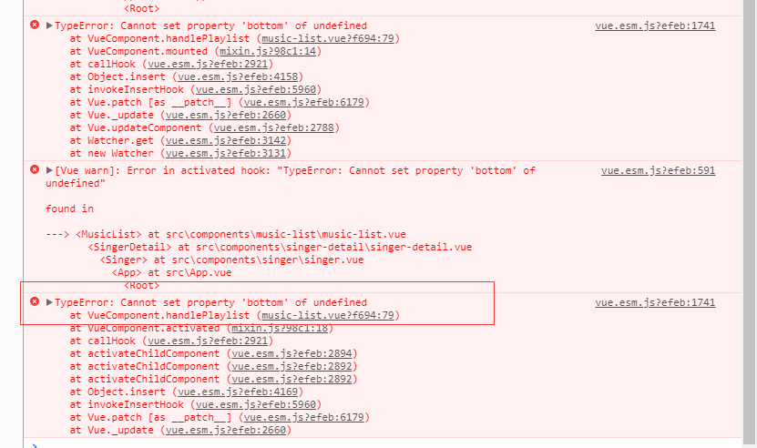
Error in mounted hook: "TypeError: Cannot set property 'bottom' of undefined"
The template in the parent component music-list.vue calls the child component scroll Set the bottom value of the root element of the child component in a method in the methods of the parent component ...
"Qt Creator needs a compiler set up to build. Configure a compiler in the kit options".
Welcome, I believe you must have copied this error and searched it directly, yes, you have come to the right place. 1. First, declare that this error is an error occurred under Linux (ubuntu) system. ...
Data preprocessing-data set analysis
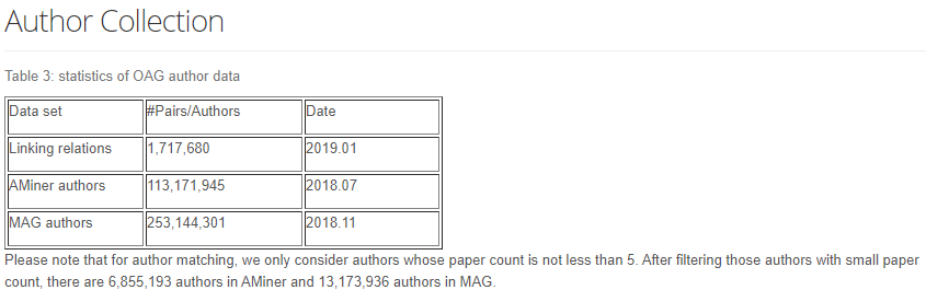
About the dataset The original ACM paper data set contains the data of the paper ID, title, abstract, keywords, citation relations, CCS classification, and sentence-level subspace markers in the paper...
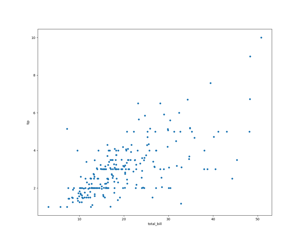
Tips data set for data analysis
It can be seen from the figure that there is a positive correlation between the tip amount and the consumption amount, that is, the more the amount consumed, the more tips are given. To ...
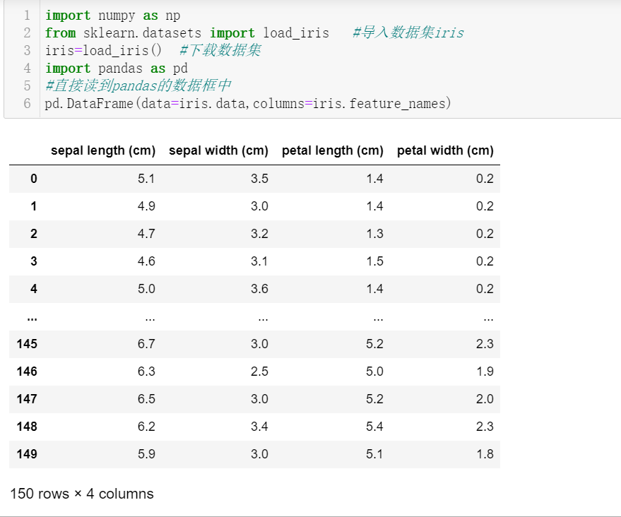
Data analysis-iris data set
Iris data set The Iris iris data set contains 3 categories, namely Iris-setosa, Iris-versicolor and Iris-virginica, with a total of 150 records, each with 50 data. Each record has 4 characteristics: c...
More Recommendation
Waymo data set analysis
Waymo data set learning Because of research needs, the point cloud data in the waymo dataset is needed, so the waymo dataset processing process is recorded download The waymo data set is relatively la...
SQUAD data set analysis
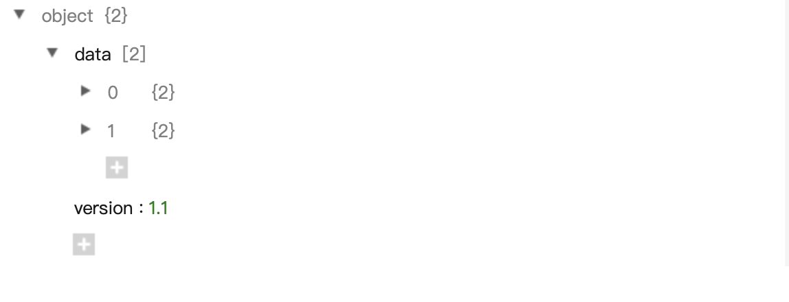
Data set demo to sum up: object contains data and version. Data contains a lot of text (doc), each text contains a title (title) and different paragraphs (paragraphs), and each paragraph contains qas ...
Data set summary and analysis
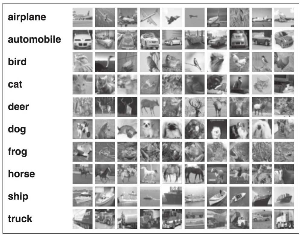
1. CIFAR-10 data set The data set contains a total of 60,000 color pictures with a resolution of 32x32 and 3 channel images. Divided into 10 categories, each category has 6000 pictures. Among them, 50...

MNIST data set analysis
MNIST data set analysis The mnist dataset is hosted atYann LeCun's website The download contains four compressed files, a total of 60,000 images and corresponding tags (55,000 training data and 5000 v...