Requirement: d3 Usually we see that either the x y axis is number or one of them is number
So how do you draw x-y axes that are non-numeric bubble charts?
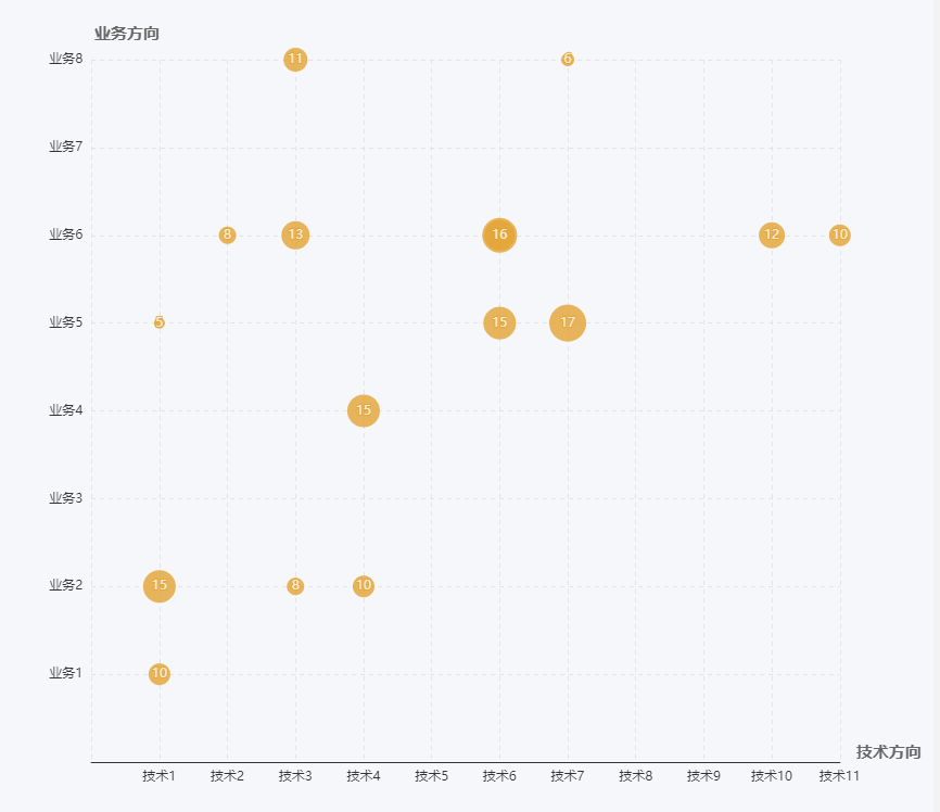
To achieve the following picture:
Using the vue + d3 v4 version, the code is as follows:
Among them, the color is rendered with a scale, and the radius is too small because the original data is too small, so there is a linear scale to render~
  let self = this
          var initWidth = 800
          var initHeight = 800

          var padding = {
            left: 300,
            top: 20,
            right: 20,
            bottom: 20
          }

          var height = initWidth - padding.top - padding.bottom
          var width = initHeight - padding.left - padding.right


          var svg = d3.select(".container")
            .append("svg")
            .attr("width", width)
            .attr("height", height)
            .style("padding-left", padding.left)
            .style("padding-right", padding.right)
            .style("padding-top", padding.top)
            .style("padding-bottom", padding.bottom)

          / / Add y axis axis

                     //y axis scale
          let ydata = self.yData
          let yScale = d3.scaleBand().rangeRound([height, 0]).padding(1)
            .domain(ydata.map(function(d) {
              return d;
            }))

                     / / Define the y axis
          let yAxis = d3.axisLeft(yScale)

                     / / Add y axis
          svg.append("g")
            .attr("class", "xaxis")
            .attr("transform", "translate(" + 0 + "," + 0 + ")")
            .call(yAxis);

                     / / Add x axis axis

                     //x axis scale
          let xData = self.xData

          let xScale = d3.scaleBand().rangeRound([0, width]).padding(1)
            .domain(xData.map(function(d) {
              return d;
            }))

                     / / Define the x axis
          let xAxis = d3.axisBottom(xScale)

                     / / Add x axis
          svg.append("g")
            .attr("class", "yaxis")
            .attr("transform", "translate(" + "0 ," + height + ")")
            .call(xAxis);

          d3.selectAll('.domain').remove() // remove the extra tick marks

                     //Add grid-----------

          // gridlines in x axis function
          function make_x_gridlines() {
            return d3.axisBottom(xScale)
              .ticks(4)
          }

          // gridlines in y axis function
          function make_y_gridlines() {
            return d3.axisLeft(yScale)
              .ticks(4)
          }

          // add the X gridlines
          svg.append("g")
            .attr("class", "grid")
            .attr("transform", "translate(0," + height + ")")
            .call(make_x_gridlines()
              .tickSize(-height)
              .tickFormat("")
            )

          // add the Y gridlines
          svg.append("g")
            .attr("class", "grid")
            .call(make_y_gridlines()
              .tickSize(-width)
              .tickFormat("")
            )

        var colorLinear = d3.scaleLinear()
            .domain([d3.min(self.tableValue , function (d) {
            				  return Number(d.p_value); } ),
                    d3.max(self.tableValue , function (d) {
                    	 return Number(d.p_value); })])
            .range(["red", "blue"]);

        var radiusLinear = d3.scaleLinear()
            .domain([d3.min(self.tableValue , function (d) {
            				  return d.gene_ratio; } ),
                    d3.max(self.tableValue , function (d) {
                    	 return d.gene_ratio; })])
            .range([10, 20]);

                     / / Add circle wrap layer, there are several types to add a few
          var cover = svg.append("g")

                     / / Add circle
          cover.selectAll("circle")
            .data(self.tableValue)
            .enter()
            .append("circle")
            .attr("cx", function(d) {
              return xScale(d.x)
            })
            .attr("cy", function(d) {
              return yScale(d.y)
            })
            .attr("r", function(d) {
              return radiusLinear(d.gene_ratio)
            })
            .attr("fill", function(d) {
              return colorLinear(Number(d.p_value))
            })
            .on("mouseover", function(d) {
              let self = this;
              d3.select(this)
                .transition()
                .duration(100)
                .attr("r", d3.select(this).attr("r") * 1.6)
              showtext.attr("x", function() {
                  return xScale(d.x)
                })
                .attr("y", function() {
                  return yScale(d.y) - d3.select(self).attr("r") * 1.6 - 5
                })
                .text(function() {
                  return d.id
                })
                .attr("text-anchor", "middle")
                .attr("fill", "#666")
            })
            .on("mouseout", function() {
              d3.select(this)
                .transition()
                .duration(100)
                .attr("r", d3.select(this).attr("r") / 1.6)
              showtext.text("")
            })
                     / / Add the left side of the part of the wrap layer
          let detail = cover.append("g")
          let showtext = svg.append("text")
            .text("")
            .attr("font-size", '14px')
Copy code
The final effect:
Oh~ Not bad~ You're done!